|
Getting your Trinity Audio player ready…
|
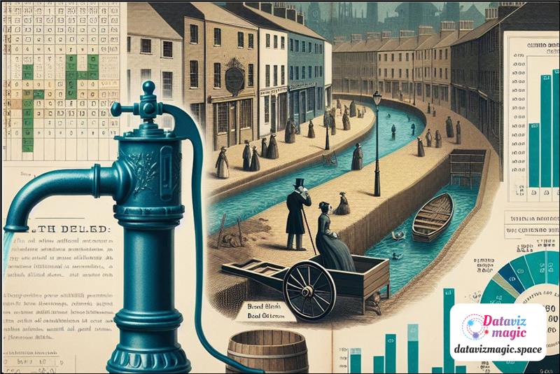
The cholera outbreak on Broad Street in 1854, in London, is a historical event that marked the beginning of modern epidemiology and highlighted the importance of data analysis in public health.
At that time, London faced serious sanitation problems, with sewage and drinking water often mixing. Cholera, a disease caused by the bacterium Vibrio cholerae, spread rapidly, resulting in hundreds of deaths. Dr. John Snow, investigating the cause of the outbreak, challenged the prevailing theory that the disease was transmitted through the air (miasma) and proposed that contaminated water was the true source of infection.
To test his hypothesis, Snow created a detailed map of the Soho district, where the outbreak was concentrated. He marked the locations of water pumps and cholera cases, revealing a clear pattern: most deaths occurred near the Broad Street water pump.
This map was crucial in demonstrating the relationship between contaminated water and the spread of the disease. Data analysis showed that of the 13 water pumps in the area, only the Broad Street pump was associated with a large number of cholera cases. This visualization allowed Snow to identify the water pump as the probable source of infection.
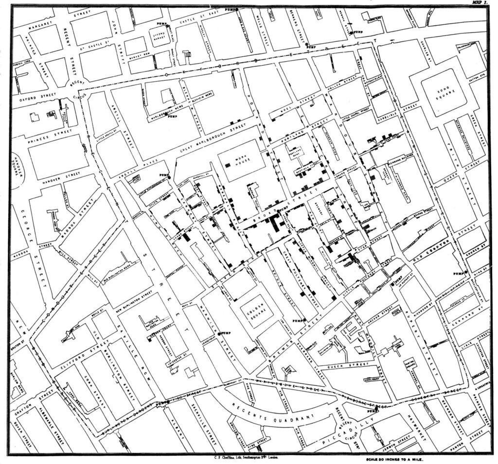
Based on this analysis, Snow recommended that the Broad Street water pump be deactivated. After the pump handle was removed, the number of new cholera cases dropped dramatically, corroborating his theory that contaminated water was the source of the infection. This event is considered one of the first examples of using data analysis to solve a public health problem, highlighting the importance of collecting and interpreting accurate data for informed decision-making. Snow’s approach was innovative for its time, combining empirical observation with statistical analysis to identify the cause of an epidemic.
John Snow’s work not only helped control the cholera outbreak but also had a lasting impact on public health. His scientific and evidence-based approach influenced the construction of more efficient sanitation systems and the improvement of hygiene conditions in cities. Additionally, his map is often cited as a pioneering example of spatial epidemiology, demonstrating how data visualization can reveal hidden patterns and inform public health policies. Snow’s methodology set a precedent for future epidemiological investigations and showed the importance of considering environmental factors in disease propagation.
Data analysis played a crucial role in identifying the source of the cholera outbreak. By mapping cholera cases and water sources, Snow was able to visualize the correlation between the location of water pumps and the incidence of the disease. This method of spatial analysis allowed him to identify the Broad Street water pump as the main source of contamination. The precision and clarity of the collected data were fundamental in convincing authorities to take immediate action to deactivate the pump.
In addition to mapping cholera cases, Snow also collected additional data to strengthen his hypothesis. He interviewed local residents and analyzed water consumption patterns, identifying that those who consumed water from other sources were not affected by the disease. This comparative analysis provided additional evidence that the Broad Street pump water was contaminated. The combination of qualitative and quantitative data was essential in building a convincing argument.
The removal of the Broad Street water pump handle was a simple but effective measure that resulted in a significant drop in the number of new cholera cases. This act not only saved lives but also validated Snow’s approach of using data to inform public health decisions. Data analysis allowed for a quick and targeted response to the outbreak, demonstrating the power of data science in resolving health crises.
The impact of John Snow’s work goes beyond controlling the cholera outbreak. His innovative approach laid the foundations for modern epidemiology, a discipline that continues to use data analysis to understand and control the spread of diseases. Snow’s map is frequently cited in epidemiology and public health studies as a classic example of how data visualization can reveal important patterns and inform effective interventions.
Data analysis also played a crucial role in shifting paradigms in the understanding of infectious diseases. Before Snow’s work, the miasmatic theory prevailed, suggesting that diseases were caused by “bad air.” The evidence provided by Snow’s map helped displace this theory, establishing the importance of water and sanitation in disease prevention. This paradigm shift had lasting implications for public health and sanitary engineering.
John Snow’s legacy is evident in modern public health practices. Data collection and analysis continue to be essential tools in identifying and controlling disease outbreaks. Snow’s evidence-based approach is a model for public health professionals, who use data to make informed decisions and protect population health. His work also highlights the importance of transparency and clear communication in responding to health crises.

The data analysis of the cholera outbreak map on Broad Street in 1854 was fundamental in identifying the source of the infection and controlling the epidemic. John Snow’s work exemplifies the importance of data science in public health and continues to be a reference for epidemiological studies and sanitary interventions. His contribution not only saved lives at the time but also established principles that are still applied in disease prevention and control today. The story of the cholera outbreak on Broad Street is a powerful reminder of how data analysis can be a vital tool in the fight against diseases and in promoting public health.
Snow’s visualization is a classic example of how the graphical representation of data can transform our understanding of a complex problem and guide effective actions.
This example shows that data visualization is not just an analytical tool but also a way to tell stories and communicate complex information in an accessible and engaging manner. The combination of graphic design skills, narrative, and data analysis is essential to create visualizations that not only inform but also inspire action.