|
Getting your Trinity Audio player ready…
|
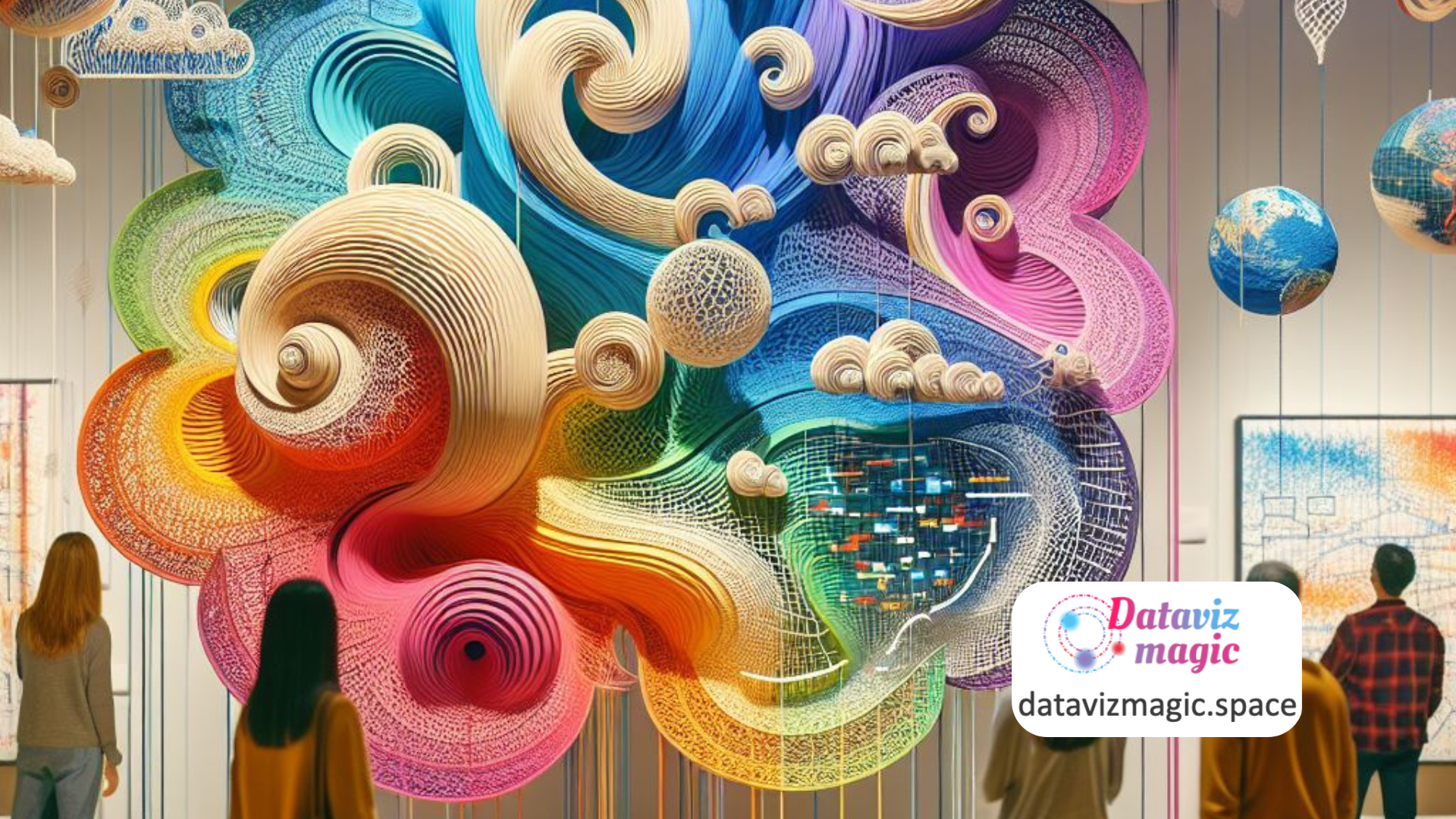
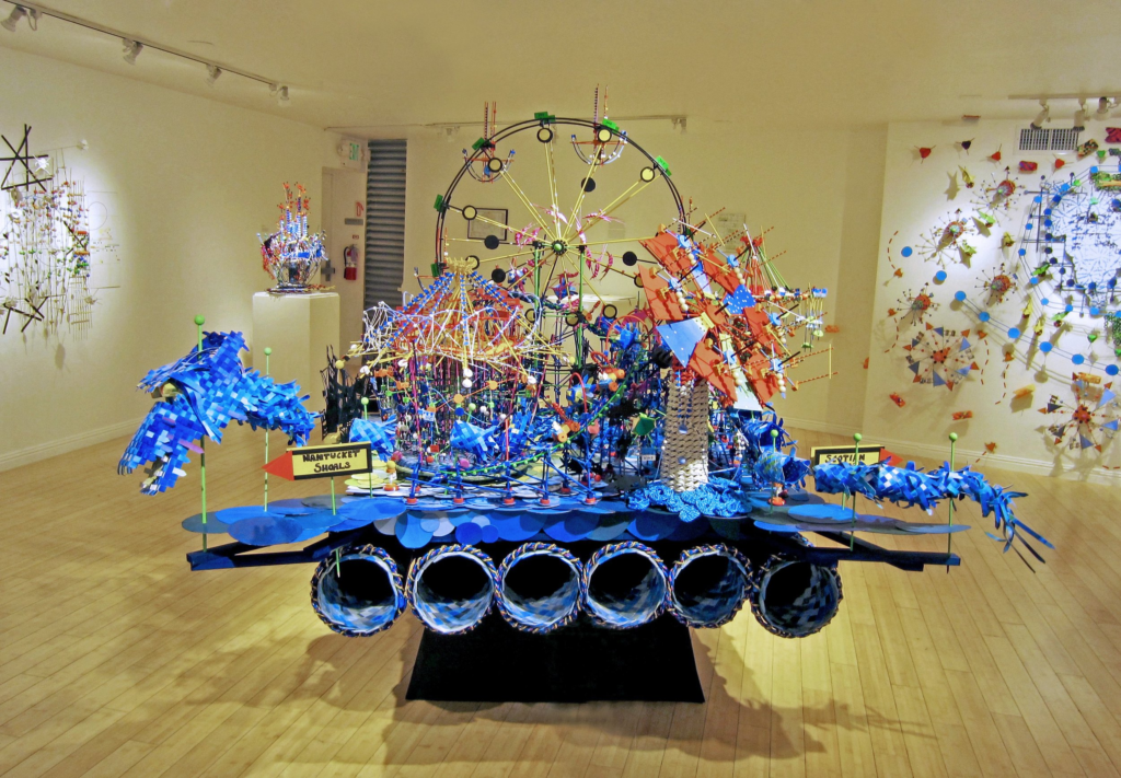
Data visualization is often associated with charts, dashboards, and interactive maps. However, artist Nathalie Miebach expands this definition by transforming scientific data into three-dimensional sculptures and musical compositions. Her work, featured on nathaliemiebach.com, is a remarkable example of how art can serve as a powerful form of data visualization and storytelling.
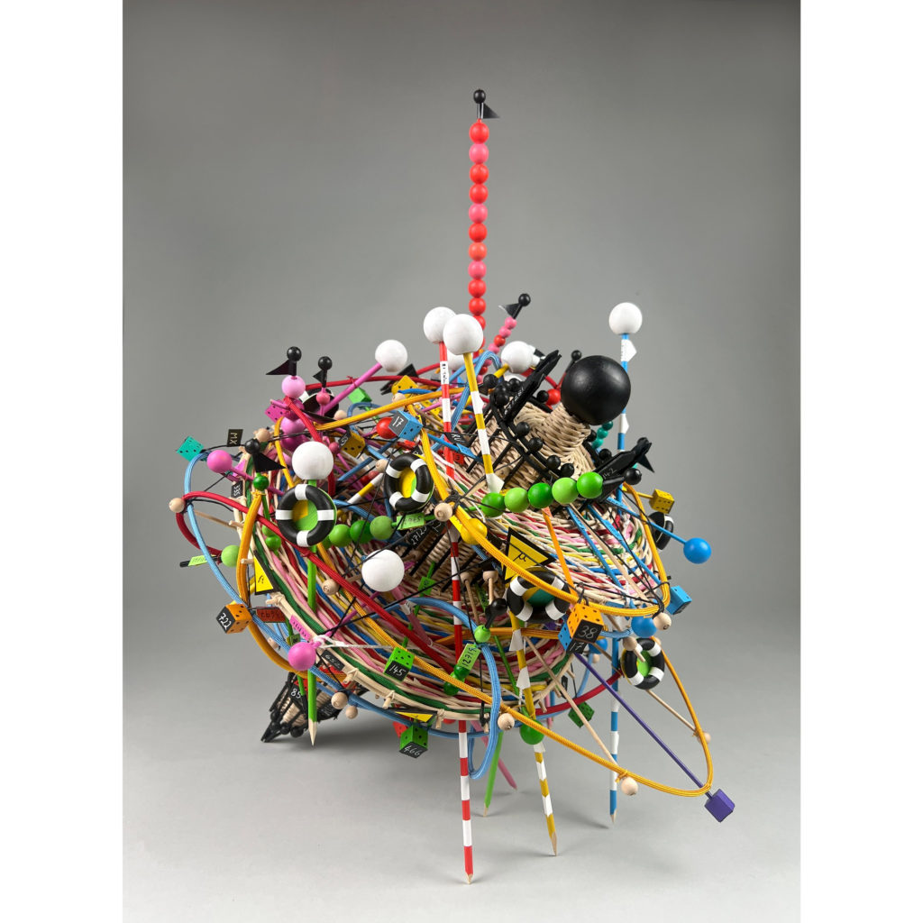
Miebach uses meteorological, oceanographic, and environmental data as raw material for her creations. Instead of representing them through traditional graphs, she translates them into physical and musical forms, creating sculptures that can be “read” visually and, in many cases, heard. This approach turns cold, abstract data into sensory and emotional experiences.
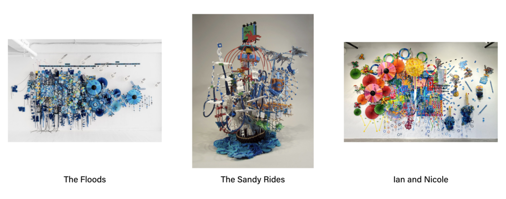
One of her most emblematic projects is Weather Scores, in which Miebach collects data on temperature, humidity, atmospheric pressure, and wind speed to compose musical scores. Each note, pause, and rhythm is directly derived from the data, creating a sound narrative that accompanies the corresponding visual sculpture.
This fusion of science and art is a sophisticated form of data storytelling. By incorporating narrative elements such as the passage of time, extreme weather events, or seasonal patterns, her works tell stories that go beyond numbers. They reveal relationships, tensions, and rhythms that often go unnoticed in traditional representations.
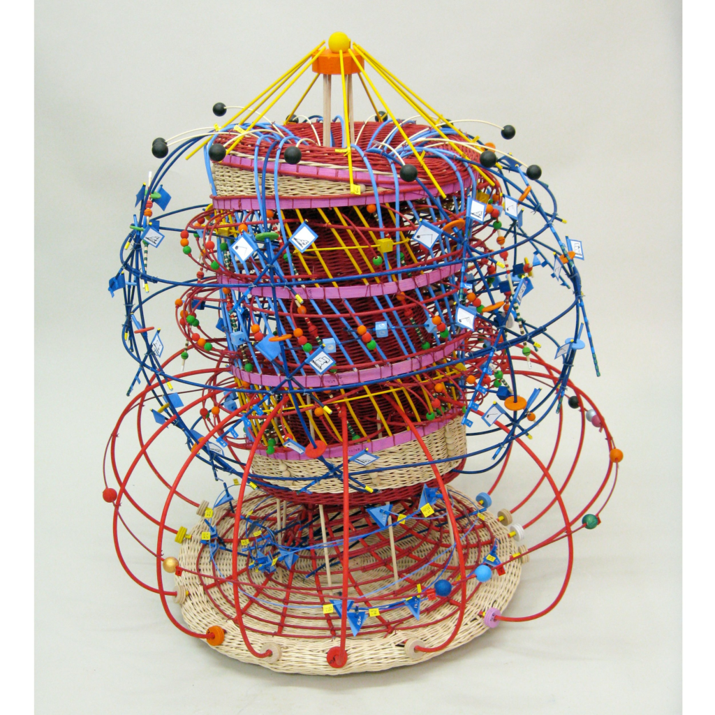
The three-dimensionality of Miebach’s sculptures is also an innovation in data visualization. By occupying physical space, her works allow the audience to explore data in a tactile and spatial way, enhancing understanding and engagement. This is especially relevant in a world saturated with two-dimensional digital visualizations.
Another important aspect of her work is emotional accessibility. By transforming data into art, Miebach creates emotional connections with themes such as climate change, natural disasters, and fragile ecosystems. This makes the data more human and understandable, even for those without a scientific background.
The artist also challenges the idea that data visualization must be objective and neutral. Her works take on an interpretive stance, where aesthetics and subjectivity are integral parts of the narrative. This opens space for a broader discussion about the role of visualization in constructing meaning.
Miebach frequently collaborates with scientists, meteorologists, and musicians to ensure her data is accurate and her interpretations coherent. This interdisciplinary collaboration is an example of how data visualization can be enriched by multiple perspectives.
In addition to the sculptures, the website features visual scores that can be performed by musicians. These compositions are a way to “hear the data,” offering a new sensory dimension to visualization. Music, in this context, becomes an alternative language for communicating patterns and variations in data.
The use of materials such as wicker, string, and beads is also significant. These handcrafted elements contrast with the digital nature of the data, creating a tension between the analog and the technological. This aesthetic choice reinforces the idea that data is part of the physical world and has real impact.

Miebach’s exhibitions are immersive experiences. The audience is invited to walk around the sculptures, observe the details, and in some cases, interact with the works. This immersion is a powerful form of data engagement that goes beyond passive chart reading.
The website also serves as a repository of projects, processes, and reflections by the artist. It documents not only the finished works but also the methods of data collection, the algorithms used to translate numbers into forms, and the initial sketches. This offers a transparent and educational view of the visualization process.
Nathalie Miebach’s work is an example of how data visualization can be an artistic, sensory, and narrative practice. She expands the boundaries of the field, showing that data can be interpreted, felt, and experienced in unexpected ways.
Her work also raises important questions about how we choose to represent data and which stories we decide to tell. By giving shape and sound to numbers, Miebach reminds us that every visualization is ultimately a construction, and that how we choose to tell a story with data matters as much as the data itself.
In a world where data is increasingly central to political, social, and environmental decisions, Nathalie Miebach’s approach offers a poetic and critical alternative. She invites us to see data not just as analytical tools, but as raw material for empathy, reflection, and transformation.
#datavizmagic #datavizshow #datastorytelling #datavisualization #turningdataintoart