|
Getting your Trinity Audio player ready…
|
We live in an era where data flows in unimaginable volumes, yet we often struggle to turn it into meaningful knowledge. The Visual Earth project emerges as an innovative response to this challenge, using geo-tagged images to reveal social, cultural, and economic patterns around the world. More than an academic study, it is a visual narrative about how we live, express ourselves, and connect.
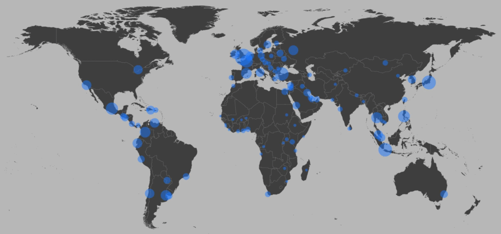
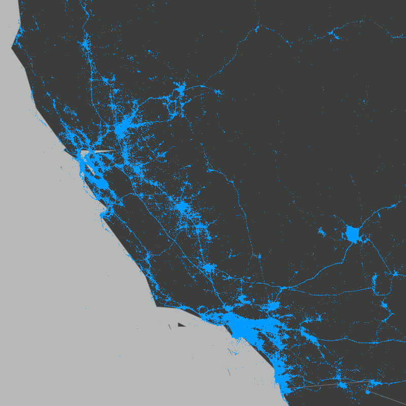
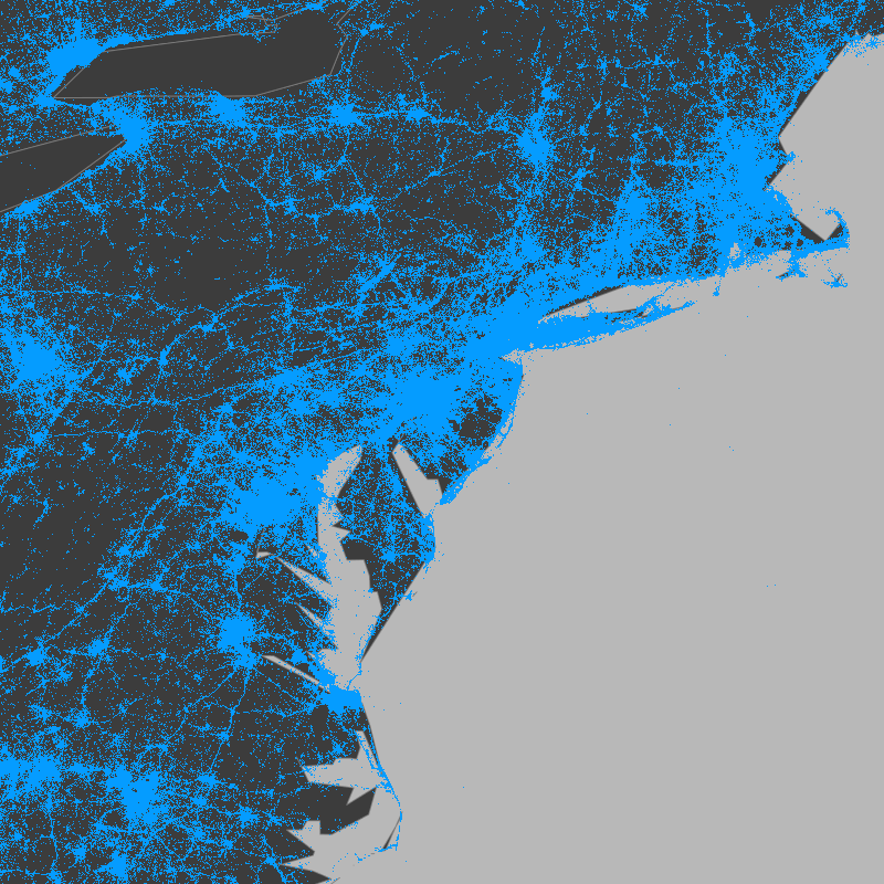
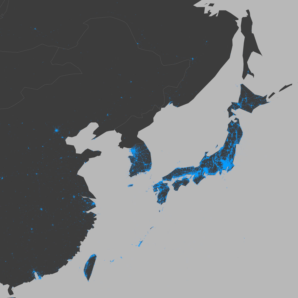
The project analyzed 270 million images shared on Twitter between 2011 and 2014, all with geographic location data. From this immense dataset, researchers selected 100 cities across six continents, using criteria that go beyond size or fame. The goal was to capture the diversity of global urban life—and in doing so, tell stories that numbers alone cannot reveal.
Each shared image is a fragment of a story. When grouped and visually analyzed, these images become a powerful tool for data storytelling. They show how people use photography to document daily life, celebrate moments, protest, or simply share beauty. And in doing so, they reveal patterns that reflect inequality, cultural habits, and social transformation.
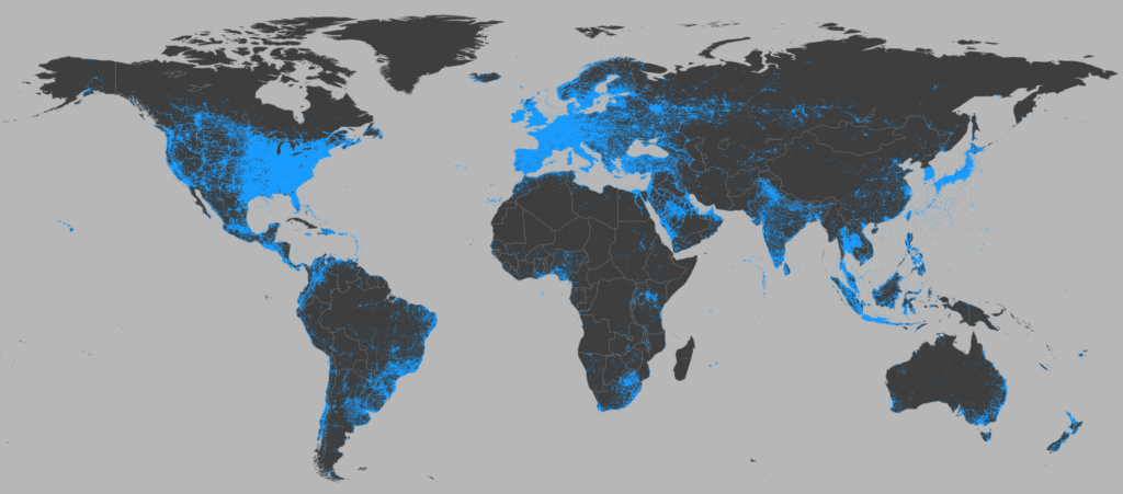
The strength of Visual Earth lies in its ability to turn data into accessible visual narratives. Instead of cold graphs or complex tables, the project presents maps and visualizations that speak directly to our senses. Colors, shapes, and densities combine to show, for example, how image sharing grows faster in high-income countries, or how certain events trigger spikes in visual content.
This approach is a brilliant example of purposeful data visualization. It’s not just about representing statistics, but about building a bridge between data and human experience. Each map is a window into how technology shapes the way we see and show the world—and how that varies depending on economic, geographic, and cultural context.
The project also raises important questions about access and representation. When we observe that low-income countries share fewer images, we’re not just seeing a statistic—we’re seeing a reflection of digital inequality. The absence of data is also a form of data, and Visual Earth invites us to reflect on who is being seen and who remains invisible.
Another fascinating aspect is the use of time as a narrative element. The visualizations show how image sharing evolved over months and years, revealing both global and local trends. The impact of changes to Twitter’s platform, such as the introduction of image previews, is visible in the graphs—a reminder of how technological decisions affect collective behavior.
Visual Earth is also an example of how interdisciplinarity enriches data visualization. The project combines data science, geography, sociology, design, and communication. It’s a work that demands both analytical rigor and aesthetic sensitivity—and it’s precisely this combination that makes it so powerful.
For educators, the project offers a valuable resource. It can be used to teach about urbanization, inequality, digital culture, and more. By presenting data in a visual and engaging way, it facilitates learning and sparks curiosity. It’s a tool that transforms statistics into stories students can see, explore, and discuss.
In research, Visual Earth demonstrates the potential of social data to generate deep insights. Instead of relying solely on censuses or interviews, researchers can now observe behaviors in real time, on a global scale. This opens new possibilities for understanding the world—and for changing it.
The aesthetics of the visualizations also deserve praise. They don’t just inform—they captivate. The beauty of the maps and graphics draws the eye, invites exploration, and makes the content more memorable. It’s proof that data visualization can be both scientific and artistic.
The project also reminds us that data is, ultimately, about people. Each point on a map represents a human action—a click, a glance, a choice to share. By visualizing this data, we are visualizing ourselves, our routines, our desires, and our differences.
In a world saturated with information, projects like Visual Earth show the value of telling good stories with data. They help us see invisible patterns, question what we take for granted, and imagine new ways of living together on this connected planet.
The visual narrative of Visual Earth is, therefore, a form of empathy. By seeing how others live and express themselves—even through digital images—we grow closer to them. And that closeness is the first step toward building a more just and understanding world.
We live in an era where data flows in unimaginable volumes, yet we often struggle to turn it into meaningful knowledge. The Visual Earth project emerges as an innovative response to this challenge, using geo-tagged images to reveal social, cultural, and economic patterns around the world. More than an academic study, it is a visual narrative about how we live, express ourselves, and connect.
The project analyzed 270 million images shared on Twitter between 2011 and 2014, all with geographic location data. From this immense dataset, researchers selected 100 cities across six continents, using criteria that go beyond size or fame. The goal was to capture the diversity of global urban life—and in doing so, tell stories that numbers alone cannot reveal.
Each shared image is a fragment of a story. When grouped and visually analyzed, these images become a powerful tool for data storytelling. They show how people use photography to document daily life, celebrate moments, protest, or simply share beauty. And in doing so, they reveal patterns that reflect inequality, cultural habits, and social transformation.
The strength of Visual Earth lies in its ability to turn data into accessible visual narratives. Instead of cold graphs or complex tables, the project presents maps and visualizations that speak directly to our senses. Colors, shapes, and densities combine to show, for example, how image sharing grows faster in high-income countries, or how certain events trigger spikes in visual content.
This approach is a brilliant example of purposeful data visualization. It’s not just about representing statistics, but about building a bridge between data and human experience. Each map is a window into how technology shapes the way we see and show the world—and how that varies depending on economic, geographic, and cultural context.
The project also raises important questions about access and representation. When we observe that low-income countries share fewer images, we’re not just seeing a statistic—we’re seeing a reflection of digital inequality. The absence of data is also a form of data, and Visual Earth invites us to reflect on who is being seen and who remains invisible.
Another fascinating aspect is the use of time as a narrative element. The visualizations show how image sharing evolved over months and years, revealing both global and local trends. The impact of changes to Twitter’s platform, such as the introduction of image previews, is visible in the graphs—a reminder of how technological decisions affect collective behavior.
Visual Earth is also an example of how interdisciplinarity enriches data visualization. The project combines data science, geography, sociology, design, and communication. It’s a work that demands both analytical rigor and aesthetic sensitivity—and it’s precisely this combination that makes it so powerful.
For educators, the project offers a valuable resource. It can be used to teach about urbanization, inequality, digital culture, and more. By presenting data in a visual and engaging way, it facilitates learning and sparks curiosity. It’s a tool that transforms statistics into stories students can see, explore, and discuss.
Visual Earth demonstrates the potential of social data to generate deep insights. Instead of relying solely on censuses or interviews, researchers can now observe behaviors in real time, on a global scale. This opens new possibilities for understanding the world – and for changing it.
The aesthetics of the visualizations also deserve praise. They don’t just inform—they captivate. The beauty of the maps and graphics draws the eye, invites exploration, and makes the content more memorable. It’s proof that data visualization can be both scientific and artistic.
The project also reminds us that data is, ultimately, about people. Each point on a map represents a human action—a click, a glance, a choice to share. By visualizing this data, we are visualizing ourselves, our routines, our desires, and our differences.
In a world saturated with information, projects like Visual Earth show the value of telling good stories with data. They help us see invisible patterns, question what we take for granted, and imagine new ways of living together on this connected planet.
The visual narrative of Visual Earth is, therefore, a form of empathy. By seeing how others live and express themselves—even through digital images—we grow closer to them. And that closeness is the first step toward building a more just and understanding world.

This vision resonates deeply with the work of Lev Manovich, one of the most influential thinkers in digital culture and data visualization. A professor at the City University of New York and founder of the Cultural Analytics Lab, Manovich has pioneered the study of how digital media and software shape contemporary culture. His books, such as The Language of New Media and Cultural Analytics, explore the aesthetics and politics of data, offering frameworks that help us understand projects like Visual Earth not just as technical feats, but as cultural artifacts.
Manovich is also a visual artist whose projects—like Selfiecity and Soft Cinema—blend data science with artistic expression. His work reveals how data can be used not only to analyze the world but to reimagine it. Through his dual role as theorist and creator, Manovich exemplifies the power of data storytelling to bridge disciplines, provoke thought, and inspire new ways of seeing. In this sense, Visual Earth stands as a living example of the ideas he has championed for decades.
#datavizmagic #datavizshow #datastorytelling #datavisualization