
|
Getting your Trinity Audio player ready…
|

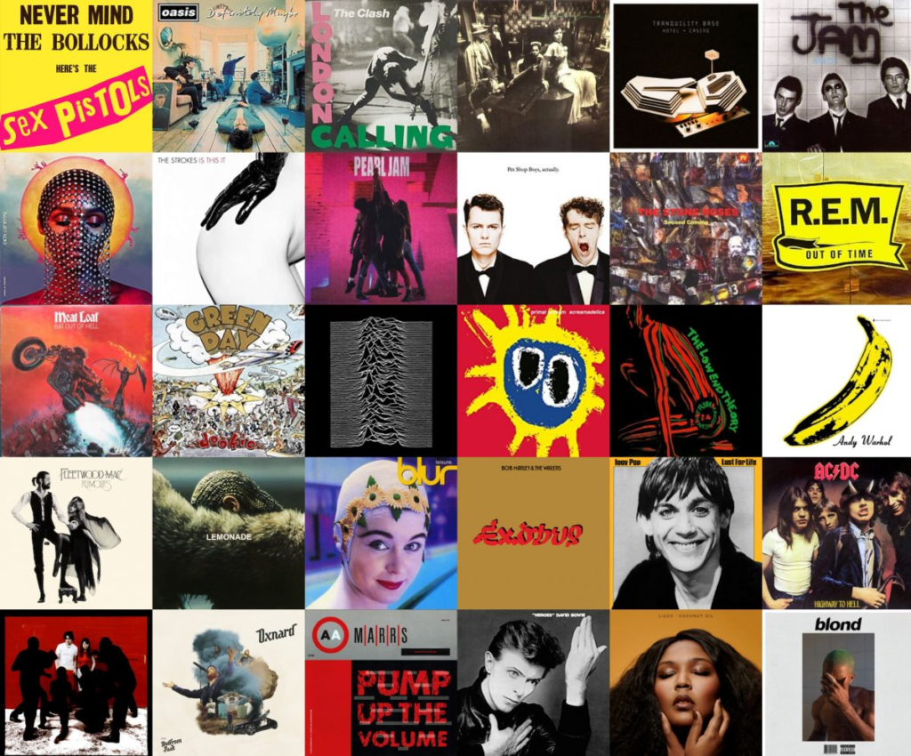
Music has been an essential part of human culture for centuries. With the advancement of technology, the way we consume and analyze music has also evolved. The Best Year in Music project on The Pudding website offers a detailed analysis of the biggest Billboard hits from 1958 to 2016. This article explores how data visualization and data storytelling can be used to tell the story of musical evolution.
Data visualization is a powerful tool that transforms complex data into easy-to-understand graphs and images. In the “Best Year in Music” project, interactive graphs allow users to explore decades of musical data intuitively.
The project uses line and bar charts to show the popularity of songs over time. These charts help identify trends and changes in musical tastes. Data storytelling goes beyond simply presenting charts. It involves telling a story with the data, providing context and meaning. In the case of “Best Year in Music,” the narrative helps understand how historical events influenced music.
The project’s charts show how certain musical genres gained or lost popularity over the years. For example, the rise of rap and hip-hop in the 1990s and 2000s is clearly visible.
Interactivity is a key component of modern data visualization. On the site, users can click on different years to see the biggest hits and explore how music has changed over time.
Music is deeply emotional, and data visualization can capture that emotion by showing the popularity of songs that defined eras. Heat maps, for example, can show which songs were most played during different periods.
The project uses advanced data visualization tools like D3.js to create dynamic and interactive charts. These tools allow for deep exploration of musical data. In addition to showing the evolution of musical tastes, the project also highlights how technology has influenced music. From vinyl to streaming, each technological era brought significant changes.
Data visualization allows for direct comparisons between different periods. For example, we can compare the popularity of songs from the 1980s with those from the 2000s and see how tastes have changed.
With the continuous advancement of technology, the way we analyze and consume music will continue to evolve. Data visualization and data storytelling tools will be essential to understand these changes.
Music companies can use data visualization to make informed decisions about releases and marketing. Data storytelling can help tell compelling stories about artists and albums.
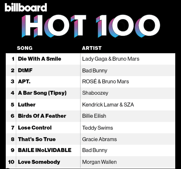
Source: Billboard Instagram
The “Best Year in Music” project on The Pudding is a brilliant example of how data visualization and data storytelling can be used to tell the story of music. By combining interactive charts with an engaging narrative, the project offers a new way to explore and understand musical evolution.
Musical data analysis can also reveal unexpected patterns. For example, we might discover that certain historical events, such as economic crises or social movements, have a direct impact on musical trends.
Finally, the combination of data visualization and data storytelling not only enriches our understanding of music but also allows us to appreciate the complexity and beauty of musical evolution over the decades.
+VIDEO: Billboard Ranks The Top Hot 100 Songs of the 21st Century
#datavizmagic #datavizshow #datastorytelling #datavisualization #billboard