
|
Getting your Trinity Audio player ready…
|
In the world of data communication, few platforms blend education, inspiration, and practical advice as effectively as Data Viz Today. Created and hosted by Alli Torban, this podcast and blog serve as a vibrant hub for data visualization enthusiasts, analysts, designers, and storytellers. The site offers a rich collection of podcast episodes, resources, and tools that explore how to turn raw data into compelling visual narratives.

At its core, Data Viz Today is about helping people make better decisions through better visualizations. Each episode dives into a specific aspect of data visualization, from choosing the right chart type to designing with accessibility in mind. These discussions are not only technical but also deeply human, emphasizing the importance of empathy and clarity in data storytelling.
One of the standout features of the podcast is its focus on practical storytelling techniques. In episodes like “Next Question,” Alli explores how asking better questions can lead to more meaningful data stories. This aligns with the broader principle in data storytelling that the narrative should guide the audience through the data, not overwhelm them with it.
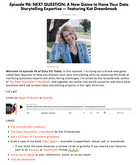
The podcast frequently features interviews with leading figures in the data visualization community such as Lea Pica, Mona Chalabi, and Kat Greenbrook. These conversations offer insights into how professionals approach complex topics like climate change, racial injustice, and public health through visual storytelling.

A recurring theme in Data Viz Today is the importance of design decisions. Alli emphasizes that every element in a visualization, including color, typography, layout, and annotations, should serve a purpose. This reflects a core tenet of effective data visualization, where design is not decoration but communication.
The site also promotes the idea of originality in visualization. In one episode, discusses the value of creating custom visual forms rather than relying solely on standard chart types. This creative approach can foster a deeper connection with the data and help the audience engage with it in new ways.
Another strength of Data Viz Today is its accessibility. The podcast is designed for a wide audience, from beginners to seasoned professionals. Alli’s clear explanations and thoughtful questions make complex topics approachable, which is essential for democratizing data literacy.
The podcast also explores the emotional dimension of data storytelling. In episodes that cover topics like COVID-19 or climate change, the focus is not just on the numbers, but on how those numbers affect real people. This human-centered approach is what makes data storytelling so powerful because it connects facts to feelings.
Alli Torban’s background as a data visualization designer informs every aspect of the show. She shares her own experiences, challenges, and lessons learned, making the content relatable and grounded in real-world practice. Her transparency encourages listeners to experiment, iterate, and grow in their own work.
The site includes a newsletter and a book titled Chart Spark, which provides a structured process for brainstorming and designing data visualizations. These resources extend the podcast’s mission by offering hands-on guidance for anyone looking to improve their data storytelling skills.

Data Viz Today also highlights the importance of feedback and iteration. Many episodes discuss how visualizations evolve through critique and testing. This iterative mindset is crucial in data storytelling, where clarity and impact often emerge through refinement.
The podcast doesn’t shy away from difficult topics. Whether discussing racial injustice or misinformation, Alli and her guests explore how data visualization can be a tool for advocacy and truth-telling. This reinforces the ethical responsibility that comes with visualizing data.
Another valuable aspect of the site is its focus on community building. Through interviews, listener questions, and shared resources, Data Viz Today fosters a sense of belonging among data practitioners. This community aspect is vital for learning and inspiration.
The site’s design reflects its content, being clean, intuitive, and focused on clarity. Episodes are easy to navigate, and show notes often include links, tools, and visual examples. This reinforces the podcast’s educational mission and makes it a practical resource for ongoing learning.
Through thoughtful interviews, practical advice, and a deep commitment to clarity, Alli Torban has created a space where data becomes not just understandable but meaningful. For anyone interested in the intersection of data, design, and narrative, this site is an invaluable resource.
+VIDEO:
#datavizmagic #datavizshow #datastorytelling #datavisualization #podcast