
Flourish is a powerful data visualization platform designed to help users transform complex datasets into engaging, interactive stories. Whether you’re a journalist, marketer, educator, or analyst, Flourish provides the tools to create professional-grade visualizations without writing a single line of code. Its mission is clear: to make data storytelling accessible, beautiful, and impactful.
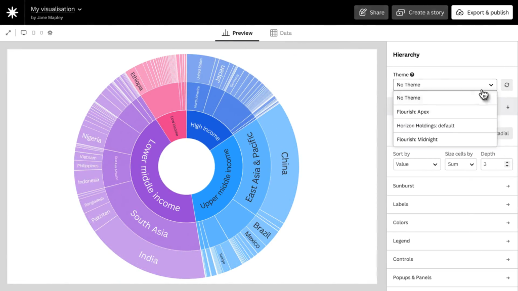
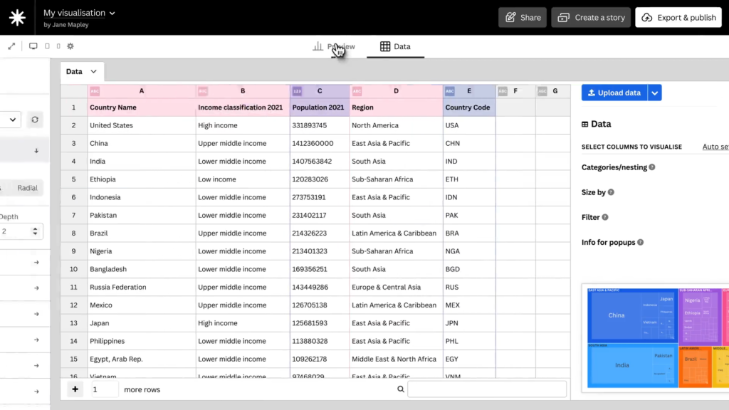
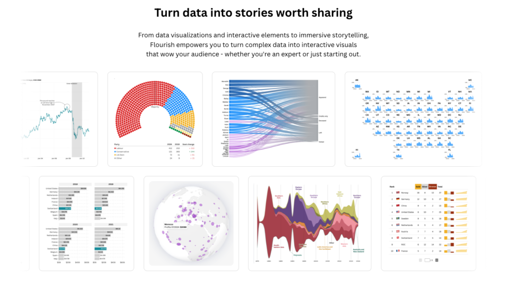
At the heart of Flourish is its extensive library of templates. These templates allow users to create everything from bar charts and scatter plots to animated maps and 3D visualizations. Each template is customizable, enabling users to tailor their visuals to the story they want to tell. This flexibility is essential for effective data storytelling, where context and clarity are key.
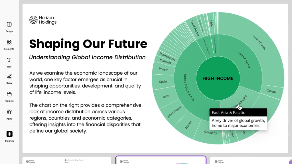
One of Flourish’s standout features is its no-code scrollytelling tool. Scrollytelling is a technique that combines scrolling with storytelling, allowing users to guide their audience through a narrative as they scroll down a webpage. With Flourish’s built-in editor, users can embed visualizations, text, and transitions to create immersive digital experiences.
Flourish is widely used by newsrooms, including the BBC and The Guardian, to create interactive graphics that explain complex topics in a visually compelling way. These organizations rely on Flourish to turn raw data into stories that inform and engage millions of readers. This demonstrates the platform’s credibility and effectiveness in high-stakes communication.
The platform also supports live-updating visualizations, which is particularly useful for dashboards and real-time reporting. By connecting to live data sources like Google Sheets or APIs, users can ensure their visualizations remain current without manual updates. This feature is crucial for data storytelling in fast-moving environments such as finance, health, or elections.
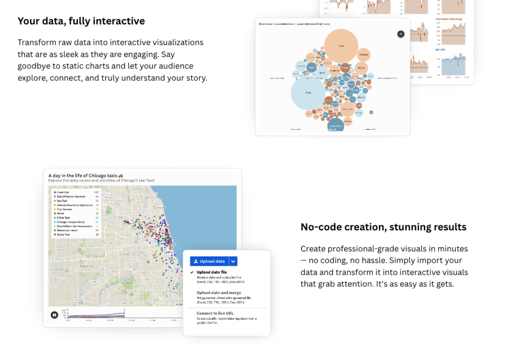
Flourish emphasizes interactivity as a core principle. Unlike static charts, interactive visualizations invite users to explore the data themselves. This hands-on engagement deepens understanding and allows audiences to uncover insights that matter to them personally. It transforms passive viewers into active participants in the story.
Another strength of Flourish is its ease of sharing and embedding. Visualizations can be embedded into websites, presentations, and social media with responsive design that adapts to any screen size. This ensures that data stories reach audiences wherever they are, on any device, without compromising quality or clarity.
Flourish also supports team collaboration and brand consistency. Organizations can create shared libraries of templates and themes, ensuring that all visual content aligns with brand guidelines. This is particularly valuable for large teams working across departments or regions.
The platform’s accessibility features are designed to make data stories inclusive. Users can add alt text, keyboard navigation, and screen reader support to ensure that visualizations are usable by people with disabilities. This commitment to accessibility reflects best practices in ethical data communication.
Flourish is not just a tool for professionals. Its intuitive interface and educational resources make it ideal for students and educators as well. Teachers can use Flourish to bring data to life in the classroom, helping students develop data literacy and storytelling skills that are increasingly essential in today’s world.
The platform also encourages creative experimentation. Users can animate transitions between charts, layer multiple datasets, and even build custom templates using Flourish’s developer tools. This creative freedom allows storytellers to push the boundaries of traditional data visualization.
Flourish’s blog and documentation offer a wealth of inspiration and guidance. From tutorials on best practices to showcases of user-created projects, the platform fosters a vibrant community of data storytellers. This ecosystem of support helps users continuously improve their skills and stay up to date with new features.
In terms of data storytelling, Flourish excels at helping users connect data to narrative. By combining visuals with explanatory text, annotations, and transitions, users can guide their audience through a logical and emotional journey. This narrative structure is what transforms data from information into insight.
Flourish also plays a role in advocacy and public awareness. Nonprofits and advocacy groups use the platform to highlight issues such as climate change, inequality, and public health. By visualizing data in a compelling way, these organizations can drive engagement and inspire action.
In conclusion, Flourish is more than a data visualization tool. It is a storytelling platform that empowers users to communicate complex ideas with clarity, creativity, and impact. Whether you’re building a dashboard, crafting a scrollytelling experience, or designing a single chart, Flourish gives you the tools to turn data into stories that resonate.
+VIDEO:
#datavizmagic #datavizshow #datastorytelling #datavisualization #tools