
|
Getting your Trinity Audio player ready…
|
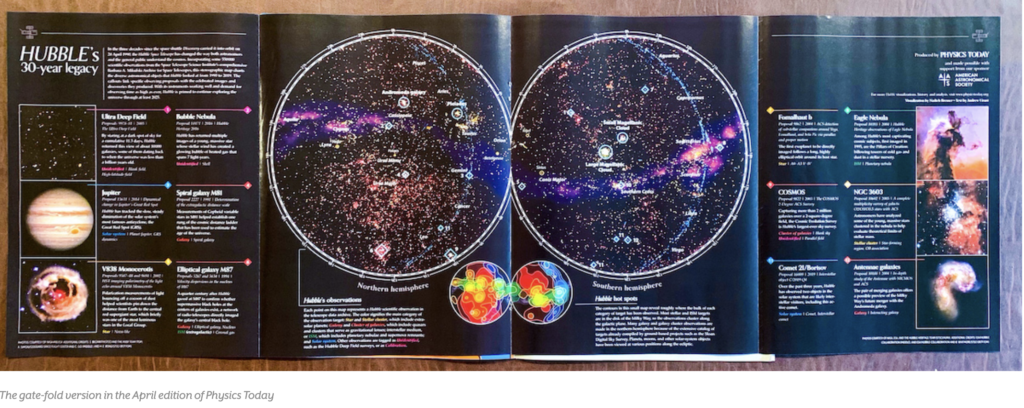
Data visualization and data storytelling are powerful tools that transform complex information into comprehensible and engaging stories. The “Designing the Hubble Skymap” project on the Visual Cinnamon website is a brilliant example of how these techniques can be applied to tell the story of the Hubble Space Telescope’s observations.
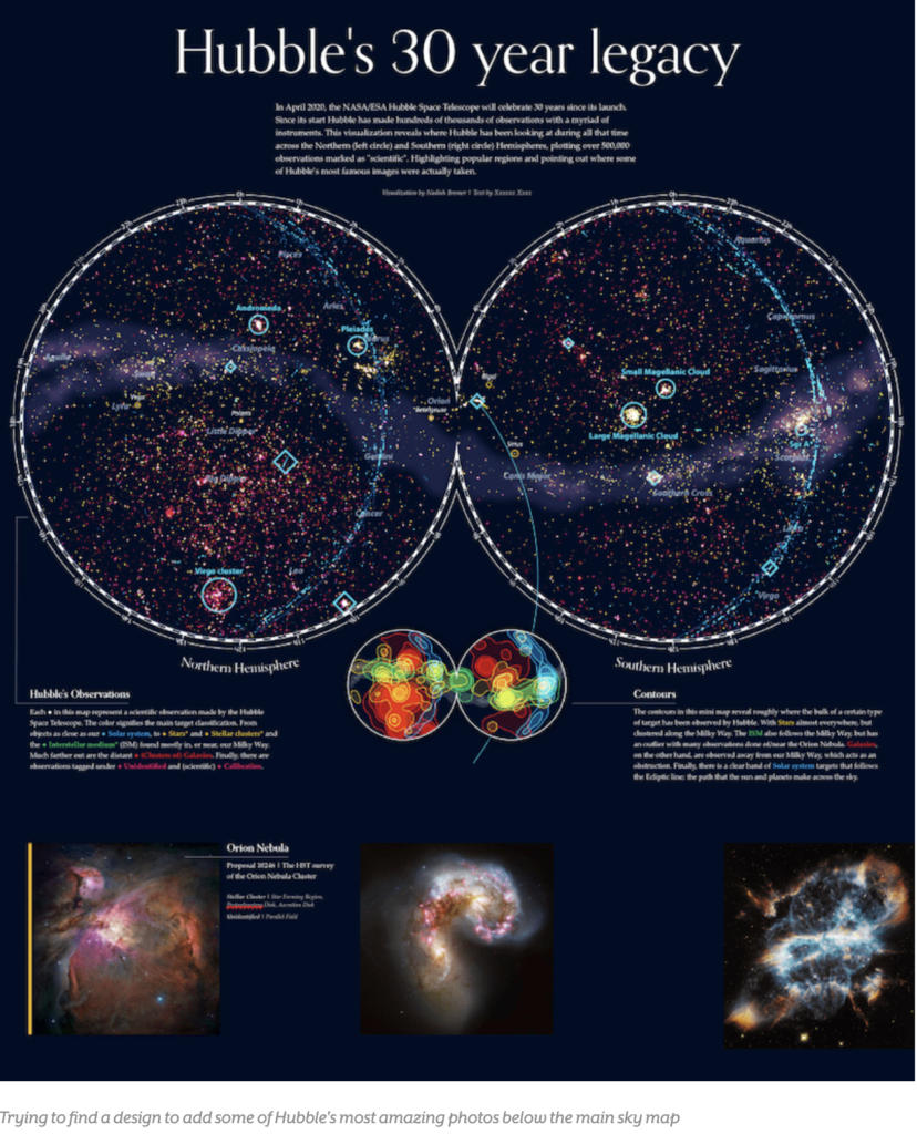
The project was created to commemorate the 30th anniversary of the Hubble Space Telescope, highlighting more than 550,000 scientific observations made over three decades. Data visualization here is used to map these observations in the sky, providing a comprehensive and detailed view of Hubble’s contributions to astronomy.
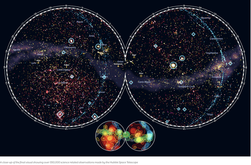
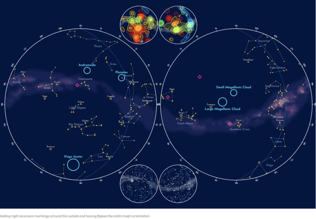
The choice of the Aitoff projection for the sky map was crucial to represent the vast amount of data clearly and accessibly. This projection allows users to see the distribution of observations across the sky, with the Milky Way crossing horizontally through the center of the map.
Each point on the map represents an observation, and the colors indicate different types of targets, such as stars, galaxies, and the interstellar medium. This color coding facilitates the identification of patterns and trends in Hubble’s observations.
Data storytelling is enriched with the inclusion of contextual elements, such as famous constellations and notable celestial objects. These details help situate Hubble’s observations within a broader astronomical context, making the visualization more engaging and informative.
The process of data cleaning and analysis was crucial to ensure the accuracy of the visualization. The author used tools like Python and R to process the raw data, correcting inconsistencies and preparing it for the final visualization.
Interactivity is a key component of the project, allowing users to explore different aspects of Hubble’s observations. For example, it is possible to view the frequency of observations by target classification or by instruments used.
Data visualization also highlights the technological evolution of Hubble, showing how different instruments contributed to discoveries over the years. This helps tell the story of the telescope’s scientific and technological development.
Data storytelling is complemented by additional charts that show the distribution of observations over time and by wavelength. These charts provide a more detailed view of Hubble’s capabilities and research focuses.
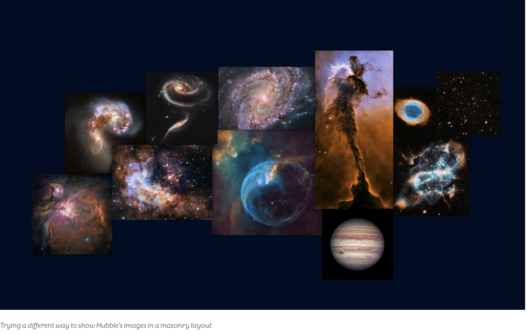
The choice to use a static visualization instead of an interactive one was deliberate, aiming to create a detailed and informative poster. This demonstrates how different visualization approaches can be used to achieve specific communication goals.
The inclusion of annotations and detailed legends on the sky map helps guide users through the visualization, highlighting points of interest and providing additional context. This is an example of how data storytelling can be used to enhance understanding and engagement.
Data visualization not only communicates information but also inspires curiosity and exploration. The project encourages users to learn more about Hubble’s observations and the history of astronomy.
Data storytelling is a powerful tool for telling complex stories in an accessible and engaging way. In the case of “Designing the Hubble Skymap,” the combination of data visualization and storytelling creates a rich and educational experience.
Data visualization can be used to reveal patterns and insights that would not be evident otherwise. In the project, the distribution of Hubble’s observations in the sky reveals areas of focus and gaps in coverage.
Data storytelling can also be used to highlight the importance of specific events, such as the discovery of new galaxies or the observation of rare phenomena. This helps contextualize Hubble’s contributions to science.
Data visualization and data storytelling are complementary tools that, when used together, can transform complex data into powerful stories. The “Designing the Hubble Skymap” project is an inspiring example of how these techniques can be applied in practice.
The combination of data visualization and data storytelling not only improves communication but also increases the emotional and cognitive impact of the information. This is crucial for engaging the audience and conveying complex messages effectively.
In summary, the “Designing the Hubble Skymap” project on Visual Cinnamon demonstrates how data visualization and data storytelling can be used to tell the story of the Hubble Space Telescope’s observations. By combining detailed graphics with an engaging narrative, the project offers a new way to explore and understand Hubble’s contributions to astronomy.
More about Hubble and James Webb: https://spacetelescopelive.org/
#datavizmagic #datavizshow #datastorytelling #datavisualization #nasa #hubbletelescope