
The World Ocean Atlas (WOA), developed by NOAA’s National Centers for Environmental Information (NCEI), is one of the most comprehensive and authoritative collections of oceanographic data in the world. It provides global datasets of temperature, salinity, oxygen, nutrients, and other oceanographic variables, all derived from the World Ocean Database. These datasets are essential for scientists, educators, and policymakers who rely on accurate ocean data to understand and communicate the state of the oceans.
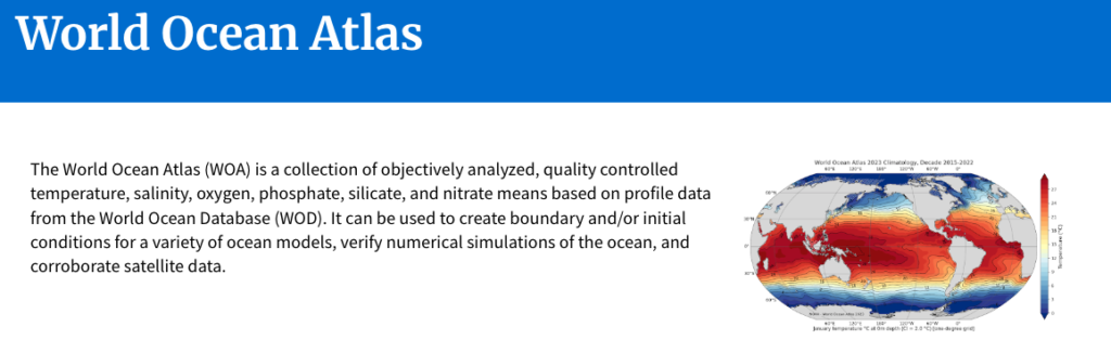
At its core, the WOA is a data product, but its true power lies in how it enables data visualization and data storytelling. By transforming raw oceanographic measurements into gridded, quality-controlled datasets, the WOA allows users to create maps, charts, and models that reveal patterns and trends across space and time. These visualizations are critical for interpreting the health of marine ecosystems and the impacts of climate change.
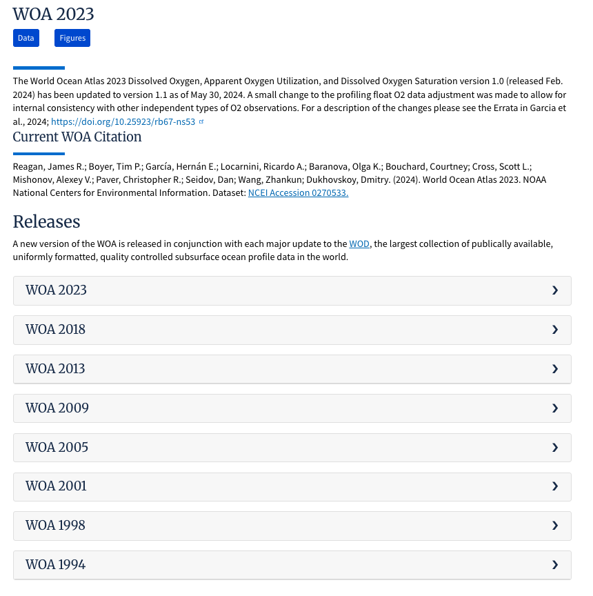
The WOA is updated regularly, with the most recent version being the World Ocean Atlas 2023. This release includes data from 1955 to 2022, offering a long-term view of ocean conditions. The datasets are available in multiple formats, including NetCDF, CSV, and ArcGIS-compatible files, making them accessible to a wide range of users from oceanographers to data journalists.
One of the most powerful applications of the WOA is in climate modeling. Scientists use WOA data to set boundary and initial conditions for ocean circulation models, which are essential for predicting climate patterns like El Niño and La Niña. These models rely on accurate visualizations of temperature and salinity gradients to simulate ocean currents and heat transport.
Beyond modeling, the WOA supports data storytelling by providing the foundational data needed to communicate complex oceanographic phenomena. For example, a journalist writing about ocean deoxygenation can use oxygen datasets to create compelling maps that show where and how oxygen levels are declining over time. These visuals help audiences grasp the scale and urgency of the issue.
The WOA also plays a key role in educational storytelling. Teachers and students can use the data to explore questions like “How has ocean temperature changed over the past 50 years?” or “Where are nutrient concentrations highest in the Pacific Ocean?” By visualizing these datasets, learners can engage with real-world data and develop critical thinking skills.
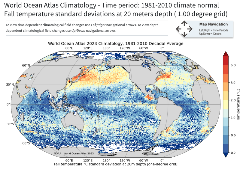
A unique feature of the WOA is its depth-resolved data. The datasets include measurements at 102 standard depth levels, from the surface to the deep ocean. This vertical resolution allows for detailed storytelling about ocean stratification, thermoclines, and nutrient cycling, phenomena that are invisible at the surface but crucial to marine life.
The WOA’s long time series also enables temporal storytelling. By comparing data across decades, users can visualize how ocean conditions have evolved in response to natural variability and human-induced climate change. These time-based narratives are essential for understanding trends and making informed decisions.
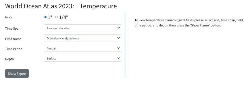
To support visualization, the WOA provides pre-made figures and maps on its website. These include global climatologies of temperature, salinity, and nutrients, which can be used directly or serve as templates for custom visualizations. These resources lower the barrier for non-specialists to engage with ocean data.
This is also a model of data transparency and reproducibility. Each dataset is accompanied by detailed metadata, documentation, and citations, allowing users to trace the origin and processing of the data. This transparency is vital for building trust in visualizations and ensuring that stories based on WOA data are credible.
In the realm of policy and advocacy, WOA data has been used to support international reports such as the IPCC assessments. Visualizations derived from datasets help policymakers understand the state of the oceans and the need for action on issues like ocean acidification and warming.
The WOA’s compatibility with GIS platforms enhances its storytelling potential. By integrating WOA data with spatial layers such as marine protected areas or shipping routes, users can create rich, multi-dimensional narratives that connect ocean conditions with human activities.
The accessibility of the WOA is another strength. The data is freely available to the public, and the NCEI provides user guides and technical support to help users navigate the datasets. This openness fosters a global community of practice around ocean data visualization and storytelling.
As ocean data becomes increasingly important in the face of climate change, the WOA stands out as a foundational resource. Its structured, high-quality datasets empower users to create visualizations that not only inform but also inspire action.
In conclusion, the World Ocean Atlas is more than a database. It is a storytelling engine. By enabling the transformation of complex ocean data into clear, compelling visual narratives, it helps scientists, educators, journalists, and advocates communicate the vital role of the ocean in our planet’s health.
#datavizmagic #datavizshow #datastorytelling #datavisualization #resources