
|
Getting your Trinity Audio player ready…
|
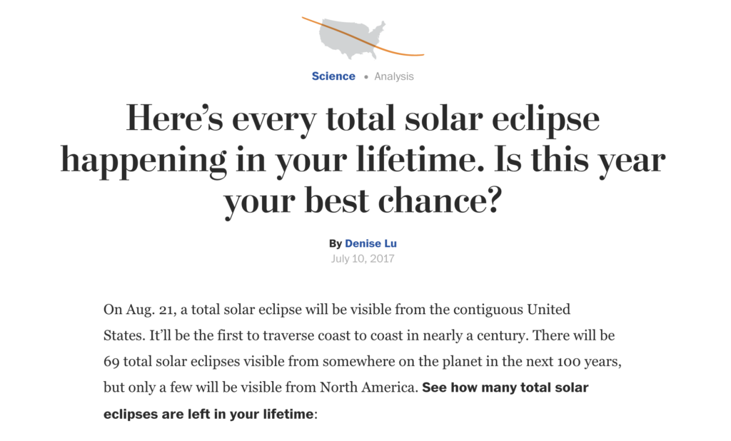
A total solar eclipse is a fascinating astronomical phenomenon where the moon passes between the Earth and the sun, completely blocking the sunlight in certain areas. The Washington Post article highlights all the total solar eclipses that will occur during a person’s lifetime, offering a comprehensive and detailed view of this rare phenomenon.
Collecting data to predict solar eclipses involves precise astronomical calculations. This data includes the trajectory of the moon’s shadow, known as the path of totality, exact times, and the duration of the eclipse at different locations. The accuracy of this data is crucial for creating reliable predictions and precise visualizations.
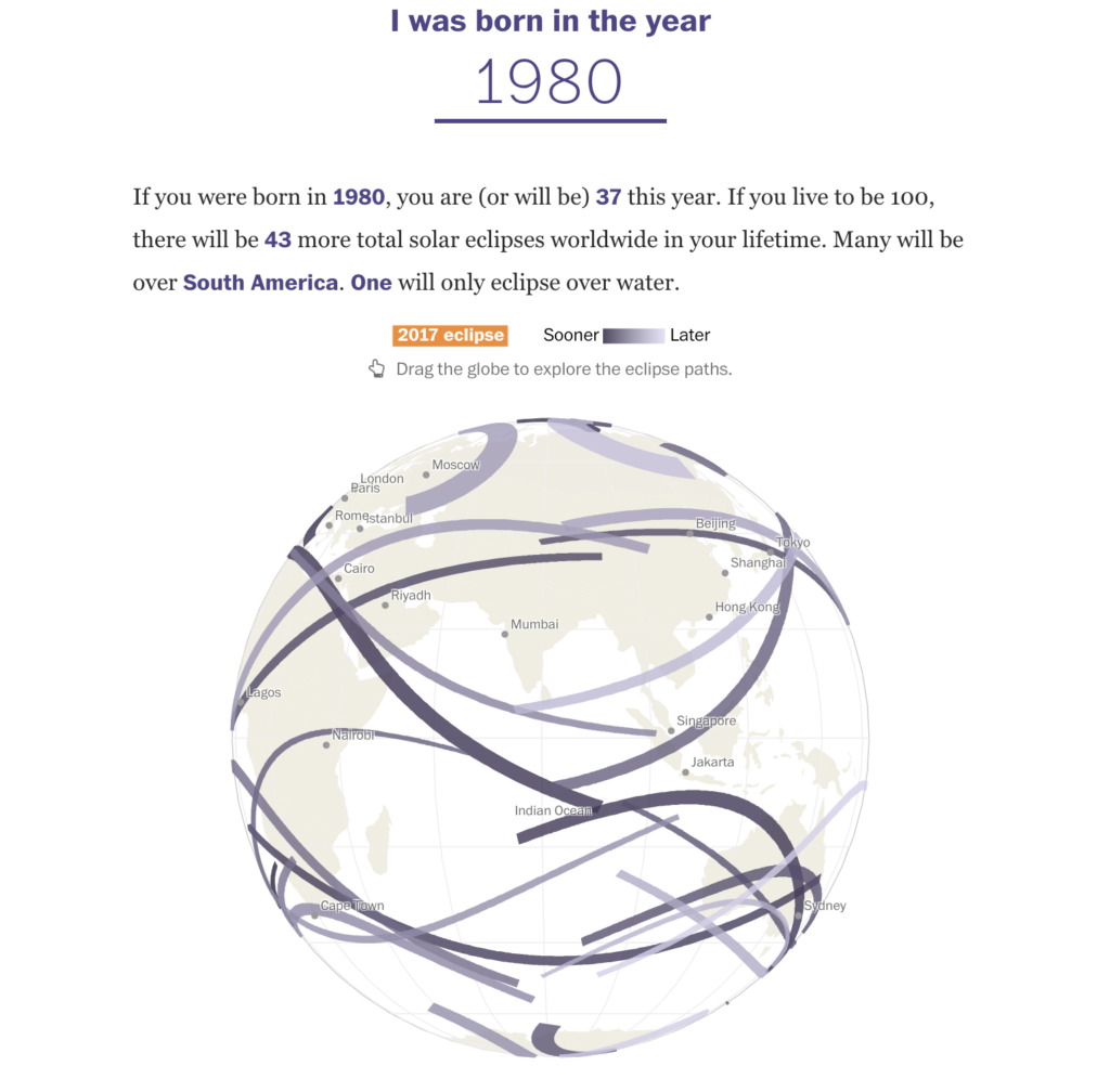
The Washington Post uses interactive data visualizations to communicate complex information about solar eclipses. Detailed graphs and maps show the path of totality, allowing readers to explore how the eclipses will be visible in different locations over time. These visualizations make the data accessible and understandable to a broad audience.
Data storytelling is essential to make the data about solar eclipses accessible and engaging. Through visual narratives, the Washington Post can explain complex astronomical concepts clearly and attractively, helping the public understand the importance and rarity of these events. The combination of data and visual narrative is a powerful tool for scientific communication.
Emotional Impact of Visualizations: Data visualizations about solar eclipses not only inform but also evoke an emotional response. Seeing the trajectory of the moon’s shadow crossing different regions creates a sense of anticipation and wonder, demonstrating the power of data storytelling in connecting data with human emotions. This shows how data visualization can go beyond the simple presentation of information.
Data analysis is crucial to accurately predict the path of totality and inform the public about the best locations to observe the eclipses. This involves complex calculations and the integration of astronomical data with geographic information. The accuracy of these predictions is fundamental to the success of communication about these events.
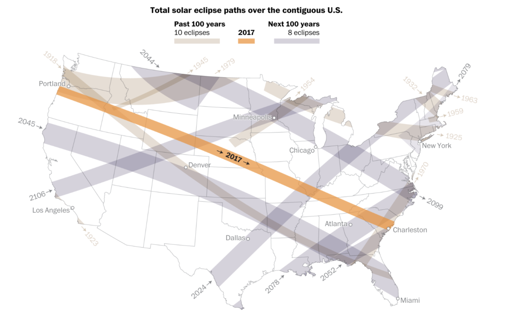
The Washington Post also uses historical data to compare future solar eclipses with past events. This helps contextualize the rarity of these events and highlight their importance, using data to tell a more complete and rich story. The comparison with previous eclipses provides valuable historical perspective.
Interactive visualizations allow readers to explore the data on their own, increasing engagement and understanding. Tools like interactive maps and animated graphs make the learning experience more dynamic and engaging. Interactivity is a key component of modern data storytelling.
Challenges in Data Visualization: Creating effective visualizations for a phenomenon as complex as a solar eclipse presents significant challenges. It is necessary to balance scientific accuracy with visual clarity, ensuring that the information is understandable and impactful without losing precision. The Washington Post successfully overcame these challenges.
Data analysis and data storytelling play crucial roles in communicating information about solar eclipses. The use of interactive visualizations and visual narratives by the Washington Post exemplifies how complex data can be transformed into engaging and informative stories, connecting the public with science in a meaningful way. The combination of data analysis and visual narrative is a powerful tool for communicating complex information clearly and impactfully.
+VIDEO: