
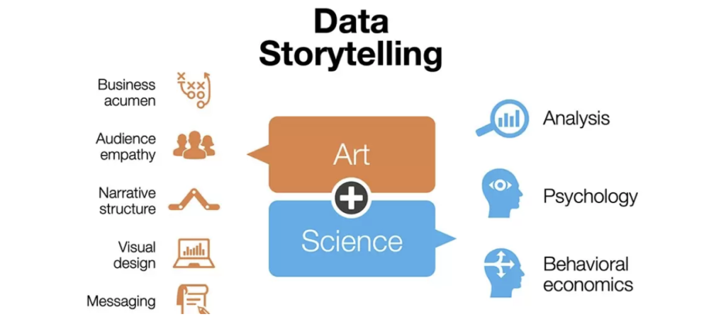
In today’s data-driven world, the ability to communicate effectively with data is a crucial skill. Cole Nussbaumer Knaflic’s book, “Storytelling with Data: A Data Visualization Guide for Business Professionals,” provides a comprehensive framework for transforming raw data into compelling stories. The first step in this process is understanding the context. By knowing your audience and defining your core message, you can create a clear and relevant storyline that makes your data more accessible and impactful.
Once the context is established, the next step is to choose the most effective visual representation for your data. Knaflic emphasizes the importance of selecting visuals that best convey your message, whether it’s a bar chart, line graph, or scatter plot. The goal is to eliminate clutter and focus the audience’s attention on the key insights. By simplifying visuals and using design principles effectively, you can make your data more engaging and easier to understand.
The final step in Knaflic’s framework is to tell a story with your data. This involves tying all the elements together to create a narrative that resonates with your audience. By thinking like a designer and using techniques to guide attention, you can highlight the most important parts of your data and make a lasting impact. “Storytelling with Data” shows that with the right approach, anyone can transform data into a powerful tool for communication.
In addition to understanding the context, choosing the right visuals, and telling a story, Knaflic’s book also delves into the importance of iteration and feedback in the data visualization process. Iteration involves continuously refining your visuals and narrative based on feedback from your audience. This helps ensure that your message is clear and that your data story is as effective as possible.
Knaflic also highlights the significance of using color strategically in data visualizations. Colors can be used to draw attention to key data points, differentiate between categories, and convey meaning. However, it’s crucial to use colors thoughtfully to avoid overwhelming or confusing your audience. Consistency in color usage and adhering to colorblind-friendly palettes can enhance the accessibility and impact of your visuals.
Moreover, the book emphasizes the role of storytelling techniques such as building suspense, creating a logical flow, and using analogies to make complex data more relatable. By incorporating these techniques, you can make your data stories more engaging and memorable.
Finally, Knaflic encourages readers to develop their data visualization skills through practice and continuous learning. She provides numerous examples and exercises in the book to help readers apply the concepts and techniques discussed. By honing these skills, business professionals can become more effective communicators and leverage data to drive decision-making and influence their audiences.
“Storytelling with Data” is not just a guide to creating better charts and graphs; it’s a comprehensive resource for anyone looking to harness the power of data to tell compelling stories and make a meaningful impact in their field.
About the author:

Cole Nussbaumer Knaflic is an expert in data visualization and storytelling. She has a background in analytics and has worked at Google, where she developed her skills in communicating data effectively. Cole is passionate about helping others learn how to tell compelling stories with data, and she shares her knowledge through her book, workshops, and blog.
Link to buy: Storytelling with Data: A Data Visualization Guide for Business Professionals
+ VIDEO: