
Data visualization and data storytelling are powerful tools that transform complex information into comprehensible and engaging stories. The site “Tabletop Whale” is a scientific illustration blog that uses these techniques to explain scientific concepts in an accessible and visually appealing way. This article explores how the principles of data visualization and data storytelling are applied on Tabletop Whale to effectively communicate science.
Tabletop Whale is an original scientific illustration blog created by Eleanor Lutz. The site features a variety of infographics and animations covering scientific topics ranging from biology to astronomy. Through the use of data visualizations, the blog makes science more accessible and interesting to the general public.
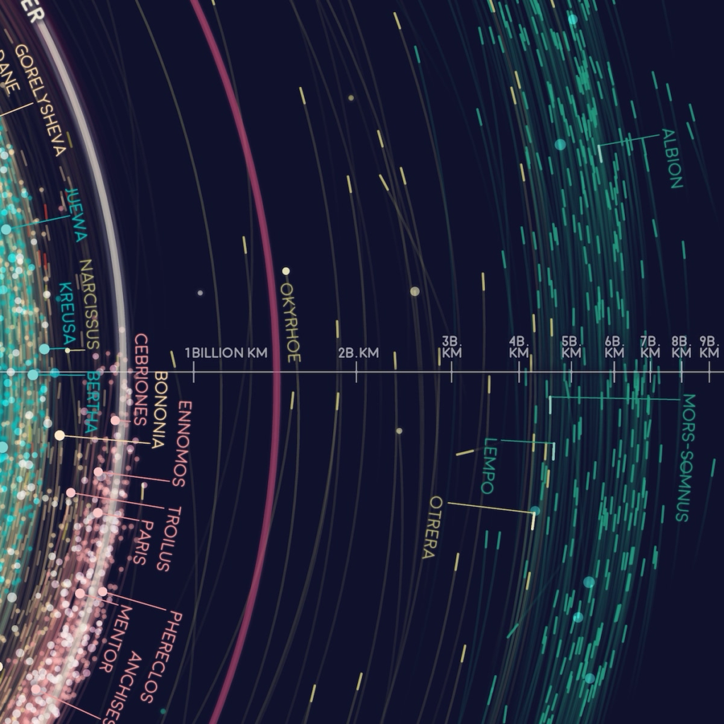
A notable example of data visualization on Tabletop Whale is the map of the solar system’s orbits. This map shows the orbits of over 18,000 asteroids using data from NASA. The visualization makes it easier to understand the distribution and movement of asteroids, something that would be difficult to grasp with textual data alone.
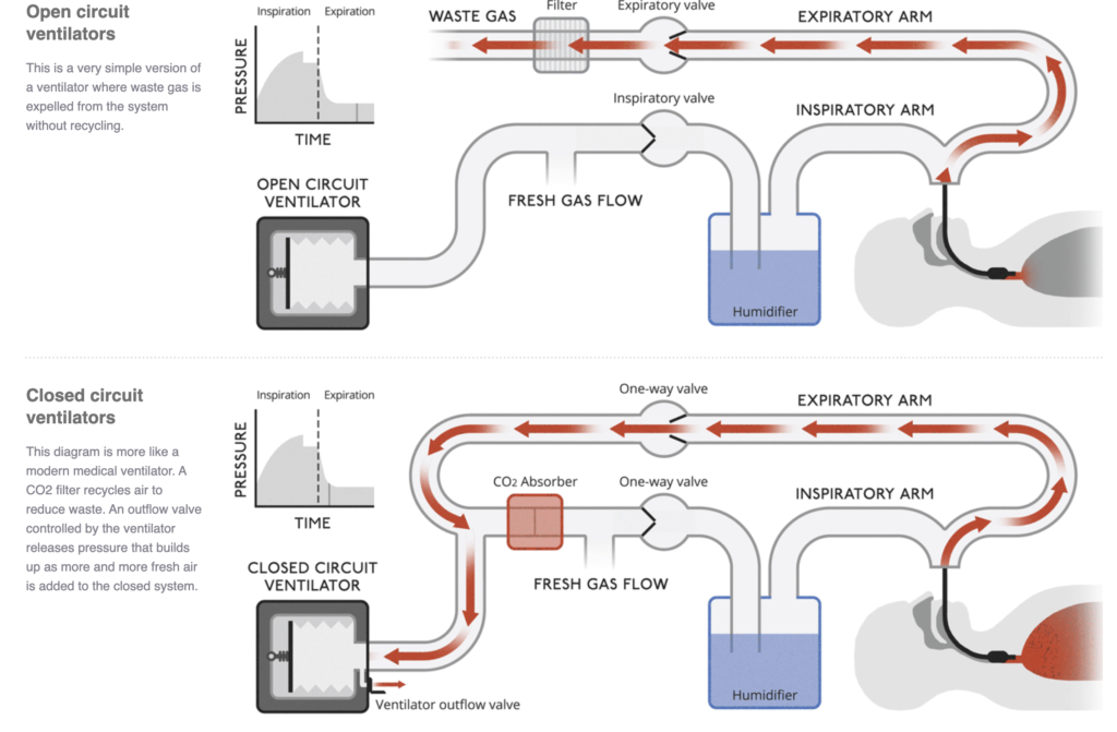
Data storytelling is another crucial aspect of Tabletop Whale. Each infographic and animation is accompanied by a detailed explanation that contextualizes the presented data. For example, in the project about medical ventilators, the animations are accompanied by descriptions explaining how ventilators work and why they are important. This helps the audience understand not just the data but also the story behind it.

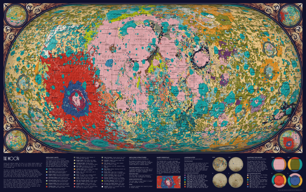
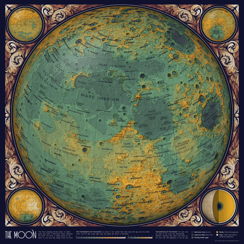
The combination of data visualization and data storytelling is especially effective in communicating complex scientific concepts. In the project about the geology of the Moon, Eleanor Lutz used data from six different datasets to create a cohesive geological map. The visualization helps highlight the different geological formations of the Moon, while the narrative explains the challenges and decisions made during the map creation process.
Accessibility is a priority on Tabletop Whale. The visualizations are designed to be understandable even for those without a scientific background. This is achieved through the use of vibrant colors, clear labels, and detailed explanations. The visual approach makes science more engaging and accessible to a broader audience.
Data accuracy is fundamental to the credibility of the visualizations. In the project about asteroid orbits, for example, the data was carefully cleaned and verified to ensure accuracy. This is essential to avoid the spread of misinformation and to maintain public trust.
Innovation is a hallmark of Tabletop Whale. Eleanor Lutz frequently experiments with new visualization and storytelling techniques to improve scientific communication. For example, in the project about the geology of the Moon, she combined related geological terms into a single color to simplify the visualization. This innovative approach helps make complex data more comprehensible.
Collaboration is another important aspect of Tabletop Whale. In the project about medical ventilators, Eleanor Lutz collaborated with Dr. Sarah Low to create animations explaining how ventilators work. This collaboration between illustrators and scientific experts ensures that the visualizations are accurate and informative.
Visual storytelling is a powerful tool for engaging the audience. The visualizations on Tabletop Whale are not only informative but also visually appealing. This helps capture the audience’s attention and maintain interest in science. The combination of accurate data and engaging storytelling makes science more accessible and interesting.
Education is a central goal of Tabletop Whale. The visualizations are designed to be used as educational tools in classrooms and other learning environments. This helps promote scientific literacy and inspire the next generation of scientists and engineers.
Sustainability is a recurring theme on Tabletop Whale. Many of the projects highlight the importance of conservation and environmental sustainability. For example, the visualizations about ocean biology help raise awareness about the importance of preserving marine ecosystems.

Data storytelling is also used to highlight important social issues. In the project about medical ventilators, the narrative emphasizes the importance of ventilators during the COVID-19 pandemic and the efforts to address ventilator shortages. This helps contextualize the data and highlight its relevance to current issues.
Creativity is a distinctive feature of Tabletop Whale. Eleanor Lutz uses a combination of illustration, animation, and data visualization to create unique and engaging projects. This creative approach helps make science more accessible and interesting to a broader audience.
Transparency is fundamental to the credibility of the visualizations. Eleanor Lutz often shares the source code and data used in her projects, allowing others to verify and replicate her visualizations. This promotes transparency and trust in science.
In conclusion, Tabletop Whale demonstrates the power of data visualization and data storytelling in scientific communication. By combining accurate data with engaging narratives, the site makes science more accessible and interesting to the general public. Eleanor Lutz’s innovative and collaborative approach serves as a model for effective scientific communication.

About the Author:
Eleanor Lutz is the creator of Tabletop Whale, a scientific illustration blog. She is an information designer specializing in data and science communication. Currently, Eleanor works as a Graphics Editor at the New York Times. She has a background in studying mosquito neuroscience and enjoys teaching coding and engaging with students. Eleanor’s work is characterized by its creativity, accuracy, and accessibility, making complex scientific concepts understandable and engaging for a wide audience.
#datavizmagic #tools #datastorytelling #datavisualization #tabletopwhale