
The Data Visualization Catalogue is an online resource designed to help individuals find the most appropriate data visualization method for their specific data needs.
Created by Severino Ribecca, this site serves as a comprehensive guide and library of various data visualization techniques, tools, and resources. It is particularly valuable for data analysts, scientists, and anyone involved in presenting data in a clear and effective manner.

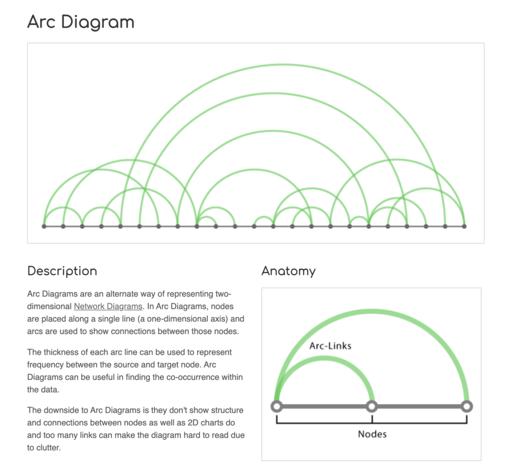
One of the primary features of the Data Visualisation Catalogue is its extensive list of visualization types. Users can explore a wide range of charts, graphs, and diagrams, each categorized by their function and method. This includes common visualizations like bar charts and line graphs, as well as more specialized ones like Sankey diagrams and violin plots. Each entry provides a detailed description, examples, and guidance on when and how to use the visualization.
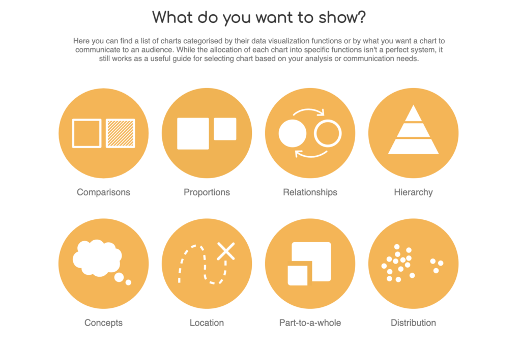
The site also offers a search function that allows users to find visualizations based on specific criteria, such as the type of data they have or the message they want to convey. This makes it easier for users to identify the most effective way to present their data, ensuring that their visualizations are both informative and visually appealing.
For those new to data visualization, the Data Visualisation Catalogue serves as an educational resource. It includes explanations of key concepts and principles of data visualization, helping users understand the importance of choosing the right visualization method. This educational aspect is crucial for building foundational knowledge and improving the overall quality of data presentations.
The site is also a valuable tool for experienced data professionals. It provides inspiration and new ideas for visualizing data, encouraging creativity and innovation in data presentation. By exploring different visualization techniques, professionals can discover new ways to communicate complex data insights effectively.
In addition to its extensive library of visualizations, the Data Visualisation Catalogue includes links to various tools and software that can be used to create these visualizations. This makes it a one-stop resource for both learning about and implementing data visualization techniques. Users can find information on popular tools like Tableau, D3.js, and R, among others.
The importance of the Data Visualisation Catalogue lies in its ability to enhance the effectiveness of data communication. By providing a comprehensive guide to different visualization methods, it helps users present their data in a way that is both accurate and engaging. This is particularly important in fields like business, science, and education, where clear and effective data communication is essential for decision-making and knowledge sharing.
The Data Visualization Catalogue is an essential resource for anyone involved in data analysis and presentation. It offers a wealth of information on various visualization techniques, tools, and best practices, making it easier for users to choose the right method for their data. Whether you are a beginner looking to learn the basics or an experienced professional seeking new ideas, the Data Visualisation Catalogue provides the guidance and inspiration needed to create impactful data visualizations.