
|
Getting your Trinity Audio player ready…
|

Source: SciHi Blog
The map of Napoleon’s march to Russia, created by Charles Joseph Minard, is often cited as an iconic example of data storytelling and data visualization. This graphic not only presents data but tells a powerful story about Napoleon’s disastrous campaign in 1812. Minard managed to synthesize complex information into a visualization that is both informative and emotionally impactful.
Minard combined historical data on the trajectory of Napoleon’s army, recorded temperatures during the campaign, and the number of soldiers over time. These data were integrated into a single visualization that highlights the magnitude of the losses suffered by the army. The precision and richness of the data used by Minard are a testament to his skill in data analysis.
Minard’s map is a combination of a flow chart and a line graph. The width of the line represents the number of soldiers, while the trajectory shows the path taken by the army. The lower line of the graph indicates the extreme temperatures faced during the retreat. This structure allows multiple dimensions of data to be presented in a cohesive and understandable manner.
The data analysis is evident in how Minard presents the army’s decline. The width of the line decreases drastically as the campaign progresses, visualizing the loss of lives in a clear and impactful way. This allows for a quick and intuitive understanding of the scale of the tragedy, highlighting the effectiveness of data visualization.
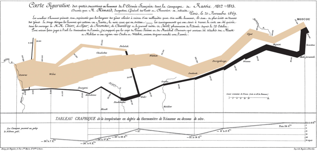
He uses data storytelling by integrating multiple dimensions of data into a cohesive visual narrative. He not only presents numbers but tells the story of the hardships and losses faced by Napoleon’s army, making the data more accessible and memorable. The visual narrative is a powerful tool for communicating complex information in an engaging way.
Minard’s visualization has a significant emotional impact. By showing the army’s decline visually, it evokes an emotional response that isolated numbers could not convey. This demonstrates the power of data storytelling in communicating complex information in an engaging and memorable way.
Compared to other data visualizations, Minard’s map stands out for its ability to synthesize multiple dimensions of data into a single cohesive image. It is often cited as a classic example of excellence in data storytelling, serving as a reference for professionals in the field. The clarity and depth of Minard’s visualization are unparalleled.
Today, Minard’s approach can be seen in many modern visualizations that aim to tell complex stories in a clear and impactful way. Tools like Tableau allow data analysts to create interactive visualizations that follow the principles established by Minard, facilitating the communication of insights. These modern tools expand the possibilities of data storytelling.
Source: Wikipedia
On platforms like Tableau, it is possible to find examples of visualizations that use techniques similar to Minard’s to tell data stories. These visualizations help highlight trends, patterns, and anomalies in a visually appealing and informative way. The ability to create interactive visualizations is a significant advancement in the field of data analysis.
Creating effective data visualizations can be challenging. It is necessary to balance data accuracy with presentation clarity, ensuring that the visualization is understandable and impactful without distorting the facts. Minard achieved this masterfully in his map of Napoleon’s march, setting a high standard for future visualizations.
Minard’s legacy continues to influence the field of data visualization. His map is often cited as an example of how a well-crafted visualization can tell a powerful and unforgettable story, inspiring new generations of data analysts and designers. Minard’s influence is evident in many of today’s best practices in data visualization.
A map by Charles Joseph Minard is draped over the chair in the background.
Source: Wikipedia
Visual narrative is a powerful tool in data storytelling. It allows data to be presented in a way that resonates with the audience, facilitating the understanding and retention of information. Minard’s map is a classic example of how visual narrative can transform data into an engaging and memorable story.
Minard integrated qualitative data, such as the trajectory and weather conditions, with quantitative data, such as the number of soldiers. This combination enriches the narrative and provides a more complete and detailed view of the events. The integration of different types of data is an essential practice in data storytelling.
He’s approach remains relevant today, especially in a world where the amount of available data is immense. The ability to synthesize and communicate this data effectively is crucial for informed decision-making and insight communication. Minard’s map serves as a model for effective and impactful data visualizations.
Data analysis and data storytelling are essential for transforming raw data into actionable insights. Minard’s map of Napoleon’s march continues to inspire data professionals, demonstrating how a well-crafted visualization can tell a powerful and unforgettable story. The combination of data analysis and visual narrative is a powerful tool for communicating complex information clearly and impactfully.