
|
Getting your Trinity Audio player ready…
|
Data visualization and data storytelling are powerful tools that transform complex information into comprehensible and engaging stories. The site “13 Reasons Why Your Brain Craves Infographics” by NeoMam Studios explores the scientific reasons why infographics are so effective. This article relates these reasons to the principles of data visualization and data storytelling, highlighting how these techniques can improve communication and understanding of information.
Data visualization is the graphical representation of information and data. Using visual elements like charts, maps, and diagrams, data visualization facilitates the identification of patterns, trends, and outliers. This is essential for transforming raw data into actionable insights.
Data storytelling involves communicating insights derived from data through engaging stories. It combines data analysis, visualizations, and a clear narrative to contextualize information and inspire action. Data storytelling is crucial for making data understandable and memorable.
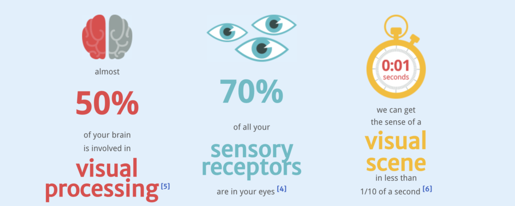
The NeoMam Studios site highlights that nearly 50% of the human brain is involved in visual processing. This explains why infographics are so effective: they leverage the brain’s natural ability to process visual information quickly.
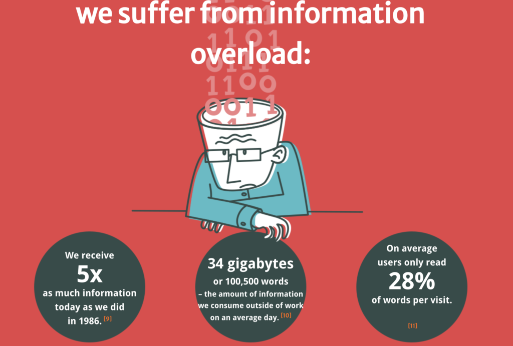
We live in an era of information overload, receiving five times more information today than in 1986. Infographics and data visualizations help combat this overload by making information more accessible and digestible.
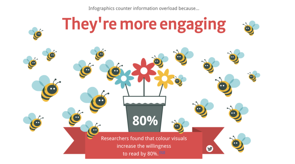
Infographics are more engaging and accessible than pure text. Studies show that colorful visuals increase the willingness to read by 80%. Additionally, the understanding of medication labels increases from 70% to 95% when accompanied by images.
Data storytelling and data visualization are persuasive tools. A verbal presentation with visuals is 67% more persuasive than a pure verbal presentation. Moreover, people remember information presented visually better.
Companies use data visualizations to analyze large volumes of information and make data-driven decisions. Data storytelling is used to communicate the need for product improvements or to create compelling cases for potential clients.
Tools like Tableau and Power BI allow the creation of interactive visualizations that facilitate data exploration and communication of insights. These tools are essential for data analysts and communicators. Data storytelling helps simplify complex information, build credibility, and influence decisions. It is a valuable skill for data analysts and communication professionals.
While data visualization and data storytelling have many benefits, it is important to avoid misinterpretation or biased information. The correct choice of visualizations and thorough data analysis are essential.
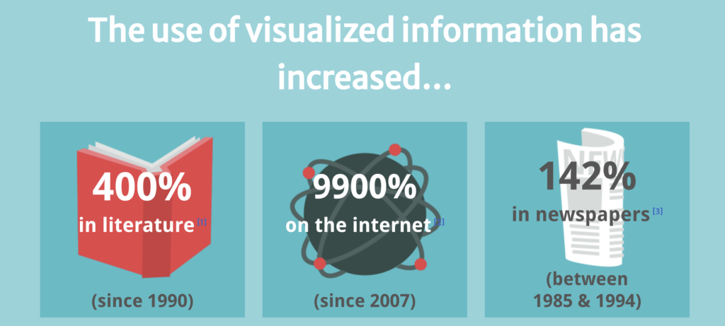
Since 1990, the use of visualized information has increased by 400% in literature, 9900% on the internet, and 142% in newspapers. This demonstrates the growing importance of infographics in modern communication.
Adding images of brain scans and mentioning cognitive neuroscience makes people more inclined to believe what they are reading. This shows how data visualization can be used to enhance the credibility of information. Infographics are easy to digest, fun to share, and extremely engaging. They help convey information quickly and effectively, leveraging the brain’s ability to process visuals.
Companies like NeoMam Studios use infographics to communicate complex information in an accessible and engaging manner. These examples show how data visualization and data storytelling can be applied in different contexts.
Color plays a crucial role in data visualization. Colorful visuals not only attract attention but also improve understanding and retention of information. The appropriate choice of colors can highlight important information and facilitate data interpretation.
The human brain can process an image in just 13 milliseconds. This rapid processing capability is one of the reasons why infographics are so effective. They allow information to be understood almost instantly.

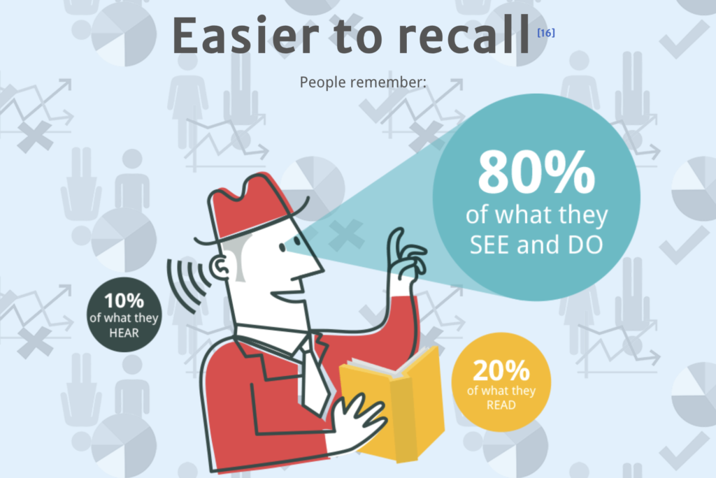
People remember 80% of what they see and do, compared to only 20% of what they read and 10% of what they hear. This highlights the importance of using data visualizations to improve information retention. Data storytelling is not just about presenting facts but also about telling a story that resonates with the audience. A good story can make data more relevant and impactful, facilitating informed decision-making.
Effective infographics are simple and straightforward. They avoid overwhelming the audience with unnecessary information and focus on communicating the main messages clearly and concisely.
The combination of data visualization and data storytelling is a powerful approach to effectively communicate information. Infographics, as explored by NeoMam Studios, exemplify how these techniques can transform complex data into engaging and memorable stories.
Bonus video:
#datavizmagic #datavizshow #datastorytelling #datavisualization #humanbrain