Vinicius Camargo Carnevalli
-
The Art of Thinking in Graphs.
•
The Art of Thinking in Graphs: Illustrating the Principles That Shape Our Productivity, Decision-Making, and the Way We Think by Dolev Erez is an innovative work that proposes a new way of understanding the world through graphs. The book presents key principles that influence our productivity, decision-making, and thought patterns,…
-

Data Viz Today: A podcast that brings data to life.
•
In the world of data communication, few platforms blend education, inspiration, and practical advice as effectively as Data Viz Today. Created and hosted by Alli Torban, this podcast and blog serve as a vibrant hub for data visualization enthusiasts, analysts, designers, and storytellers. The site offers a rich collection of…
-
ColorWise: Data Guide to the Intentional Use of Color.
•
ColorWise: A Data Storyteller’s Guide to the Intentional Use of Color, by Kate Strachnyi, is a practical and insightful guide for anyone who works with data visualizations and wants to use color more effectively. The book addresses one of the most overlooked yet powerful tools in data storytelling — color…
-

Mapping the depths: How the world ocean atlas powers data.
•
The World Ocean Atlas (WOA), developed by NOAA’s National Centers for Environmental Information (NCEI), is one of the most comprehensive and authoritative collections of oceanographic data in the world. It provides global datasets of temperature, salinity, oxygen, nutrients, and other oceanographic variables, all derived from the World Ocean Database. These…
-

Data Detective: Ten Easy Rules to Make Sense of Statistics.
•
The Data Detective: Ten Easy Rules to Make Sense of Statistics, by Tim Harford, is a practical and engaging guide that helps readers navigate the often confusing world of statistics. Rather than focusing solely on mathematical formulas or technical jargon, Harford emphasizes the importance of mindset, curiosity, and critical thinking…
-
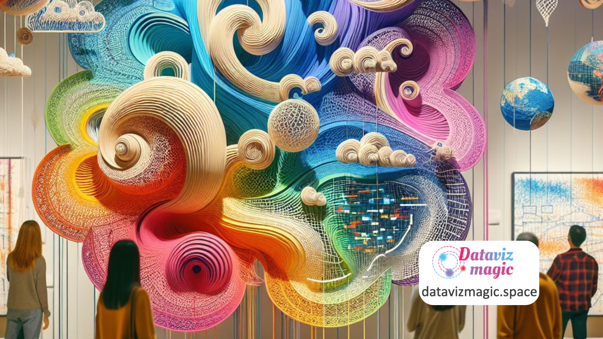
Turning data into art: Work of Nathalie Miebach.
•
Data visualization is often associated with charts, dashboards, and interactive maps. However, artist Nathalie Miebach expands this definition by transforming scientific data into three-dimensional sculptures and musical compositions. Her work, featured on nathaliemiebach.com, is a remarkable example of how art can serve as a powerful form of data visualization and…
-

Fresh Perspectives: Meaning, Space, Data, and Truth.
•
Seeing with Fresh Eyes: Meaning, Space, Data, Truth, by Edward R. Tufte, is a visually stunning and intellectually provocative work that invites readers to rethink how they observe, interpret, and communicate information. In this book, Tufte continues his mission to elevate the standards of visual communication, exploring how design can…
-

Infogram: Interactive Visualization Platform
•
Data visualization and data storytelling are essential tools for transforming complex information into comprehensible and engaging stories. The site “Infogram” offers a powerful platform for creating interactive data visualizations and infographics that capture the audience’s attention. This article explores how the principles of data visualization and data storytelling are applied…
-

Unmasking AI: My Mission to Protect What Is Human in a World of Machines.
•
Unmasking AI: My Mission to Protect What Is Human in a World of Machines, written by Dr. Joy Buolamwini, is a compelling exploration of the ethical challenges posed by artificial intelligence and the urgent need to address them. This book delves into the intersection of technology, ethics, and social justice,…
-

Exploring the past with data: Insights from Time Machine Europe
•
Data visualization and data storytelling are essential tools in transforming complex historical data into engaging and comprehensible narratives. Time Machine Europe aims to digitize and map the economic, social, cultural, and geographical evolution of Europe over time. This article explores how the principles of data visualization and data storytelling are…