Data Viz Show
-

Between Inspiration and Loss of Control: Music in the Age of AI.
•
In the spring of 2023, a song titled Heart on My Sleeve went viral. It featured the unmistakable voices of Drake and The Weeknd except it wasn’t them. It wasn’t even human. The track was generated by an anonymous user using artificial intelligence, and it sent shockwaves through the music…
-
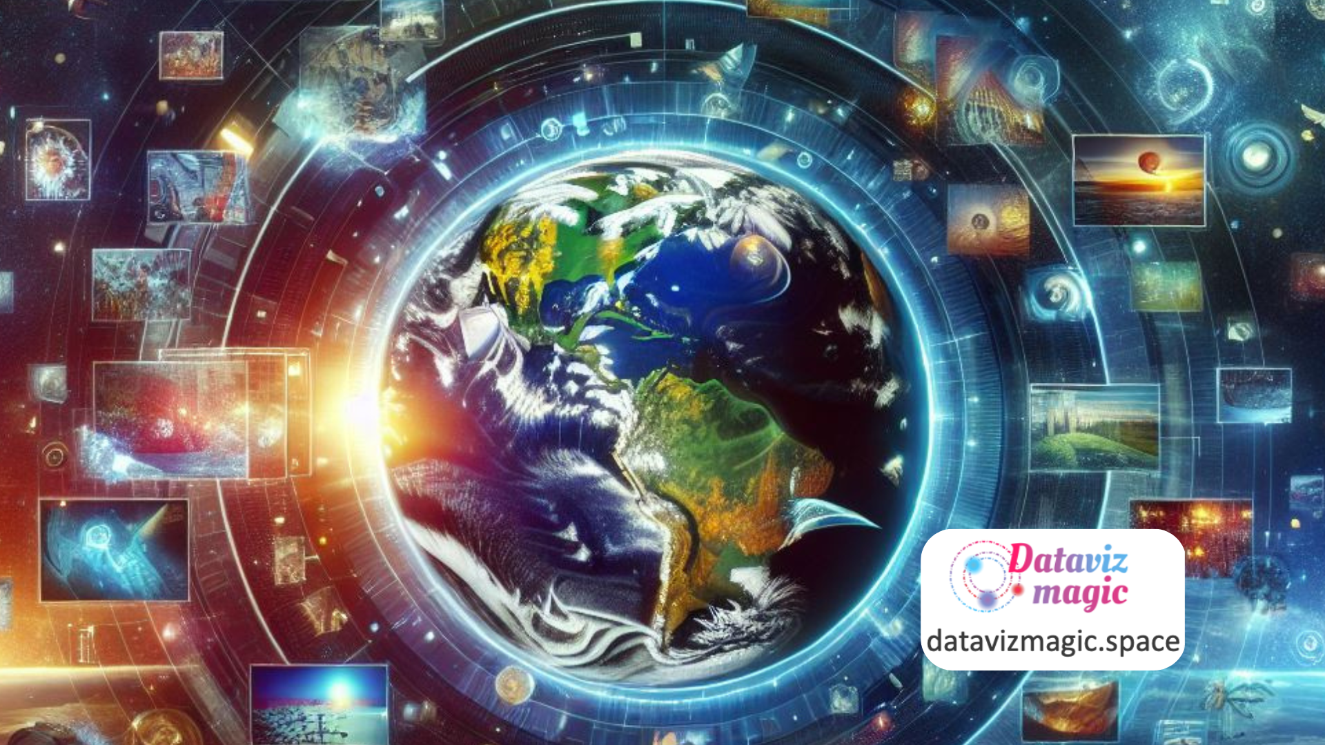
Visual Earth: When Images Tell the Story of the World.
•
We live in an era where data flows in unimaginable volumes, yet we often struggle to turn it into meaningful knowledge. The Visual Earth project emerges as an innovative response to this challenge, using geo-tagged images to reveal social, cultural, and economic patterns around the world. More than an academic…
-

Data Viz Today: A podcast that brings data to life.
•
In the world of data communication, few platforms blend education, inspiration, and practical advice as effectively as Data Viz Today. Created and hosted by Alli Torban, this podcast and blog serve as a vibrant hub for data visualization enthusiasts, analysts, designers, and storytellers. The site offers a rich collection of…
-
Turning data into art: Work of Nathalie Miebach.
•
Data visualization is often associated with charts, dashboards, and interactive maps. However, artist Nathalie Miebach expands this definition by transforming scientific data into three-dimensional sculptures and musical compositions. Her work, featured on nathaliemiebach.com, is a remarkable example of how art can serve as a powerful form of data visualization and…
-

Exploring the past with data: Insights from Time Machine Europe
•
Data visualization and data storytelling are essential tools in transforming complex historical data into engaging and comprehensible narratives. Time Machine Europe aims to digitize and map the economic, social, cultural, and geographical evolution of Europe over time. This article explores how the principles of data visualization and data storytelling are…
-

Why the human brain craves infographics.
•
Data visualization and data storytelling are powerful tools that transform complex information into comprehensible and engaging stories. The site “13 Reasons Why Your Brain Craves Infographics” by NeoMam Studios explores the scientific reasons why infographics are so effective. This article relates these reasons to the principles of data visualization and…
-

Hubble Space Telescope’s with the lens of Data Visualization.
•
Data visualization and data storytelling are powerful tools that transform complex information into comprehensible and engaging stories. The “Designing the Hubble Skymap” project on the Visual Cinnamon website is a brilliant example of how these techniques can be applied to tell the story of the Hubble Space Telescope’s observations. The…
-

A Journey through every Billboard Top 5 Hit.
•
Music has been an essential part of human culture for centuries. With the advancement of technology, the way we consume and analyze music has also evolved. The Best Year in Music project on The Pudding website offers a detailed analysis of the biggest Billboard hits from 1958 to 2016. This…
-

Solar Eclipses: Data & Stories Exploration.
•
A total solar eclipse is a fascinating astronomical phenomenon where the moon passes between the Earth and the sun, completely blocking the sunlight in certain areas. The Washington Post article highlights all the total solar eclipses that will occur during a person’s lifetime, offering a comprehensive and detailed view of…
-

The Power of Data Storytelling: Lessons from the Map of Napoleon’s March.
•
The map of Napoleon’s march to Russia, created by Charles Joseph Minard, is often cited as an iconic example of data storytelling and data visualization. This graphic not only presents data but tells a powerful story about Napoleon’s disastrous campaign in 1812. Minard managed to synthesize complex information into a…