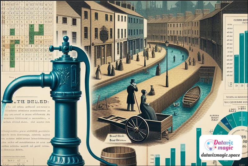
Welcome to the world of Almanac Data Viz Magic!
This almanac blog is your go-to space for transforming data into impactful visual stories. Data visualization goes far beyond pretty charts — it’s a bridge between numbers and decisions, between complexity and clarity. Here, you’ll find valuable tips on must-read books, specialized websites, and the latest artificial intelligence tools that are reshaping how we analyse and communicate information.
Whether you’re a curious beginner or a seasoned professional looking for fresh inspiration, this blog is your starting point to explore techniques, trends, and resources that will take your data visualization skills to the next level.
Get ready to dive into practical content, trusted recommendations, and insights that blend design, statistics, and technology. Let’s turn data into discovery — together!
>>> Data Viz Show >>>
Data Analysis and the Cholera Outbreak Map.
The cholera outbreak on Broad Street in 1854, in London, is a historical event that marked the beginning of modern epidemiology and highlighted the importance of data analysis in public health.
At that time, London faced serious sanitation problems, with sewage and drinking water often mixing. Cholera, a disease caused by the bacterium Vibrio cholerae, spread rapidly, resulting in hundreds of deaths. Dr. John Snow, investigating the cause of the outbreak, challenged the prevailing theory that the disease was transmitted through the air (miasma) and proposed that contaminated water was the true source of infection.
To test his hypothesis, Snow created a detailed map of the Soho district, where the outbreak was concentrated. He marked the locations of water pumps and cholera cases, revealing a clear pattern: most deaths occurred near the Broad Street water pump.
This map was crucial in demonstrating the relationship between contaminated water and the spread of the disease. Data analysis showed that of the 13 water pumps in the area, only the Broad Street pump was associated with a large number of cholera cases. This visualization allowed Snow to identify the water pump as the probable source of infection.
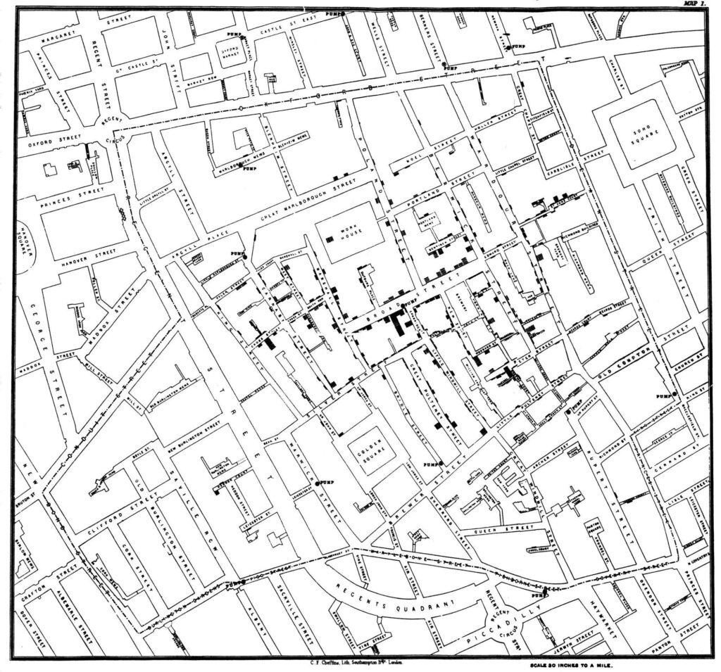
Based on this analysis, Snow recommended that the Broad Street water pump be deactivated. After the pump handle was removed, the number of new cholera cases dropped dramatically, corroborating his theory that contaminated water was the source of the infection. This event is considered one of the first examples of using data analysis to solve a public health problem, highlighting the importance of collecting and interpreting accurate data for informed decision-making. Snow’s approach was innovative for its time, combining empirical observation with statistical analysis to identify the cause of an epidemic.
John Snow’s work not only helped control the cholera outbreak but also had a lasting impact on public health. His scientific and evidence-based approach influenced the construction of more efficient sanitation systems and the improvement of hygiene conditions in cities. Additionally, his map is often cited as a pioneering example of spatial epidemiology, demonstrating how data visualization can reveal hidden patterns and inform public health policies. Snow’s methodology set a precedent for future epidemiological investigations and showed the importance of considering environmental factors in disease propagation.
Data analysis played a crucial role in identifying the source of the cholera outbreak. By mapping cholera cases and water sources, Snow was able to visualize the correlation between the location of water pumps and the incidence of the disease. This method of spatial analysis allowed him to identify the Broad Street water pump as the main source of contamination. The precision and clarity of the collected data were fundamental in convincing authorities to take immediate action to deactivate the pump.
In addition to mapping cholera cases, Snow also collected additional data to strengthen his hypothesis. He interviewed local residents and analyzed water consumption patterns, identifying that those who consumed water from other sources were not affected by the disease. This comparative analysis provided additional evidence that the Broad Street pump water was contaminated. The combination of qualitative and quantitative data was essential in building a convincing argument.
The removal of the Broad Street water pump handle was a simple but effective measure that resulted in a significant drop in the number of new cholera cases. This act not only saved lives but also validated Snow’s approach of using data to inform public health decisions. Data analysis allowed for a quick and targeted response to the outbreak, demonstrating the power of data science in resolving health crises.
The impact of John Snow’s work goes beyond controlling the cholera outbreak. His innovative approach laid the foundations for modern epidemiology, a discipline that continues to use data analysis to understand and control the spread of diseases. Snow’s map is frequently cited in epidemiology and public health studies as a classic example of how data visualization can reveal important patterns and inform effective interventions.
Data analysis also played a crucial role in shifting paradigms in the understanding of infectious diseases. Before Snow’s work, the miasmatic theory prevailed, suggesting that diseases were caused by “bad air.” The evidence provided by Snow’s map helped displace this theory, establishing the importance of water and sanitation in disease prevention. This paradigm shift had lasting implications for public health and sanitary engineering.
John Snow’s legacy is evident in modern public health practices. Data collection and analysis continue to be essential tools in identifying and controlling disease outbreaks. Snow’s evidence-based approach is a model for public health professionals, who use data to make informed decisions and protect population health. His work also highlights the importance of transparency and clear communication in responding to health crises.

The data analysis of the cholera outbreak map on Broad Street in 1854 was fundamental in identifying the source of the infection and controlling the epidemic. John Snow’s work exemplifies the importance of data science in public health and continues to be a reference for epidemiological studies and sanitary interventions. His contribution not only saved lives at the time but also established principles that are still applied in disease prevention and control today. The story of the cholera outbreak on Broad Street is a powerful reminder of how data analysis can be a vital tool in the fight against diseases and in promoting public health.
Snow’s visualization is a classic example of how the graphical representation of data can transform our understanding of a complex problem and guide effective actions.
This example shows that data visualization is not just an analytical tool but also a way to tell stories and communicate complex information in an accessible and engaging manner. The combination of graphic design skills, narrative, and data analysis is essential to create visualizations that not only inform but also inspire action.

The Future of the USA Through the Lens of Data Analysis.

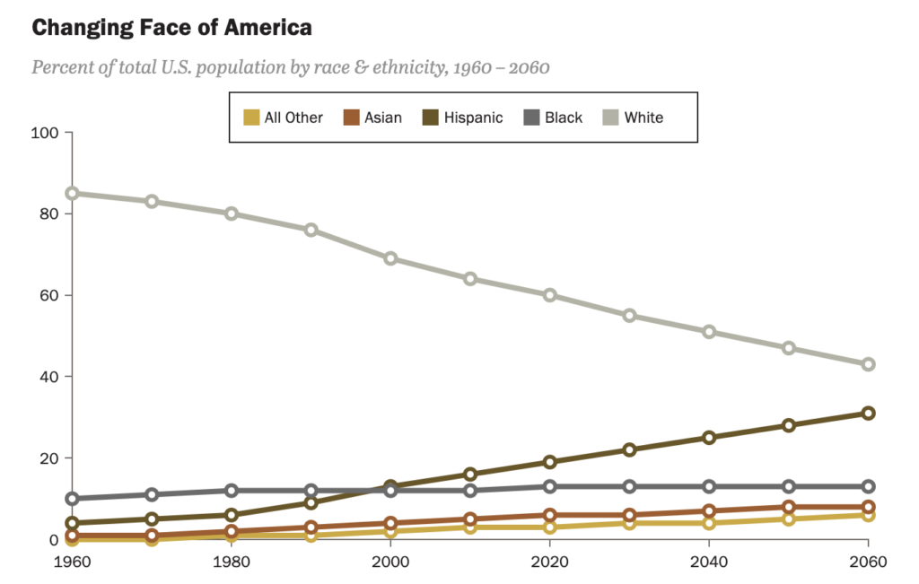
Data analysis is fundamental to understanding the demographic transformations occurring in the United States. The country is becoming predominantly non-white while a record share of the population is aging. These simultaneous changes create significant generational gaps that affect politics, the economy, and social cohesion.
Demographic data shows that the white population, which was 85% in 1960, will be only 43% in 2060. This change is driven by more than 40 million immigrants who have arrived since 1965, many of them Hispanic and Asian. Analyzing these data helps understand how racial and ethnic diversity is reshaping American society.
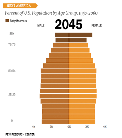
In addition to racial changes, data analysis reveals the aging population. The traditional age pyramid is transforming into a rectangle, with nearly as many Americans over 85 as those under 5. This phenomenon, resulting from higher life expectancy and lower birth rates, presents significant economic and political challenges.
Economic data analysis is equally important. Millennials (people born between 1981 and 1996), for example, are well-educated and tech-savvy but face difficulties in the job market, risking a lower standard of living than their parents. Data on employment, income, and education are essential to understanding these dynamics and developing policies to mitigate these challenges.
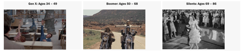
Data also shows that about 10,000 Baby Boomers (people born between 1940s and 1960s) are retiring daily, many without adequate financial preparation. This adds additional pressure on the social safety net and requires policy solutions that balance the needs of the elderly without overburdening young workers.
Public opinion data reveals deep political and social divisions. One political party tends to be older, white, religious, and conservative, while the other is younger, diverse, liberal, and secular. These divisions are exacerbated by animosity between partisans, affecting not only politics but also daily life.
Data also shows that many Americans are disillusioned with politics and desire pragmatic compromises. However, these individuals are less likely to vote and engage actively in politics, creating a paradox where the silent majority desires change but does not actively participate in the process.
Data analysis is crucial to understanding these dynamics and developing strategies to increase civic participation. Opinion polls and demographic data help identify barriers to participation and develop more effective engagement campaigns.
Demographic transformation also has implications for social cohesion. Data analysis can help identify areas of tension and develop policies that promote integration and social harmony. Data on education, employment, and housing are particularly important in this context.
Data analysis is also vital for understanding changes in family structures. American families are becoming more diverse in terms of composition and dynamics. Data on marriage, divorce, birth rates, and adoption help paint a more complete picture of these changes and develop policies that support all forms of family.
Technology is another important factor. Data analysis shows how technology use varies across generations and how this affects communication, work, and leisure. Understanding these differences is crucial for developing policies that promote digital inclusion and leverage the opportunities offered by technology.
Data analysis also plays a crucial role in education. Data on academic performance, access to education, and educational disparities help identify areas of need and develop policies that promote educational equity.
Public health is another area where data analysis is essential. Data on health, access to medical care, and health disparities help develop policies that promote the health and well-being of all Americans.
Data analysis is fundamental to understanding cultural and social changes. Data on religion, values, and social norms help paint a more complete picture of American society and develop policies that reflect these changes.
Data analysis is a powerful tool that helps us understand the complex transformations shaping the United States. By providing deep insights into demographics, economics, politics, and culture, data analysis allows us to develop more informed and effective policies to address future challenges.

The Power of Data Storytelling: Lessons from the Map of Napoleon’s March.

Source: SciHi Blog
The map of Napoleon’s march to Russia, created by Charles Joseph Minard, is often cited as an iconic example of data storytelling and data visualization. This graphic not only presents data but tells a powerful story about Napoleon’s disastrous campaign in 1812. Minard managed to synthesize complex information into a visualization that is both informative and emotionally impactful.
Minard combined historical data on the trajectory of Napoleon’s army, recorded temperatures during the campaign, and the number of soldiers over time. These data were integrated into a single visualization that highlights the magnitude of the losses suffered by the army. The precision and richness of the data used by Minard are a testament to his skill in data analysis.
Minard’s map is a combination of a flow chart and a line graph. The width of the line represents the number of soldiers, while the trajectory shows the path taken by the army. The lower line of the graph indicates the extreme temperatures faced during the retreat. This structure allows multiple dimensions of data to be presented in a cohesive and understandable manner.
The data analysis is evident in how Minard presents the army’s decline. The width of the line decreases drastically as the campaign progresses, visualizing the loss of lives in a clear and impactful way. This allows for a quick and intuitive understanding of the scale of the tragedy, highlighting the effectiveness of data visualization.
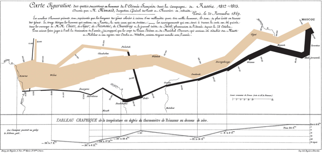
He uses data storytelling by integrating multiple dimensions of data into a cohesive visual narrative. He not only presents numbers but tells the story of the hardships and losses faced by Napoleon’s army, making the data more accessible and memorable. The visual narrative is a powerful tool for communicating complex information in an engaging way.
Minard’s visualization has a significant emotional impact. By showing the army’s decline visually, it evokes an emotional response that isolated numbers could not convey. This demonstrates the power of data storytelling in communicating complex information in an engaging and memorable way.
Compared to other data visualizations, Minard’s map stands out for its ability to synthesize multiple dimensions of data into a single cohesive image. It is often cited as a classic example of excellence in data storytelling, serving as a reference for professionals in the field. The clarity and depth of Minard’s visualization are unparalleled.
Today, Minard’s approach can be seen in many modern visualizations that aim to tell complex stories in a clear and impactful way. Tools like Tableau allow data analysts to create interactive visualizations that follow the principles established by Minard, facilitating the communication of insights. These modern tools expand the possibilities of data storytelling.
Source: Wikipedia
On platforms like Tableau, it is possible to find examples of visualizations that use techniques similar to Minard’s to tell data stories. These visualizations help highlight trends, patterns, and anomalies in a visually appealing and informative way. The ability to create interactive visualizations is a significant advancement in the field of data analysis.
Creating effective data visualizations can be challenging. It is necessary to balance data accuracy with presentation clarity, ensuring that the visualization is understandable and impactful without distorting the facts. Minard achieved this masterfully in his map of Napoleon’s march, setting a high standard for future visualizations.
Minard’s legacy continues to influence the field of data visualization. His map is often cited as an example of how a well-crafted visualization can tell a powerful and unforgettable story, inspiring new generations of data analysts and designers. Minard’s influence is evident in many of today’s best practices in data visualization.
A map by Charles Joseph Minard is draped over the chair in the background.
Source: Wikipedia
Visual narrative is a powerful tool in data storytelling. It allows data to be presented in a way that resonates with the audience, facilitating the understanding and retention of information. Minard’s map is a classic example of how visual narrative can transform data into an engaging and memorable story.
Minard integrated qualitative data, such as the trajectory and weather conditions, with quantitative data, such as the number of soldiers. This combination enriches the narrative and provides a more complete and detailed view of the events. The integration of different types of data is an essential practice in data storytelling.
He’s approach remains relevant today, especially in a world where the amount of available data is immense. The ability to synthesize and communicate this data effectively is crucial for informed decision-making and insight communication. Minard’s map serves as a model for effective and impactful data visualizations.
Data analysis and data storytelling are essential for transforming raw data into actionable insights. Minard’s map of Napoleon’s march continues to inspire data professionals, demonstrating how a well-crafted visualization can tell a powerful and unforgettable story. The combination of data analysis and visual narrative is a powerful tool for communicating complex information clearly and impactfully.

Solar Eclipses: Data & Stories Exploration.
A total solar eclipse is a fascinating astronomical phenomenon where the moon passes between the Earth and the sun, completely blocking the sunlight in certain areas. The Washington Post article highlights all the total solar eclipses that will occur during a person’s lifetime, offering a comprehensive and detailed view of this rare phenomenon.
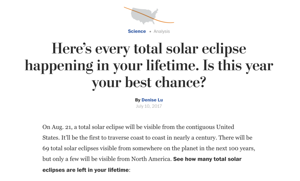
Collecting data to predict solar eclipses involves precise astronomical calculations. This data includes the trajectory of the moon’s shadow, known as the path of totality, exact times, and the duration of the eclipse at different locations. The accuracy of this data is crucial for creating reliable predictions and precise visualizations.
The Washington Post uses interactive data visualizations to communicate complex information about solar eclipses. Detailed graphs and maps show the path of totality, allowing readers to explore how the eclipses will be visible in different locations over time. These visualizations make the data accessible and understandable to a broad audience.
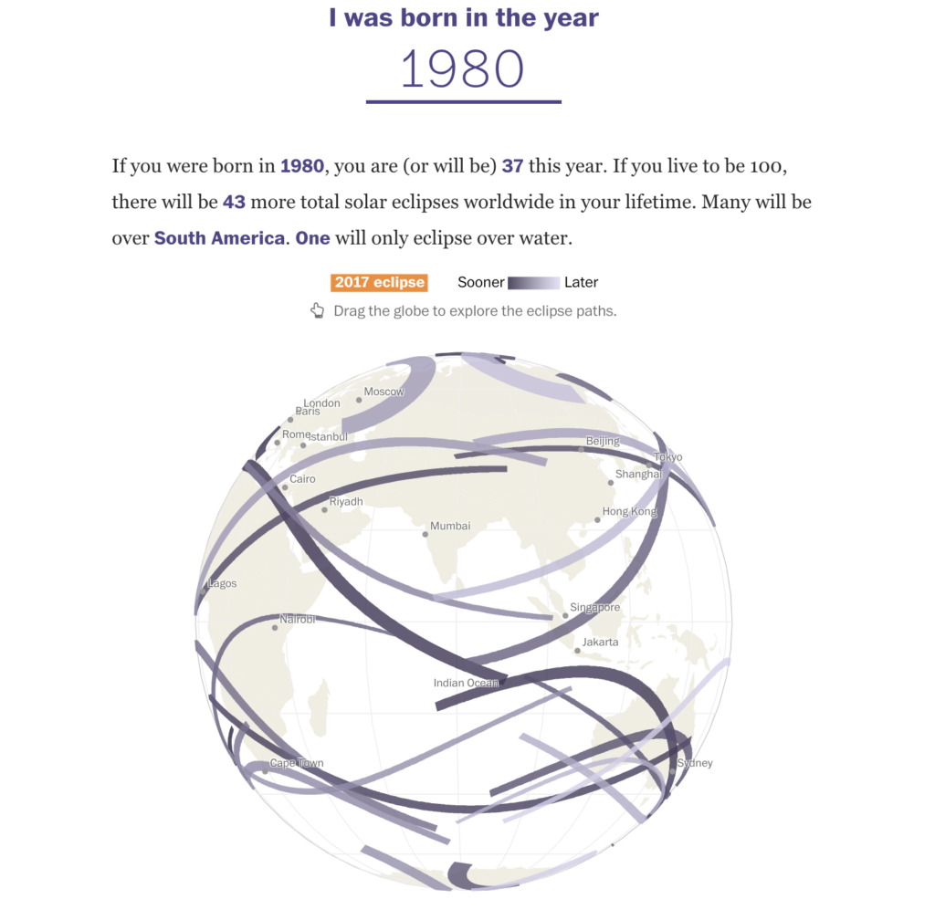
Data storytelling is essential to make the data about solar eclipses accessible and engaging. Through visual narratives, the Washington Post can explain complex astronomical concepts clearly and attractively, helping the public understand the importance and rarity of these events. The combination of data and visual narrative is a powerful tool for scientific communication.
Emotional Impact of Visualizations: Data visualizations about solar eclipses not only inform but also evoke an emotional response. Seeing the trajectory of the moon’s shadow crossing different regions creates a sense of anticipation and wonder, demonstrating the power of data storytelling in connecting data with human emotions. This shows how data visualization can go beyond the simple presentation of information.
Data analysis is crucial to accurately predict the path of totality and inform the public about the best locations to observe the eclipses. This involves complex calculations and the integration of astronomical data with geographic information. The accuracy of these predictions is fundamental to the success of communication about these events.
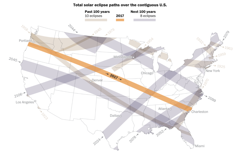
The Washington Post also uses historical data to compare future solar eclipses with past events. This helps contextualize the rarity of these events and highlight their importance, using data to tell a more complete and rich story. The comparison with previous eclipses provides valuable historical perspective.
Interactive visualizations allow readers to explore the data on their own, increasing engagement and understanding. Tools like interactive maps and animated graphs make the learning experience more dynamic and engaging. Interactivity is a key component of modern data storytelling.
Challenges in Data Visualization: Creating effective visualizations for a phenomenon as complex as a solar eclipse presents significant challenges. It is necessary to balance scientific accuracy with visual clarity, ensuring that the information is understandable and impactful without losing precision. The Washington Post successfully overcame these challenges.
Data analysis and data storytelling play crucial roles in communicating information about solar eclipses. The use of interactive visualizations and visual narratives by the Washington Post exemplifies how complex data can be transformed into engaging and informative stories, connecting the public with science in a meaningful way. The combination of data analysis and visual narrative is a powerful tool for communicating complex information clearly and impactfully.
+VIDEO:

A Journey through every Billboard Top 5 Hit.

Music has been an essential part of human culture for centuries. With the advancement of technology, the way we consume and analyze music has also evolved. The Best Year in Music project on The Pudding website offers a detailed analysis of the biggest Billboard hits from 1958 to 2016. This article explores how data visualization and data storytelling can be used to tell the story of musical evolution.
Data visualization is a powerful tool that transforms complex data into easy-to-understand graphs and images. In the “Best Year in Music” project, interactive graphs allow users to explore decades of musical data intuitively.
The project uses line and bar charts to show the popularity of songs over time. These charts help identify trends and changes in musical tastes. Data storytelling goes beyond simply presenting charts. It involves telling a story with the data, providing context and meaning. In the case of “Best Year in Music,” the narrative helps understand how historical events influenced music.
The project’s charts show how certain musical genres gained or lost popularity over the years. For example, the rise of rap and hip-hop in the 1990s and 2000s is clearly visible.
Interactivity is a key component of modern data visualization. On the site, users can click on different years to see the biggest hits and explore how music has changed over time.
Music is deeply emotional, and data visualization can capture that emotion by showing the popularity of songs that defined eras. Heat maps, for example, can show which songs were most played during different periods.
The project uses advanced data visualization tools like D3.js to create dynamic and interactive charts. These tools allow for deep exploration of musical data. In addition to showing the evolution of musical tastes, the project also highlights how technology has influenced music. From vinyl to streaming, each technological era brought significant changes.
Data visualization allows for direct comparisons between different periods. For example, we can compare the popularity of songs from the 1980s with those from the 2000s and see how tastes have changed.
With the continuous advancement of technology, the way we analyze and consume music will continue to evolve. Data visualization and data storytelling tools will be essential to understand these changes.
Music companies can use data visualization to make informed decisions about releases and marketing. Data storytelling can help tell compelling stories about artists and albums.
Source: Billboard Instagram
The “Best Year in Music” project on The Pudding is a brilliant example of how data visualization and data storytelling can be used to tell the story of music. By combining interactive charts with an engaging narrative, the project offers a new way to explore and understand musical evolution.
Musical data analysis can also reveal unexpected patterns. For example, we might discover that certain historical events, such as economic crises or social movements, have a direct impact on musical trends.
Finally, the combination of data visualization and data storytelling not only enriches our understanding of music but also allows us to appreciate the complexity and beauty of musical evolution over the decades.
+VIDEO: Billboard Ranks The Top Hot 100 Songs of the 21st Century
#datavizmagic #datavizshow #datastorytelling #datavisualization #billboard

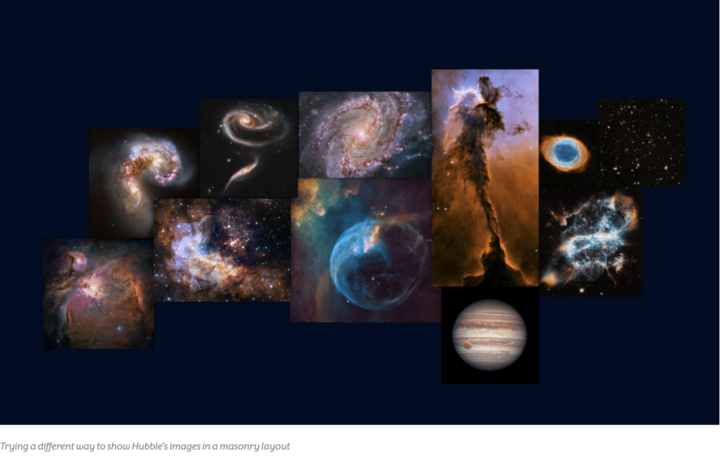
Hubble Space Telescope’s with the lens of Data Visualization.
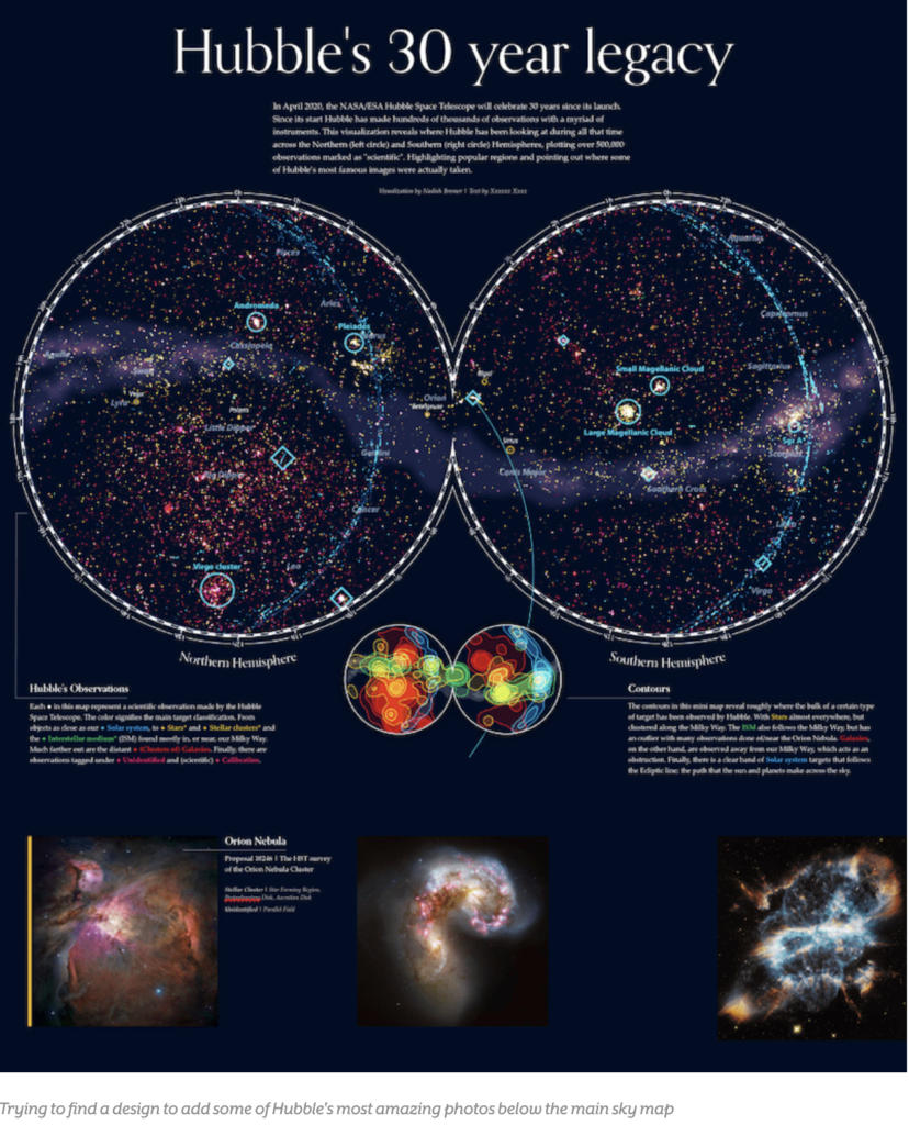
Data visualization and data storytelling are powerful tools that transform complex information into comprehensible and engaging stories. The “Designing the Hubble Skymap” project on the Visual Cinnamon website is a brilliant example of how these techniques can be applied to tell the story of the Hubble Space Telescope’s observations.
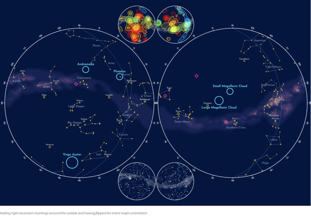
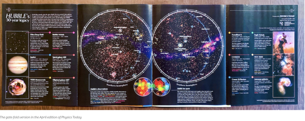
The project was created to commemorate the 30th anniversary of the Hubble Space Telescope, highlighting more than 550,000 scientific observations made over three decades. Data visualization here is used to map these observations in the sky, providing a comprehensive and detailed view of Hubble’s contributions to astronomy.
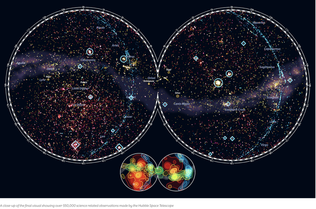
The choice of the Aitoff projection for the sky map was crucial to represent the vast amount of data clearly and accessibly. This projection allows users to see the distribution of observations across the sky, with the Milky Way crossing horizontally through the center of the map.
Each point on the map represents an observation, and the colors indicate different types of targets, such as stars, galaxies, and the interstellar medium. This color coding facilitates the identification of patterns and trends in Hubble’s observations.
Data storytelling is enriched with the inclusion of contextual elements, such as famous constellations and notable celestial objects. These details help situate Hubble’s observations within a broader astronomical context, making the visualization more engaging and informative.
The process of data cleaning and analysis was crucial to ensure the accuracy of the visualization. The author used tools like Python and R to process the raw data, correcting inconsistencies and preparing it for the final visualization.
Interactivity is a key component of the project, allowing users to explore different aspects of Hubble’s observations. For example, it is possible to view the frequency of observations by target classification or by instruments used.
Data visualization also highlights the technological evolution of Hubble, showing how different instruments contributed to discoveries over the years. This helps tell the story of the telescope’s scientific and technological development.
Data storytelling is complemented by additional charts that show the distribution of observations over time and by wavelength. These charts provide a more detailed view of Hubble’s capabilities and research focuses.
The choice to use a static visualization instead of an interactive one was deliberate, aiming to create a detailed and informative poster. This demonstrates how different visualization approaches can be used to achieve specific communication goals.
The inclusion of annotations and detailed legends on the sky map helps guide users through the visualization, highlighting points of interest and providing additional context. This is an example of how data storytelling can be used to enhance understanding and engagement.
Data visualization not only communicates information but also inspires curiosity and exploration. The project encourages users to learn more about Hubble’s observations and the history of astronomy.
Data storytelling is a powerful tool for telling complex stories in an accessible and engaging way. In the case of “Designing the Hubble Skymap,” the combination of data visualization and storytelling creates a rich and educational experience.
Data visualization can be used to reveal patterns and insights that would not be evident otherwise. In the project, the distribution of Hubble’s observations in the sky reveals areas of focus and gaps in coverage.
Data storytelling can also be used to highlight the importance of specific events, such as the discovery of new galaxies or the observation of rare phenomena. This helps contextualize Hubble’s contributions to science.
Data visualization and data storytelling are complementary tools that, when used together, can transform complex data into powerful stories. The “Designing the Hubble Skymap” project is an inspiring example of how these techniques can be applied in practice.
The combination of data visualization and data storytelling not only improves communication but also increases the emotional and cognitive impact of the information. This is crucial for engaging the audience and conveying complex messages effectively.
In summary, the “Designing the Hubble Skymap” project on Visual Cinnamon demonstrates how data visualization and data storytelling can be used to tell the story of the Hubble Space Telescope’s observations. By combining detailed graphics with an engaging narrative, the project offers a new way to explore and understand Hubble’s contributions to astronomy.
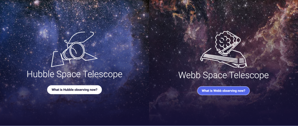
More about Hubble and James Webb: https://spacetelescopelive.org/
#datavizmagic #datavizshow #datastorytelling #datavisualization #nasa #hubbletelescope

Why the human brain craves infographics.
Data visualization and data storytelling are powerful tools that transform complex information into comprehensible and engaging stories. The site “13 Reasons Why Your Brain Craves Infographics” by NeoMam Studios explores the scientific reasons why infographics are so effective. This article relates these reasons to the principles of data visualization and data storytelling, highlighting how these techniques can improve communication and understanding of information.
Data visualization is the graphical representation of information and data. Using visual elements like charts, maps, and diagrams, data visualization facilitates the identification of patterns, trends, and outliers. This is essential for transforming raw data into actionable insights.
Data storytelling involves communicating insights derived from data through engaging stories. It combines data analysis, visualizations, and a clear narrative to contextualize information and inspire action. Data storytelling is crucial for making data understandable and memorable.
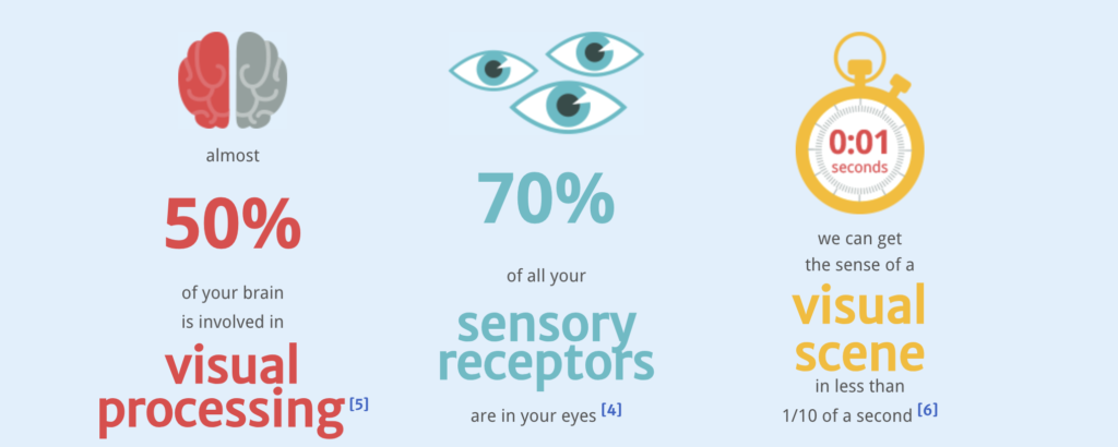
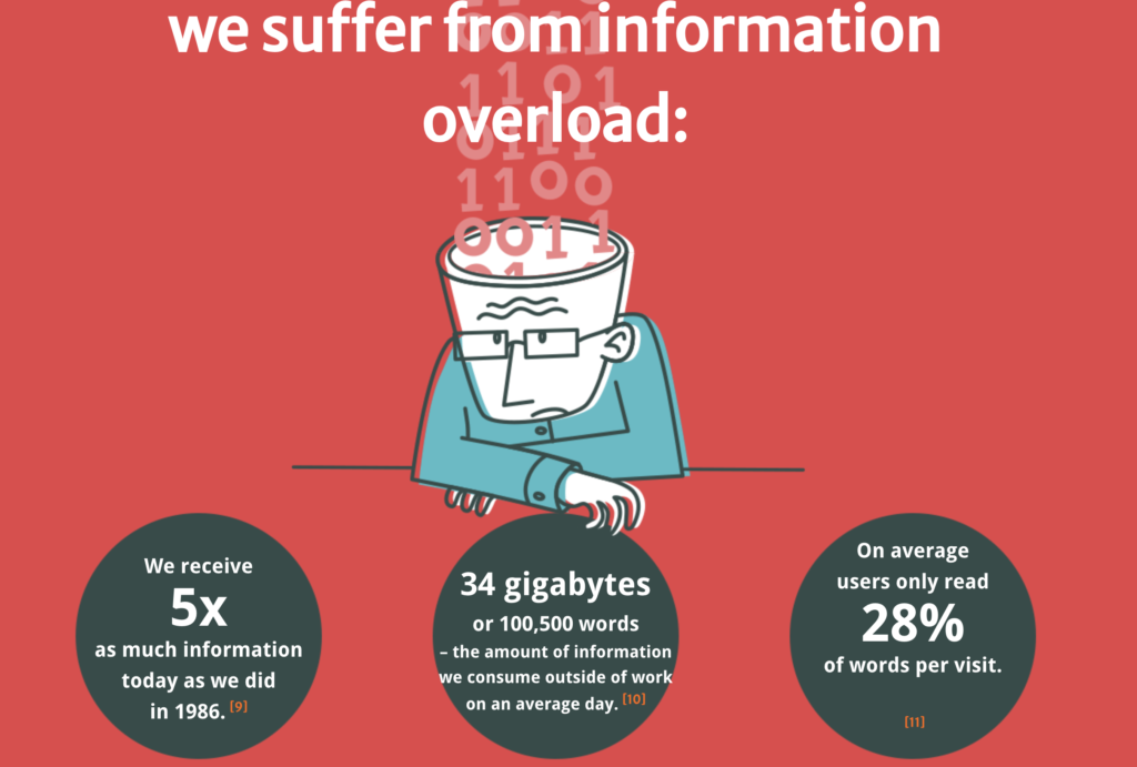
The NeoMam Studios site highlights that nearly 50% of the human brain is involved in visual processing. This explains why infographics are so effective: they leverage the brain’s natural ability to process visual information quickly.
We live in an era of information overload, receiving five times more information today than in 1986. Infographics and data visualizations help combat this overload by making information more accessible and digestible.
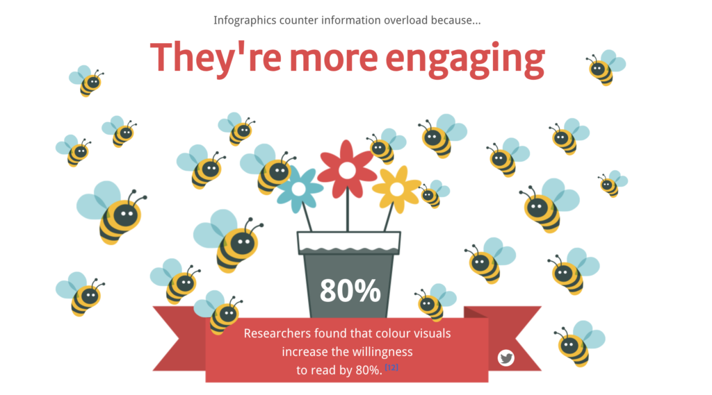
Infographics are more engaging and accessible than pure text. Studies show that colorful visuals increase the willingness to read by 80%. Additionally, the understanding of medication labels increases from 70% to 95% when accompanied by images.
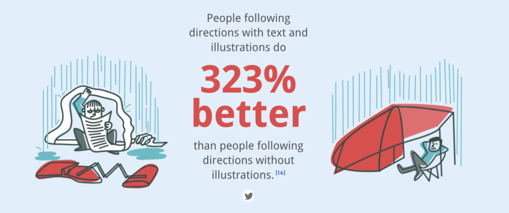
Data storytelling and data visualization are persuasive tools. A verbal presentation with visuals is 67% more persuasive than a pure verbal presentation. Moreover, people remember information presented visually better.
Companies use data visualizations to analyze large volumes of information and make data-driven decisions. Data storytelling is used to communicate the need for product improvements or to create compelling cases for potential clients.
Tools like Tableau and Power BI allow the creation of interactive visualizations that facilitate data exploration and communication of insights. These tools are essential for data analysts and communicators. Data storytelling helps simplify complex information, build credibility, and influence decisions. It is a valuable skill for data analysts and communication professionals.
While data visualization and data storytelling have many benefits, it is important to avoid misinterpretation or biased information. The correct choice of visualizations and thorough data analysis are essential.
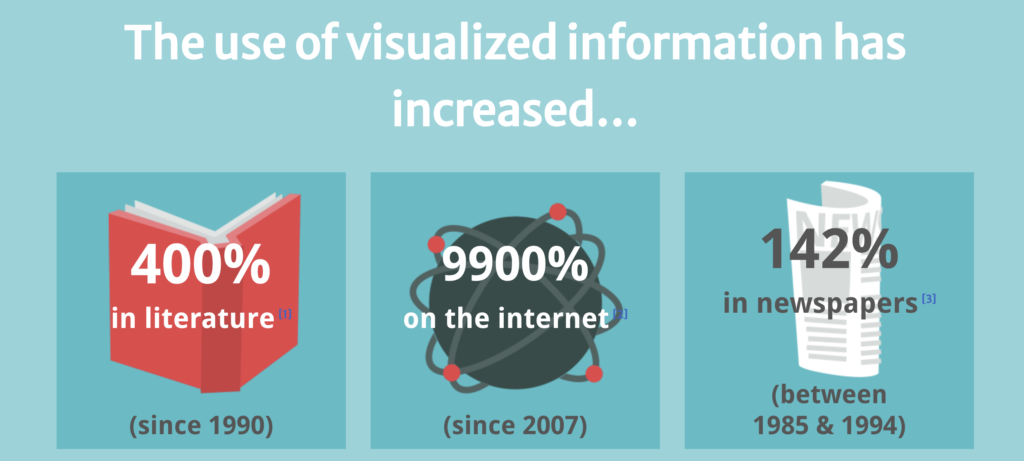
Since 1990, the use of visualized information has increased by 400% in literature, 9900% on the internet, and 142% in newspapers. This demonstrates the growing importance of infographics in modern communication.
Adding images of brain scans and mentioning cognitive neuroscience makes people more inclined to believe what they are reading. This shows how data visualization can be used to enhance the credibility of information. Infographics are easy to digest, fun to share, and extremely engaging. They help convey information quickly and effectively, leveraging the brain’s ability to process visuals.
Companies like NeoMam Studios use infographics to communicate complex information in an accessible and engaging manner. These examples show how data visualization and data storytelling can be applied in different contexts.
Color plays a crucial role in data visualization. Colorful visuals not only attract attention but also improve understanding and retention of information. The appropriate choice of colors can highlight important information and facilitate data interpretation.
The human brain can process an image in just 13 milliseconds. This rapid processing capability is one of the reasons why infographics are so effective. They allow information to be understood almost instantly.
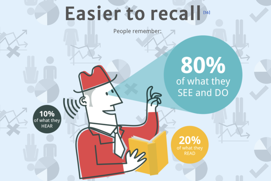
People remember 80% of what they see and do, compared to only 20% of what they read and 10% of what they hear. This highlights the importance of using data visualizations to improve information retention. Data storytelling is not just about presenting facts but also about telling a story that resonates with the audience. A good story can make data more relevant and impactful, facilitating informed decision-making.
Effective infographics are simple and straightforward. They avoid overwhelming the audience with unnecessary information and focus on communicating the main messages clearly and concisely.
The combination of data visualization and data storytelling is a powerful approach to effectively communicate information. Infographics, as explored by NeoMam Studios, exemplify how these techniques can transform complex data into engaging and memorable stories.
Bonus video:
#datavizmagic #datavizshow #datastorytelling #datavisualization #humanbrain

Exploring the past with data: Insights from Time Machine Europe
Data visualization and data storytelling are essential tools in transforming complex historical data into engaging and comprehensible narratives. Time Machine Europe aims to digitize and map the economic, social, cultural, and geographical evolution of Europe over time. This article explores how the principles of data visualization and data storytelling are applied within the Time Machine project to bring history to life.

Time Machine is an ambitious initiative that seeks to create a vast digital information system, mapping Europe’s rich history using advanced digital technologies. By digitizing historical documents and artifacts, the project team aims to build a comprehensive database that can be accessed and analyzed by researchers, historians, and the general public.
Data visualization plays a crucial role in the initiative. By converting historical data into visual formats such as maps, charts, and graphs, it facilitates the identification of patterns and trends over time. For example, visualizing population growth or migration patterns across centuries can provide valuable insights into historical events and societal changes.

One of the key components of Time Machine is the use of augmented and virtual reality (AR/VR) to enhance data storytelling. By creating immersive experiences, AR/VR allows users to explore historical sites and events in a more engaging and interactive way. This not only makes history more accessible but also helps to preserve cultural heritage.
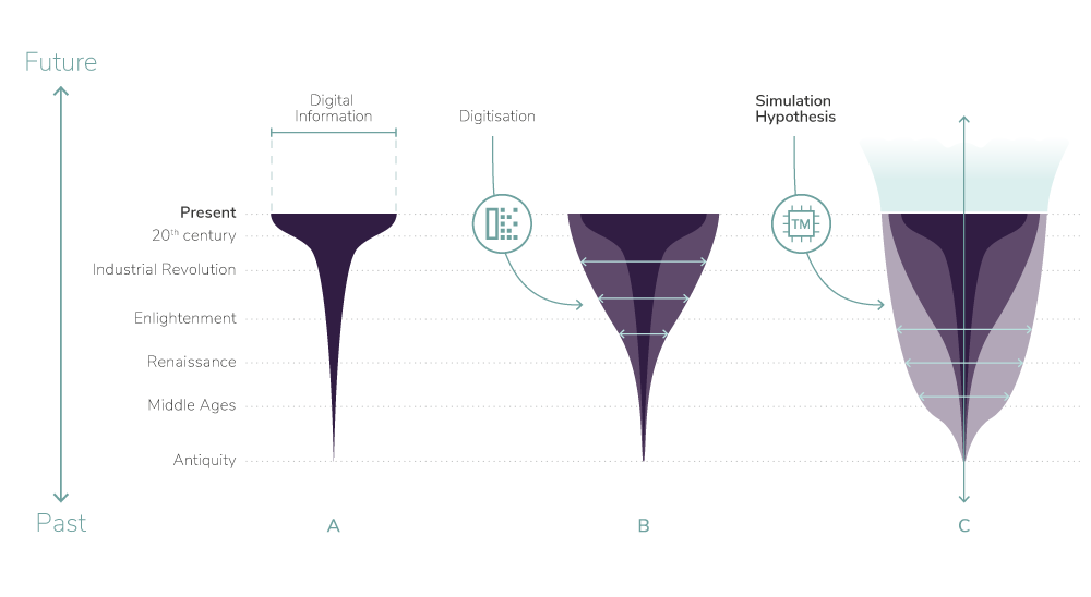
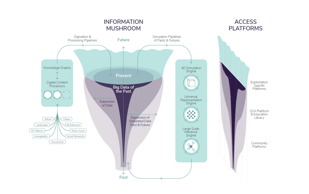
The initiative also emphasizes the importance of creating a “Big Data of the Past.” This involves not only digitizing historical records but also processing and analyzing them to extract meaningful insights. Data visualization tools are essential in this process, as they help to present complex data in a clear and understandable manner.
Data storytelling is another critical aspect of Time Machine. By combining data analysis with narrative techniques, the aim is to create compelling stories that bring historical data to life. This approach helps to contextualize data, making it more relatable and memorable for the audience.
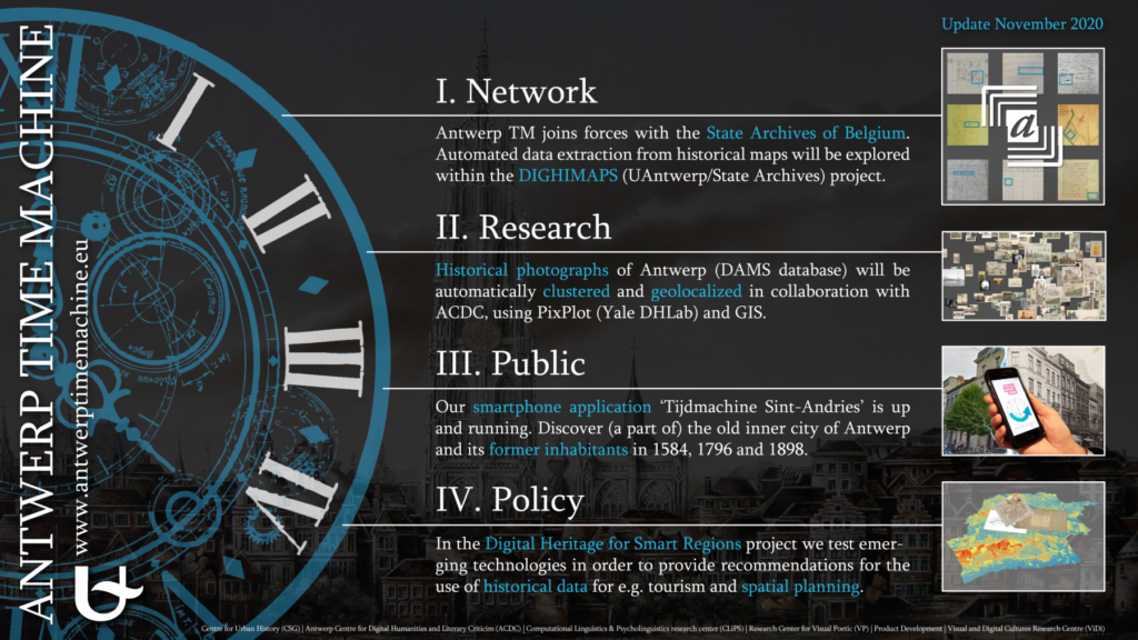
Time Machine also highlights the importance of collaboration in data visualization and storytelling. By bringing together experts from various fields, including historians, data scientists, and technologists, it ensures that the data is accurately interpreted and effectively communicated.
One of the challenges faced is ensuring the accuracy and reliability of the data. This requires rigorous data validation and verification processes. Data visualization tools can help in this regard by highlighting inconsistencies and anomalies in the data, allowing researchers to address them promptly.
The initiative also aims to make historical data more accessible to the public. By creating user-friendly interfaces and interactive visualizations, Time Machine allows users to explore historical data in a more intuitive and engaging way. This democratizes access to historical information and encourages public participation in historical research.
Another significant aspect of Time Machine is its potential to inform contemporary decision-making. By understanding historical trends and patterns, policymakers can make more informed decisions that take into account the lessons of the past. Data visualization and storytelling play a crucial role in this process by presenting historical data in a way that is relevant and actionable.
The use of advanced technologies such as machine learning and artificial intelligence (AI) is also a key feature of Time Machine. These technologies enable the project to process and analyze vast amounts of data more efficiently. Data visualization tools help to present the results of these analyses in a clear and understandable manner.
The initiative also emphasizes the importance of preserving cultural heritage. By digitizing historical records and artifacts, it ensures that they are preserved for future generations. Data visualization and storytelling help to bring these records to life, making them more accessible and engaging for the public.
Time Machine also aims to promote critical thinking and historical awareness. By presenting historical data in a clear and engaging way, users are encouraged to think critically about the past and its relevance to the present. Data storytelling plays a crucial role in this process by creating compelling narratives that resonate with the audience.
The initiative also highlights the potential of data visualization and storytelling to enhance education. By creating interactive and engaging visualizations, history becomes more accessible and interesting for students. This can help to foster a deeper understanding and appreciation of history among young people.
Time Machine also aims to support research and innovation in the field of digital humanities. By providing researchers with access to a vast database of historical data, new forms of research and analysis are enabled. Data visualization tools are essential in this process, as they help researchers to explore and interpret the data more effectively.
The initiative also emphasizes the importance of public engagement. By creating interactive and engaging visualizations, public participation in historical research is encouraged. This not only helps to democratize access to historical information but also fosters a sense of shared cultural heritage.
Time Machine also aims to promote European identity and cohesion. By highlighting the shared history and cultural heritage of Europe, a sense of common identity and belonging is fostered. Data visualization and storytelling play a crucial role in this process by creating compelling narratives that highlight the interconnectedness of European history.
The initiative also has significant economic potential. By promoting cultural tourism and supporting the creative industries, economic growth and job creation can be contributed to. Data visualization and storytelling are essential in this process, as they help to create engaging and marketable content.
Time Machine also aims to support sustainable development. By providing policymakers with access to historical data, more sustainable and informed decision-making can be informed. Data visualization and storytelling play a crucial role in this process by presenting historical data in a way that is relevant and actionable.
In conclusion, Time Machine Europe demonstrates the power of data visualization and data storytelling in bringing history to life. By digitizing and analyzing historical data, a comprehensive and accessible database is created that can be used for research, education, and public engagement. Data visualization and storytelling are essential tools in this process, helping to transform complex data into engaging and comprehensible narratives.
#datavizmagic #datavizshow #datastorytelling #datavisualization #timemachineeurope
Turning data into art: Work of Nathalie Miebach.
Data visualization is often associated with charts, dashboards, and interactive maps. However, artist Nathalie Miebach expands this definition by transforming scientific data into three-dimensional sculptures and musical compositions. Her work, featured on nathaliemiebach.com, is a remarkable example of how art can serve as a powerful form of data visualization and storytelling.
Miebach uses meteorological, oceanographic, and environmental data as raw material for her creations. Instead of representing them through traditional graphs, she translates them into physical and musical forms, creating sculptures that can be “read” visually and, in many cases, heard. This approach turns cold, abstract data into sensory and emotional experiences.
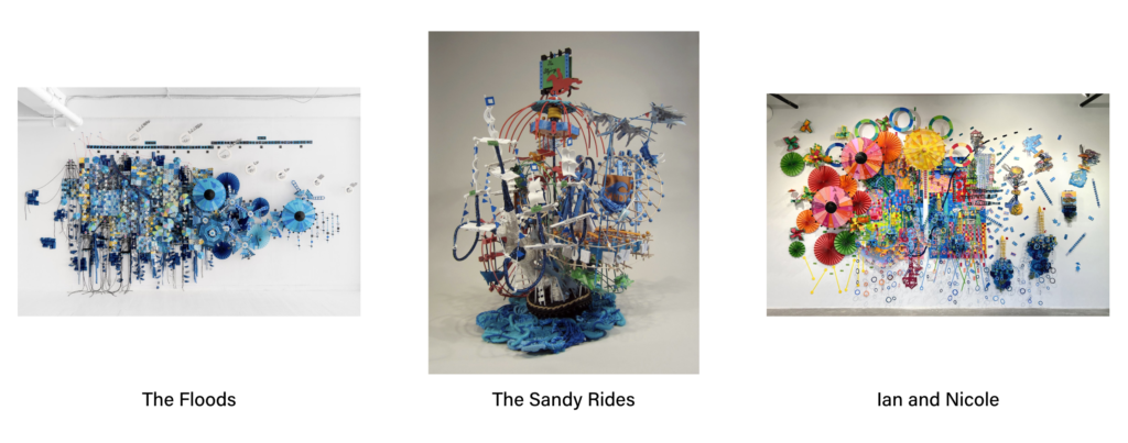
One of her most emblematic projects is Weather Scores, in which Miebach collects data on temperature, humidity, atmospheric pressure, and wind speed to compose musical scores. Each note, pause, and rhythm is directly derived from the data, creating a sound narrative that accompanies the corresponding visual sculpture.
This fusion of science and art is a sophisticated form of data storytelling. By incorporating narrative elements such as the passage of time, extreme weather events, or seasonal patterns, her works tell stories that go beyond numbers. They reveal relationships, tensions, and rhythms that often go unnoticed in traditional representations.

The three-dimensionality of Miebach’s sculptures is also an innovation in data visualization. By occupying physical space, her works allow the audience to explore data in a tactile and spatial way, enhancing understanding and engagement. This is especially relevant in a world saturated with two-dimensional digital visualizations.
Another important aspect of her work is emotional accessibility. By transforming data into art, Miebach creates emotional connections with themes such as climate change, natural disasters, and fragile ecosystems. This makes the data more human and understandable, even for those without a scientific background.
The artist also challenges the idea that data visualization must be objective and neutral. Her works take on an interpretive stance, where aesthetics and subjectivity are integral parts of the narrative. This opens space for a broader discussion about the role of visualization in constructing meaning.

Miebach frequently collaborates with scientists, meteorologists, and musicians to ensure her data is accurate and her interpretations coherent. This interdisciplinary collaboration is an example of how data visualization can be enriched by multiple perspectives.
In addition to the sculptures, the website features visual scores that can be performed by musicians. These compositions are a way to “hear the data,” offering a new sensory dimension to visualization. Music, in this context, becomes an alternative language for communicating patterns and variations in data.
The use of materials such as wicker, string, and beads is also significant. These handcrafted elements contrast with the digital nature of the data, creating a tension between the analog and the technological. This aesthetic choice reinforces the idea that data is part of the physical world and has real impact.

Miebach’s exhibitions are immersive experiences. The audience is invited to walk around the sculptures, observe the details, and in some cases, interact with the works. This immersion is a powerful form of data engagement that goes beyond passive chart reading.
The website also serves as a repository of projects, processes, and reflections by the artist. It documents not only the finished works but also the methods of data collection, the algorithms used to translate numbers into forms, and the initial sketches. This offers a transparent and educational view of the visualization process.
Nathalie Miebach’s work is an example of how data visualization can be an artistic, sensory, and narrative practice. She expands the boundaries of the field, showing that data can be interpreted, felt, and experienced in unexpected ways.

Her work also raises important questions about how we choose to represent data and which stories we decide to tell. By giving shape and sound to numbers, Miebach reminds us that every visualization is ultimately a construction, and that how we choose to tell a story with data matters as much as the data itself.
In a world where data is increasingly central to political, social, and environmental decisions, Nathalie Miebach’s approach offers a poetic and critical alternative. She invites us to see data not just as analytical tools, but as raw material for empathy, reflection, and transformation.
#datavizmagic #datavizshow #datastorytelling #datavisualization #turningdataintoart

Data Viz Today: A podcast that brings data to life.
In the world of data communication, few platforms blend education, inspiration, and practical advice as effectively as Data Viz Today. Created and hosted by Alli Torban, this podcast and blog serve as a vibrant hub for data visualization enthusiasts, analysts, designers, and storytellers. The site offers a rich collection of podcast episodes, resources, and tools that explore how to turn raw data into compelling visual narratives.

At its core, Data Viz Today is about helping people make better decisions through better visualizations. Each episode dives into a specific aspect of data visualization, from choosing the right chart type to designing with accessibility in mind. These discussions are not only technical but also deeply human, emphasizing the importance of empathy and clarity in data storytelling.
One of the standout features of the podcast is its focus on practical storytelling techniques. In episodes like “Next Question,” Alli explores how asking better questions can lead to more meaningful data stories. This aligns with the broader principle in data storytelling that the narrative should guide the audience through the data, not overwhelm them with it.
The podcast frequently features interviews with leading figures in the data visualization community such as Lea Pica, Mona Chalabi, and Kat Greenbrook. These conversations offer insights into how professionals approach complex topics like climate change, racial injustice, and public health through visual storytelling.

A recurring theme in Data Viz Today is the importance of design decisions. Alli emphasizes that every element in a visualization, including color, typography, layout, and annotations, should serve a purpose. This reflects a core tenet of effective data visualization, where design is not decoration but communication.
The site also promotes the idea of originality in visualization. In one episode, discusses the value of creating custom visual forms rather than relying solely on standard chart types. This creative approach can foster a deeper connection with the data and help the audience engage with it in new ways.
Another strength of Data Viz Today is its accessibility. The podcast is designed for a wide audience, from beginners to seasoned professionals. Alli’s clear explanations and thoughtful questions make complex topics approachable, which is essential for democratizing data literacy.
The podcast also explores the emotional dimension of data storytelling. In episodes that cover topics like COVID-19 or climate change, the focus is not just on the numbers, but on how those numbers affect real people. This human-centered approach is what makes data storytelling so powerful because it connects facts to feelings.
Alli Torban’s background as a data visualization designer informs every aspect of the show. She shares her own experiences, challenges, and lessons learned, making the content relatable and grounded in real-world practice. Her transparency encourages listeners to experiment, iterate, and grow in their own work.
The site includes a newsletter and a book titled Chart Spark, which provides a structured process for brainstorming and designing data visualizations. These resources extend the podcast’s mission by offering hands-on guidance for anyone looking to improve their data storytelling skills.

Data Viz Today also highlights the importance of feedback and iteration. Many episodes discuss how visualizations evolve through critique and testing. This iterative mindset is crucial in data storytelling, where clarity and impact often emerge through refinement.
The podcast doesn’t shy away from difficult topics. Whether discussing racial injustice or misinformation, Alli and her guests explore how data visualization can be a tool for advocacy and truth-telling. This reinforces the ethical responsibility that comes with visualizing data.
Another valuable aspect of the site is its focus on community building. Through interviews, listener questions, and shared resources, Data Viz Today fosters a sense of belonging among data practitioners. This community aspect is vital for learning and inspiration.
The site’s design reflects its content, being clean, intuitive, and focused on clarity. Episodes are easy to navigate, and show notes often include links, tools, and visual examples. This reinforces the podcast’s educational mission and makes it a practical resource for ongoing learning.
Through thoughtful interviews, practical advice, and a deep commitment to clarity, Alli Torban has created a space where data becomes not just understandable but meaningful. For anyone interested in the intersection of data, design, and narrative, this site is an invaluable resource.
+VIDEO:
#datavizmagic #datavizshow #datastorytelling #datavisualization #podcast
Visual Earth: When Images Tell the Story of the World.
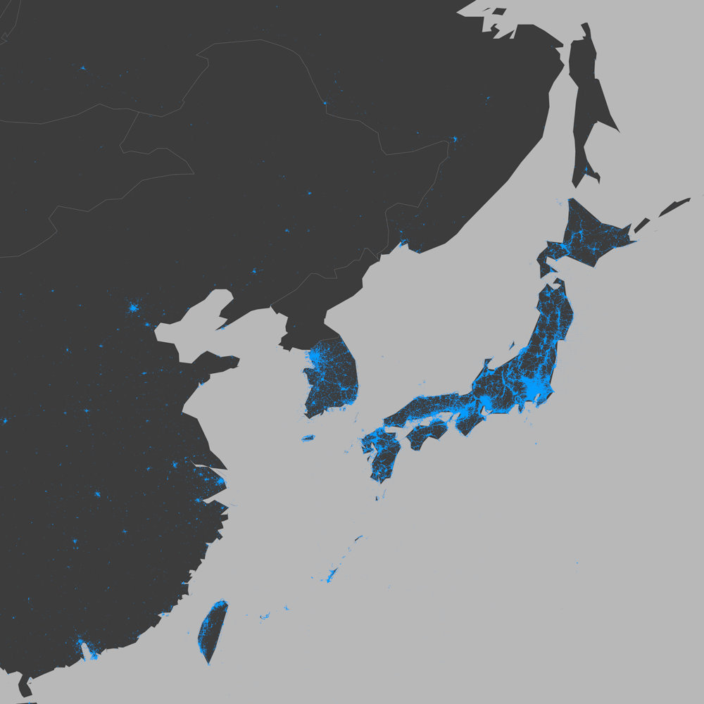
We live in an era where data flows in unimaginable volumes, yet we often struggle to turn it into meaningful knowledge. The Visual Earth project emerges as an innovative response to this challenge, using geo-tagged images to reveal social, cultural, and economic patterns around the world. More than an academic study, it is a visual narrative about how we live, express ourselves, and connect.
The project analyzed 270 million images shared on Twitter between 2011 and 2014, all with geographic location data. From this immense dataset, researchers selected 100 cities across six continents, using criteria that go beyond size or fame. The goal was to capture the diversity of global urban life—and in doing so, tell stories that numbers alone cannot reveal.
Each shared image is a fragment of a story. When grouped and visually analyzed, these images become a powerful tool for data storytelling. They show how people use photography to document daily life, celebrate moments, protest, or simply share beauty. And in doing so, they reveal patterns that reflect inequality, cultural habits, and social transformation.
The strength of Visual Earth lies in its ability to turn data into accessible visual narratives. Instead of cold graphs or complex tables, the project presents maps and visualizations that speak directly to our senses. Colors, shapes, and densities combine to show, for example, how image sharing grows faster in high-income countries, or how certain events trigger spikes in visual content.
This approach is a brilliant example of purposeful data visualization. It’s not just about representing statistics, but about building a bridge between data and human experience. Each map is a window into how technology shapes the way we see and show the world—and how that varies depending on economic, geographic, and cultural context.
The project also raises important questions about access and representation. When we observe that low-income countries share fewer images, we’re not just seeing a statistic—we’re seeing a reflection of digital inequality. The absence of data is also a form of data, and Visual Earth invites us to reflect on who is being seen and who remains invisible.
Another fascinating aspect is the use of time as a narrative element. The visualizations show how image sharing evolved over months and years, revealing both global and local trends. The impact of changes to Twitter’s platform, such as the introduction of image previews, is visible in the graphs—a reminder of how technological decisions affect collective behavior.
Visual Earth is also an example of how interdisciplinarity enriches data visualization. The project combines data science, geography, sociology, design, and communication. It’s a work that demands both analytical rigor and aesthetic sensitivity—and it’s precisely this combination that makes it so powerful.
For educators, the project offers a valuable resource. It can be used to teach about urbanization, inequality, digital culture, and more. By presenting data in a visual and engaging way, it facilitates learning and sparks curiosity. It’s a tool that transforms statistics into stories students can see, explore, and discuss.
In research, Visual Earth demonstrates the potential of social data to generate deep insights. Instead of relying solely on censuses or interviews, researchers can now observe behaviors in real time, on a global scale. This opens new possibilities for understanding the world—and for changing it.
The aesthetics of the visualizations also deserve praise. They don’t just inform—they captivate. The beauty of the maps and graphics draws the eye, invites exploration, and makes the content more memorable. It’s proof that data visualization can be both scientific and artistic.
The project also reminds us that data is, ultimately, about people. Each point on a map represents a human action—a click, a glance, a choice to share. By visualizing this data, we are visualizing ourselves, our routines, our desires, and our differences.
In a world saturated with information, projects like Visual Earth show the value of telling good stories with data. They help us see invisible patterns, question what we take for granted, and imagine new ways of living together on this connected planet.
The visual narrative of Visual Earth is, therefore, a form of empathy. By seeing how others live and express themselves—even through digital images—we grow closer to them. And that closeness is the first step toward building a more just and understanding world.
We live in an era where data flows in unimaginable volumes, yet we often struggle to turn it into meaningful knowledge. The Visual Earth project emerges as an innovative response to this challenge, using geo-tagged images to reveal social, cultural, and economic patterns around the world. More than an academic study, it is a visual narrative about how we live, express ourselves, and connect.
The project analyzed 270 million images shared on Twitter between 2011 and 2014, all with geographic location data. From this immense dataset, researchers selected 100 cities across six continents, using criteria that go beyond size or fame. The goal was to capture the diversity of global urban life—and in doing so, tell stories that numbers alone cannot reveal.
Each shared image is a fragment of a story. When grouped and visually analyzed, these images become a powerful tool for data storytelling. They show how people use photography to document daily life, celebrate moments, protest, or simply share beauty. And in doing so, they reveal patterns that reflect inequality, cultural habits, and social transformation.
The strength of Visual Earth lies in its ability to turn data into accessible visual narratives. Instead of cold graphs or complex tables, the project presents maps and visualizations that speak directly to our senses. Colors, shapes, and densities combine to show, for example, how image sharing grows faster in high-income countries, or how certain events trigger spikes in visual content.
This approach is a brilliant example of purposeful data visualization. It’s not just about representing statistics, but about building a bridge between data and human experience. Each map is a window into how technology shapes the way we see and show the world—and how that varies depending on economic, geographic, and cultural context.
The project also raises important questions about access and representation. When we observe that low-income countries share fewer images, we’re not just seeing a statistic—we’re seeing a reflection of digital inequality. The absence of data is also a form of data, and Visual Earth invites us to reflect on who is being seen and who remains invisible.
Another fascinating aspect is the use of time as a narrative element. The visualizations show how image sharing evolved over months and years, revealing both global and local trends. The impact of changes to Twitter’s platform, such as the introduction of image previews, is visible in the graphs—a reminder of how technological decisions affect collective behavior.
Visual Earth is also an example of how interdisciplinarity enriches data visualization. The project combines data science, geography, sociology, design, and communication. It’s a work that demands both analytical rigor and aesthetic sensitivity—and it’s precisely this combination that makes it so powerful.
For educators, the project offers a valuable resource. It can be used to teach about urbanization, inequality, digital culture, and more. By presenting data in a visual and engaging way, it facilitates learning and sparks curiosity. It’s a tool that transforms statistics into stories students can see, explore, and discuss.
Visual Earth demonstrates the potential of social data to generate deep insights. Instead of relying solely on censuses or interviews, researchers can now observe behaviors in real time, on a global scale. This opens new possibilities for understanding the world – and for changing it.
The aesthetics of the visualizations also deserve praise. They don’t just inform—they captivate. The beauty of the maps and graphics draws the eye, invites exploration, and makes the content more memorable. It’s proof that data visualization can be both scientific and artistic.
The project also reminds us that data is, ultimately, about people. Each point on a map represents a human action—a click, a glance, a choice to share. By visualizing this data, we are visualizing ourselves, our routines, our desires, and our differences.
In a world saturated with information, projects like Visual Earth show the value of telling good stories with data. They help us see invisible patterns, question what we take for granted, and imagine new ways of living together on this connected planet.
The visual narrative of Visual Earth is, therefore, a form of empathy. By seeing how others live and express themselves—even through digital images—we grow closer to them. And that closeness is the first step toward building a more just and understanding world.

This vision resonates deeply with the work of Lev Manovich, one of the most influential thinkers in digital culture and data visualization. A professor at the City University of New York and founder of the Cultural Analytics Lab, Manovich has pioneered the study of how digital media and software shape contemporary culture. His books, such as The Language of New Media and Cultural Analytics, explore the aesthetics and politics of data, offering frameworks that help us understand projects like Visual Earth not just as technical feats, but as cultural artifacts.
Manovich is also a visual artist whose projects—like Selfiecity and Soft Cinema—blend data science with artistic expression. His work reveals how data can be used not only to analyze the world but to reimagine it. Through his dual role as theorist and creator, Manovich exemplifies the power of data storytelling to bridge disciplines, provoke thought, and inspire new ways of seeing. In this sense, Visual Earth stands as a living example of the ideas he has championed for decades.
#datavizmagic #datavizshow #datastorytelling #datavisualization

Between Inspiration and Loss of Control: Music in the Age of AI.
In the spring of 2023, a song titled Heart on My Sleeve went viral. It featured the unmistakable voices of Drake and The Weeknd except it wasn’t them. It wasn’t even human. The track was generated by an anonymous user using artificial intelligence, and it sent shockwaves through the music industry. This moment, both thrilling and unsettling, marked a turning point in how we think about creativity, authorship, and control in the age of AI.
The Ars Electronica article Between Inspiration and Loss of Control dives deep into this cultural shift, exploring how AI is no longer just a tool for automation, but a collaborator in the creative process. From music to visual art, artificial intelligence is reshaping the boundaries of what it means to create. But with this transformation comes a profound tension: are we gaining new forms of inspiration—or surrendering control?

Artists like Holly Herndon have embraced this ambiguity. Her project Holly+ allows others to use a synthetic version of her voice, turning her identity into a shared creative resource. It’s a radical act of openness, but also a philosophical provocation: if anyone can sound like Holly, what does it mean to be Holly? Where does the artist end and the algorithm begin?
This question echoes across disciplines. In visual arts, AI-generated works like Théâtre d’Opéra Spatial have won awards without juries realizing they were machine-made. In literature, AI can now mimic the style of famous authors with eerie precision. And in music, tools like Sora and Jukebox are composing melodies that blur the line between imitation and innovation.
Yet not everyone is celebrating. Artists like Nick Cave have pushed back, arguing that true art is born from human emotion—grief, joy, struggle. “This song is bullshit,” he said of an AI-generated imitation of his work. For Cave, creativity is not just about output, but about experience. AI can simulate, but it cannot suffer. It can remix, but it cannot remember.

This divide, between those who see AI as muse and those who see it as menace, defines the current cultural moment. On one side, there is excitement about new possibilities: faster workflows, unexpected collaborations, and access to tools once reserved for experts. On the other, there is fear of homogenization, of losing the raw, imperfect beauty that defines human expression.
The Ars Electronica Futurelab, through projects like Waltz Symphony, is attempting to navigate this tension. By collaborating with musicians and institutions, they explore how AI can assist in composition without simply replicating the past. It’s a delicate dance—one that requires both technical precision and artistic intuition.
What emerges from these experiments is a new kind of authorship: one that is distributed, dynamic, and deeply collaborative. In this model, the artist is not replaced by the machine, but redefined in relation to it. Creativity becomes a dialogue, not a monologue. The work is no longer a solitary act, but a shared process between human and code.
This shift also demands new ethical frameworks. Who owns an AI-generated song? What happens when a synthetic voice is used without consent? How do we ensure that training data doesn’t perpetuate bias or erase marginalized voices? These are not just technical questions—they are cultural, legal, and deeply personal.
At the heart of this debate is a paradox: AI can generate content faster than ever, but it also forces us to slow down and reconsider what we value in art. Is it originality? Emotion? Labor? Identity? The answers are not fixed, and perhaps they never were. But in asking them, we begin to understand the stakes of this new creative era.
In many ways, AI is holding up a mirror to our own creative processes. It reveals how much of what we call “original” is built on patterns, influences, and repetition. But it also challenges us to go deeper—to find the parts of ourselves that cannot be coded, the stories that resist automation.

The future of art in the age of AI will not be defined by machines alone. It will be shaped by the choices we make: how we use these tools, how we protect human dignity, and how we redefine creativity for a world where inspiration and control are constantly in flux.
As Ars Electronica reminds us, this is not a battle between humans and machines. It is a conversation—sometimes harmonious, sometimes dissonant—about what it means to create in a world where the boundaries between artist and algorithm are dissolving.

And perhaps, in that space between inspiration and loss of control, we will find something new: a form of creativity that is not less human, but more expansive, more inclusive, and more attuned to the complexity of the world we are building together.
#datavizmagic #datavizshow #datastorytelling #datavisualization
>>> TOOLS >>>

The Data Visualization Catalogue.
The Data Visualization Catalogue is an online resource designed to help individuals find the most appropriate data visualization method for their specific data needs.
Created by Severino Ribecca, this site serves as a comprehensive guide and library of various data visualization techniques, tools, and resources. It is particularly valuable for data analysts, scientists, and anyone involved in presenting data in a clear and effective manner.

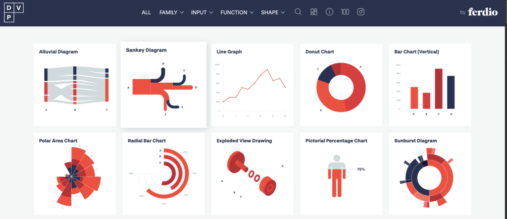
One of the primary features of the Data Visualisation Catalogue is its extensive list of visualization types. Users can explore a wide range of charts, graphs, and diagrams, each categorized by their function and method. This includes common visualizations like bar charts and line graphs, as well as more specialized ones like Sankey diagrams and violin plots. Each entry provides a detailed description, examples, and guidance on when and how to use the visualization.
The site also offers a search function that allows users to find visualizations based on specific criteria, such as the type of data they have or the message they want to convey. This makes it easier for users to identify the most effective way to present their data, ensuring that their visualizations are both informative and visually appealing.
For those new to data visualization, the Data Visualisation Catalogue serves as an educational resource. It includes explanations of key concepts and principles of data visualization, helping users understand the importance of choosing the right visualization method. This educational aspect is crucial for building foundational knowledge and improving the overall quality of data presentations.
The site is also a valuable tool for experienced data professionals. It provides inspiration and new ideas for visualizing data, encouraging creativity and innovation in data presentation. By exploring different visualization techniques, professionals can discover new ways to communicate complex data insights effectively.
In addition to its extensive library of visualizations, the Data Visualisation Catalogue includes links to various tools and software that can be used to create these visualizations. This makes it a one-stop resource for both learning about and implementing data visualization techniques. Users can find information on popular tools like Tableau, D3.js, and R, among others.
The importance of the Data Visualisation Catalogue lies in its ability to enhance the effectiveness of data communication. By providing a comprehensive guide to different visualization methods, it helps users present their data in a way that is both accurate and engaging. This is particularly important in fields like business, science, and education, where clear and effective data communication is essential for decision-making and knowledge sharing.
The Data Visualization Catalogue is an essential resource for anyone involved in data analysis and presentation. It offers a wealth of information on various visualization techniques, tools, and best practices, making it easier for users to choose the right method for their data. Whether you are a beginner looking to learn the basics or an experienced professional seeking new ideas, the Data Visualisation Catalogue provides the guidance and inspiration needed to create impactful data visualizations.

Data Viz Project: The World’s Biggest Library of Data Visualizations.

The Data Viz Project is an online platform dedicated to data visualization, created by the agency Ferdio. This site offers a vast collection of data visualization examples, categorized by type, function, and complexity. It serves as a source of inspiration and reference for professionals working with data analysis, helping them choose the best ways to present their information.
For data analysts, the Data Viz Project is an essential tool for several reasons. Firstly, it provides a wide variety of visualization examples, from simple charts to more complex representations. This allows analysts to quickly find the type of visualization that best suits their data and specific objectives.
Additionally, the site is intuitively organized, making it easy to navigate and search for specific visualizations. Each example is accompanied by a detailed description, explaining when and how to use that visualization. This is particularly useful for analysts who are learning new techniques or looking for innovative ways to present their data.
The Data Viz Project is also important for its ability to inspire creativity. By exploring different types of visualizations, analysts can discover new ways to communicate their findings and insights. This can lead to more impactful and comprehensible presentations, which is crucial for data-driven decision-making.
Another valuable aspect of the site is its constant updates. New visualization examples are regularly added, ensuring that users have access to the latest trends and techniques in data visualization. This is essential in a constantly evolving field, where new tools and methods are always emerging.
For those working in teams or collaborating with other departments, the Data Viz Project can serve as a common resource to standardize data presentation. Having a shared reference point can improve consistency and clarity in communications within the organization.
Additionally, the site offers educational resources, such as tutorials and articles, that help analysts enhance their data visualization skills. These resources are valuable for both beginners and experienced professionals who want to stay updated with industry best practices.
Finally, the Data Viz Project is a tool that promotes efficiency. By providing ready-made and well-documented examples, it saves analysts time, allowing them to focus more on data analysis and interpretation rather than creating visualizations from scratch.

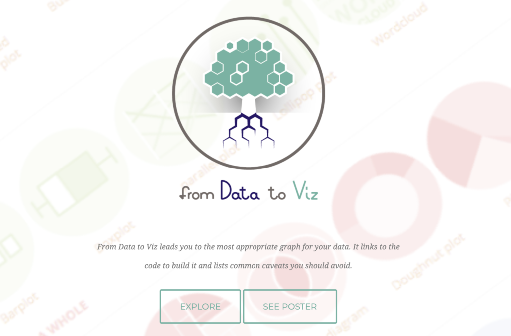
From Data to Visualization.
The “Data to Viz” website is an essential tool for professionals in Data Visualization and Data Storytelling, offering a structured and practical approach to choosing the best data visualizations. This article explores the main features of the site and why it is an excellent reference for professionals in the field.
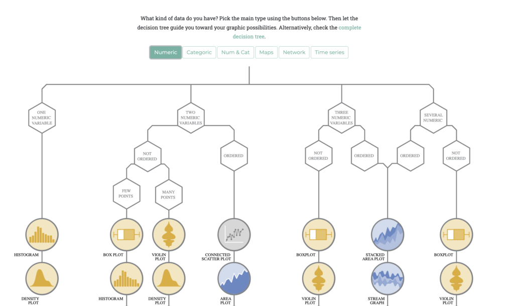
“Data to Viz” guides users in choosing the most appropriate chart for their data using a decision tree based on the format of the input data. This helps simplify the chart selection process, making it more efficient and effective.
The site offers examples of analyses based on real data using the R programming language. This not only demonstrates the practical application of visualizations but also provides reproducible code that users can adapt for their own projects.
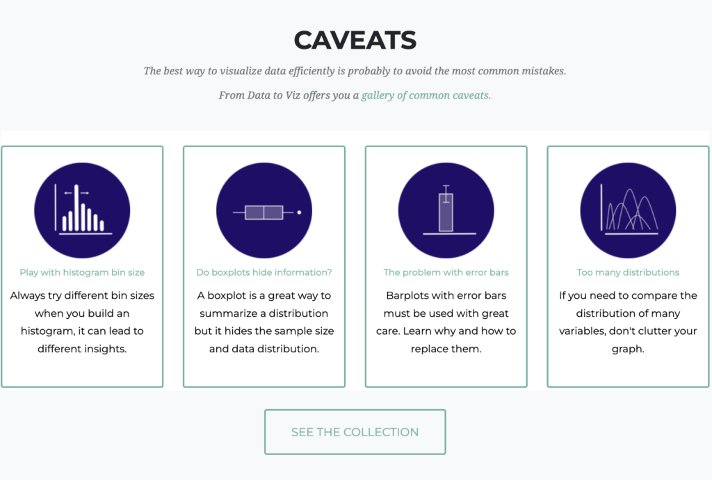
One of the great advantages of “Data to Viz” is the list of common pitfalls in data visualization. The site highlights frequent errors, such as cutting the Y-axis or creating line charts with too many lines, known as spaghetti charts. These tips help professionals avoid practices that can compromise the clarity and accuracy of visualizations.
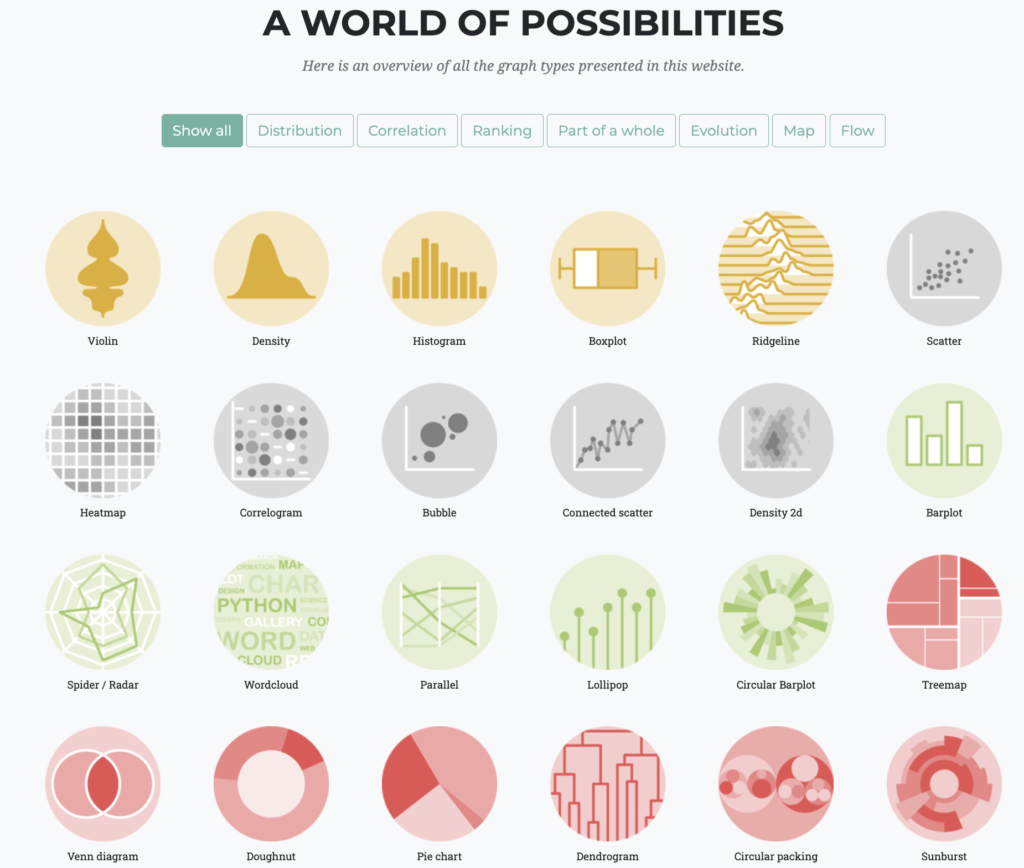
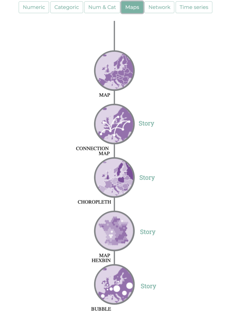
The site also features a comprehensive gallery of chart types, including distribution, correlation, ranking, part-to-whole, evolution, maps, and flow charts. Each chart type is accompanied by examples and detailed explanations, making it easier to understand and apply correctly.
Interactivity is a key component of “Data to Viz.” The site allows users to explore different types of charts and see how they can be applied to different datasets. This is particularly useful for professionals who need to experiment with various options before deciding which visualization to use.
In addition to traditional charts, the site also addresses more advanced visualizations, such as chord diagrams, network graphs, and heat maps. These visualizations are essential for representing complex data in a clear and intuitive manner.
“Data to Viz” is an excellent source of inspiration for professionals looking for new ways to present their data. The variety of charts and practical examples helps expand users’ visualization repertoires, encouraging creativity and innovation.
The site is maintained by two friends from southern France, Yan Holtz and Conor Healy, who combine their skills in data analysis and design to create a valuable resource for the data visualization community. Their dedication and knowledge are evident in the quality and usefulness of the content offered.
The site’s tools section includes additional resources, such as tutorials and links to R packages that facilitate the creation of visualizations. These resources are particularly useful for professionals who want to deepen their technical knowledge and improve their practical skills.
“Data to Viz” also offers a high-quality poster that summarizes the decision tree and chart types. This poster is a practical tool to have on hand in the workplace, serving as a quick guide for choosing visualizations.
In summary, “Data to Viz” is an invaluable resource for data professionals. With its structured approach, practical examples, useful tips, and a wide variety of chart types, the site offers everything professionals need to create effective and impactful visualizations.
The underlying philosophy of “Data to Viz” is that both the data and the context determine the appropriate chart. This holistic approach ensures that visualizations not only accurately represent the data but also tell a meaningful and engaging story.
#datavizmagic #tools #datastorytelling #datavisualization #fromdatatoviz #dataviz

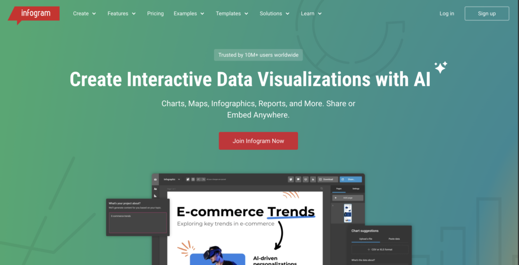
Infogram: Interactive Visualization Platform
Data visualization and data storytelling are essential tools for transforming complex information into comprehensible and engaging stories. The site “Infogram” offers a powerful platform for creating interactive data visualizations and infographics that capture the audience’s attention. This article explores how the principles of data visualization and data storytelling are applied on Infogram to effectively communicate information.
Infogram is an easy-to-use, AI-powered tool for creating infographics, charts, dashboards, maps, and more. The platform allows users to design and share interactive data visualizations across various platforms, making data communication more accessible and engaging.
Data storytelling is a practice where content, context, and design come together to create a compelling narrative with data at its center. On Infogram, data storytelling enables users to convey important insights using text and visuals. This is especially useful for communicating complex information in a clear and memorable way.
A notable example of data visualization on Infogram is the interactive annual report by B Lab Global. This report combines functionality and visual storytelling, allowing viewers to click on elements, charts, and texts to explore specific sections of the report. The intuitive navigation and visual design elevate the report, transforming it from a static document into a dynamic experience.
Data storytelling is crucial for making data comprehensible and memorable. On Infogram, users can create powerful data stories that elevate content, regardless of the topic. Whether preparing a financial report, publishing engaging news, or presenting data to students, data storytelling helps communicate the message effectively.
Data visualization allows users to reveal patterns, draw conclusions, make better decisions, and inspire actions based on the data found. For example, business decisions can be improved based on insights discovered in the latest market analysis. Visual storytelling helps make this information more digestible and understandable for the audience.
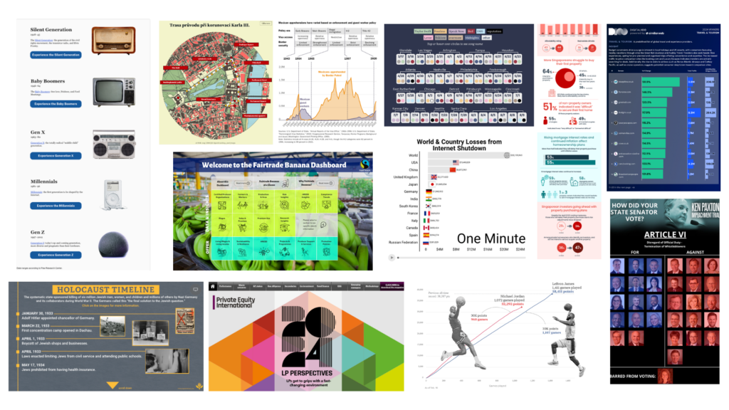
Infogram also highlights the importance of creativity in data visualization. The examples of data visualizations created by Infogram users in 2024 showcase visual excellence and creativity that continue to drive data storytelling. From interactive charts and dynamic maps to engaging infographics and impactful dashboards, these visualizations highlight the power of design.
Accessibility is a priority on Infogram. The platform allows users to create data visualizations that are understandable even for those without technical backgrounds. This is achieved through the use of vibrant colors, clear labels, and detailed explanations. The visual approach makes data more engaging and accessible to a broader audience.
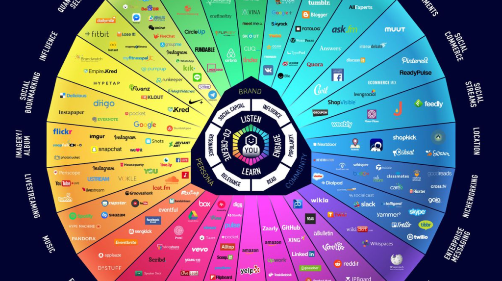
Data accuracy is fundamental to the credibility of visualizations. On Infogram, data is carefully verified and presented clearly to avoid the spread of misinformation. This is essential to maintain public trust and ensure that data-driven decisions are informed and accurate.
Innovation is a hallmark of Infogram. The platform frequently introduces advanced AI functionalities to enhance user experience and accessibility. These innovations enable users to create more engaging and interactive data visualizations, elevating data storytelling to new heights.
Collaboration is another important aspect of Infogram. The platform allows teams to work together to create accurate and informative data visualizations. This collaboration between designers, data analysts, and experts ensures that visualizations are effective and impactful.
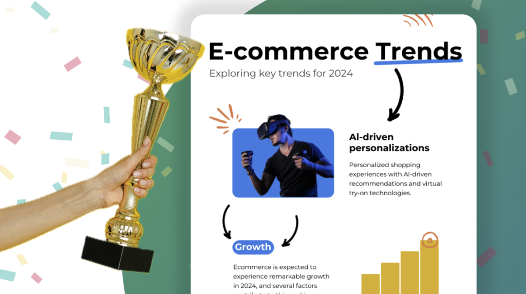
Visual storytelling is a powerful tool for engaging the audience. Visualizations on Infogram are not only informative but also visually appealing. This helps capture the audience’s attention and maintain interest in the presented information. The combination of accurate data and engaging storytelling makes data communication more effective.
Education is a central goal of Infogram. Data visualizations are designed to be used as educational tools in classrooms and other learning environments. This helps promote data literacy and inspire the next generation of scientists and engineers.
Sustainability is a recurring theme on Infogram. Many projects highlight the importance of conservation and environmental sustainability. For example, visualizations about zero-waste lifestyles help raise awareness about the importance of environmental preservation.
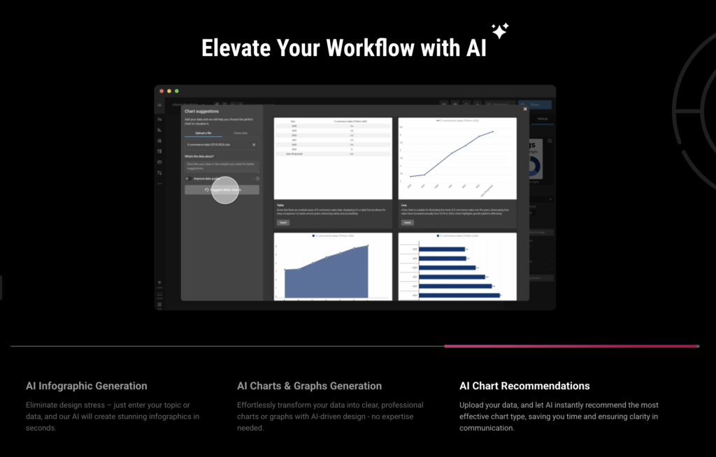
Data storytelling is also used to highlight important social issues. On Infogram, users can create visualizations that emphasize the importance of issues such as mental health, social inequality, and sustainability. This helps contextualize the data and highlight its relevance to current issues.
Creativity is a distinctive feature of Infogram. The platform allows users to experiment with different visualization and storytelling techniques to create unique and engaging projects. This creative approach helps make data communication more accessible and interesting to a broader audience.
Transparency is fundamental to the credibility of visualizations. On Infogram, users can share the source code and data used in their projects, allowing others to verify and replicate their visualizations. This promotes transparency and trust in the presented information.
In conclusion, Infogram demonstrates the power of data visualization and data storytelling in effective data communication. By combining accurate data with engaging narratives, the platform makes data communication more accessible and interesting to the general public. Infogram’s innovative and collaborative approach serves as a model for effective data communication.
#datavizmagic #tools #datastorytelling #datavisualization #infogram

Flourish: Empowering data through interactive visualization.
Flourish is a powerful data visualization platform designed to help users transform complex datasets into engaging, interactive stories. Whether you’re a journalist, marketer, educator, or analyst, Flourish provides the tools to create professional-grade visualizations without writing a single line of code. Its mission is clear: to make data storytelling accessible, beautiful, and impactful.
At the heart of Flourish is its extensive library of templates. These templates allow users to create everything from bar charts and scatter plots to animated maps and 3D visualizations. Each template is customizable, enabling users to tailor their visuals to the story they want to tell. This flexibility is essential for effective data storytelling, where context and clarity are key.
One of Flourish’s standout features is its no-code scrollytelling tool. Scrollytelling is a technique that combines scrolling with storytelling, allowing users to guide their audience through a narrative as they scroll down a webpage. With Flourish’s built-in editor, users can embed visualizations, text, and transitions to create immersive digital experiences.
Flourish is widely used by newsrooms, including the BBC and The Guardian, to create interactive graphics that explain complex topics in a visually compelling way. These organizations rely on Flourish to turn raw data into stories that inform and engage millions of readers. This demonstrates the platform’s credibility and effectiveness in high-stakes communication.
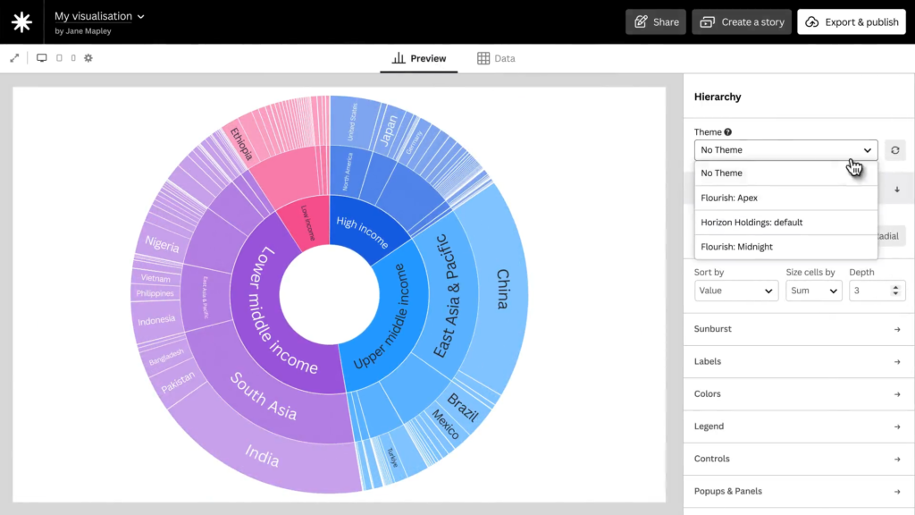
The platform also supports live-updating visualizations, which is particularly useful for dashboards and real-time reporting. By connecting to live data sources like Google Sheets or APIs, users can ensure their visualizations remain current without manual updates. This feature is crucial for data storytelling in fast-moving environments such as finance, health, or elections.
Flourish emphasizes interactivity as a core principle. Unlike static charts, interactive visualizations invite users to explore the data themselves. This hands-on engagement deepens understanding and allows audiences to uncover insights that matter to them personally. It transforms passive viewers into active participants in the story.
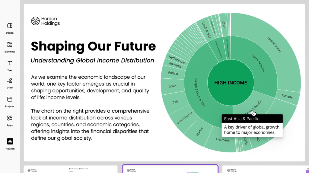
Another strength of Flourish is its ease of sharing and embedding. Visualizations can be embedded into websites, presentations, and social media with responsive design that adapts to any screen size. This ensures that data stories reach audiences wherever they are, on any device, without compromising quality or clarity.
Flourish also supports team collaboration and brand consistency. Organizations can create shared libraries of templates and themes, ensuring that all visual content aligns with brand guidelines. This is particularly valuable for large teams working across departments or regions.
The platform’s accessibility features are designed to make data stories inclusive. Users can add alt text, keyboard navigation, and screen reader support to ensure that visualizations are usable by people with disabilities. This commitment to accessibility reflects best practices in ethical data communication.
Flourish is not just a tool for professionals. Its intuitive interface and educational resources make it ideal for students and educators as well. Teachers can use Flourish to bring data to life in the classroom, helping students develop data literacy and storytelling skills that are increasingly essential in today’s world.
The platform also encourages creative experimentation. Users can animate transitions between charts, layer multiple datasets, and even build custom templates using Flourish’s developer tools. This creative freedom allows storytellers to push the boundaries of traditional data visualization.
Flourish’s blog and documentation offer a wealth of inspiration and guidance. From tutorials on best practices to showcases of user-created projects, the platform fosters a vibrant community of data storytellers. This ecosystem of support helps users continuously improve their skills and stay up to date with new features.
In terms of data storytelling, Flourish excels at helping users connect data to narrative. By combining visuals with explanatory text, annotations, and transitions, users can guide their audience through a logical and emotional journey. This narrative structure is what transforms data from information into insight.
Flourish also plays a role in advocacy and public awareness. Nonprofits and advocacy groups use the platform to highlight issues such as climate change, inequality, and public health. By visualizing data in a compelling way, these organizations can drive engagement and inspire action.
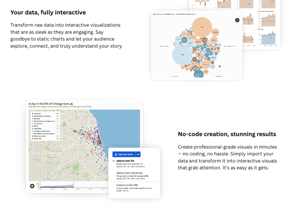
In conclusion, Flourish is more than a data visualization tool. It is a storytelling platform that empowers users to communicate complex ideas with clarity, creativity, and impact. Whether you’re building a dashboard, crafting a scrollytelling experience, or designing a single chart, Flourish gives you the tools to turn data into stories that resonate.
+VIDEO:
#datavizmagic #datavizshow #datastorytelling #datavisualization #tools

Napkin AI: When Ideas Take Visual Form.
We live in an era where the speed of information demands more than just words. Amid presentations, reports, social media, and brainstorming sessions, communicating ideas clearly and impactfully has become a daily challenge. This is where Napkin AI comes in—a platform that transforms text into intelligent, intuitive, and ready-to-use visualizations.
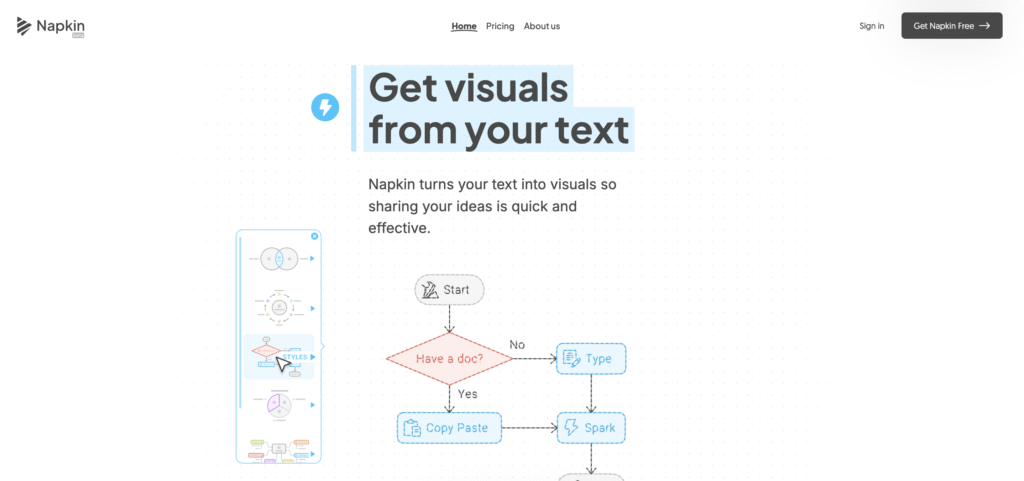
The name “Napkin” evokes the simplicity of a sketch scribbled on a napkin—that quick, spontaneous idea that needs to be captured before it disappears. But what the platform offers goes far beyond a rough draft: it turns concepts into infographics, mind maps, flowcharts, and professional-quality diagrams in just a few clicks.
Napkin’s mission is clear: to democratize the power of visualization. You don’t need to be a designer or master complex tools. Just paste your text, and the platform’s artificial intelligence takes care of generating the most suitable visual representations. The user selects, edits, and exports—simple as that.
This simplicity, however, hides remarkable technical sophistication. Napkin uses language models and design algorithms to interpret textual content and suggest visual structures that are coherent, aesthetically balanced, and adaptable to various contexts—from corporate presentations to social media posts.
The impact is profound. By automating visual creation, Napkin frees up time and creative energy. Marketing professionals, teachers, managers, and students can focus on content while the platform handles the form. It’s a quiet revolution in how we think and share ideas.
More than a tool, Napkin is an invitation to visual storytelling. It reminds us that images are not just illustrations—they are ways of thinking. A good diagram can reveal hidden relationships, a mind map can organize chaos, a chart can turn data into decisions. To visualize is to understand.
The platform also stands out for its customization. The generated visuals are fully editable: users can change icons, adjust colors, modify fonts, and rearrange elements with ease. This ensures that every creation reflects the user’s identity without sacrificing the efficiency of automation.
Another highlight is its export versatility. Content can be saved in formats like .ppt, .png, .pdf, and .svg, ready to be inserted into presentations, documents, blogs, or social media. Napkin doesn’t just create—it integrates, connects, and amplifies the reach of ideas.
What makes Napkin even more relevant is its commitment to creative accessibility. By enabling anyone—even without visual training—to create impactful content, it breaks down barriers and empowers voices. In a world where attention is won second by second, that’s gold.
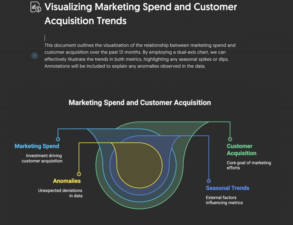
The company’s mission is clear: to bring the power of visuals into conversations that were once only textual. And this has deep implications for education, corporate communication, journalism, and even politics. After all, those who master visual storytelling often master attention—and action.
Napkin also represents a new phase of artificial intelligence: not just functional, but expressive. It shows that AI can be a creative ally, not a replacement. It can suggest, structure, inspire—while always leaving room for human touch, choice, and intention.
In this sense, the platform aligns with a broader trend: co-creation between humans and machines. Instead of fearing automation, Napkin invites us to embrace it as an extension of thought—a tool that expands, accelerates, and enriches the creative process.
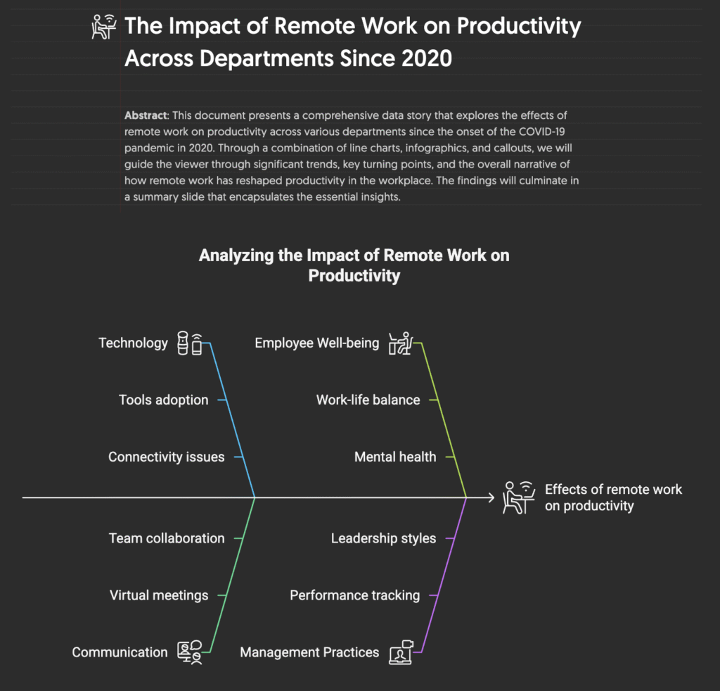
By turning text into image, Napkin also transforms how we think. It invites us to move beyond the linearity of writing and into the spatiality of design. To see connections, hierarchies, flows. To think with our eyes.
Ultimately, Napkin AI is not just a visualization platform. It’s a new way of thinking, communicating, and creating. A reminder that in a world saturated with words, sometimes all it takes is a clear, beautiful, precise image to make an idea shine.
#datavizmagic #datavizshow #datastorytelling #datavisualization
>>> Resources >>>

Data Lab – The World Bank.

The World Bank Data Lab is an initiative by the World Bank aimed at solving development challenges through data analysis and data science. The site offers a wide range of resources and tools for data professionals, helping to improve internal coordination among the World Bank’s data talents, expand pro bono partnerships with private companies and academic institutions, and increase awareness and capacity among staff to deliver modern data solutions in operations and research.
One of the main functions of the Data Lab is to support development projects through partnerships with the private sector and universities. These partnerships allow access to more frequent and granular data, essential for the effective implementation of projects. For example, the University Data Fellows program connects data science students with World Bank projects, offering a valuable opportunity to apply academic skills in real-world scenarios.
The Data Lab also organizes workshops and events to keep professionals updated on best practices in data analysis. These events are an opportunity to learn from external experts and participate in data community activities. Materials from past activities are available on the site, allowing all staff to benefit regardless of time zone.
Another important resource of the Data Lab is the data skills certification program. This program offers formal recognition of World Bank staff’s data science skills, encouraging the acquisition of new competencies. Certifications are published on staff profiles and are searchable in the World Bank’s people directory, making it easier to identify data experts for specific projects.

The site also offers a catalog of reusable codes and templates prepared for World Bank projects. These resources are essential for saving time and ensuring consistency in the application of data analysis techniques. Additionally, the Data Lab provides dynamic packages of data, codes, and analyses prepared for World Bank operations, facilitating access to integrated data solutions.
For those needing additional support, the Data Lab offers a support request form, connecting users to World Bank data science and data resources that can meet their immediate needs. This is particularly useful for professionals who feel overwhelmed by the vast amount of available resources and need specific guidance.
The importance of the World Bank Data Lab for data analysis professionals lies in its ability to centralize and make available essential resources for the execution of development projects. By providing access to data, tools, partnerships, and certifications, the Data Lab empowers professionals to apply their skills effectively and contribute to solving global development challenges.
In summary, the World Bank Data Lab is a vital platform for anyone working with data analysis in the context of global development. It offers a unique combination of educational resources, technical support, and networking opportunities, making it an indispensable tool for implementing data-driven solutions that can transform communities and improve quality of life worldwide.

The World Factbook – CIA.

The World Factbook website, maintained by the CIA, is a comprehensive source of information on various aspects of 265 world entities. It provides detailed data on each country’s history, population, government, economy, energy, geography, environment, communications, transportation, military, terrorism, and transnational issues.
For data analysts, the World Factbook is a valuable tool for several reasons. Firstly, it offers up-to-date and reliable data, essential for accurate analyses and informed decision-making. The reliability of the information is ensured by the CIA’s reputation as a world-renowned intelligence agency.

Additionally, the site allows for comparisons between countries in over 50 different areas, such as economy, health, and education. This is particularly useful for analysts who need to identify global trends, perform benchmarking, or understand the international context of specific indicators.
The World Factbook is also important for its comprehensiveness. It covers a wide range of topics, from demographic data to information on infrastructure and natural resources. This diversity of data enables analysts from different sectors to find relevant information for their specific needs.
Another crucial aspect is the accessibility of the data. The site is intuitively organized, making it easy to search for and extract information. This saves analysts time and effort, allowing them to focus on interpreting and applying the data.
For those working in risk and security analysis, the World Factbook offers insights into national and transnational security issues, such as terrorism and regional conflicts. This information is vital for risk assessment and the development of mitigation strategies.
Moreover, the site is regularly updated, ensuring that users have access to the most recent information. This is essential in a constantly changing world, where outdated data can lead to erroneous conclusions.
Finally, the World Factbook is an educational tool. It not only provides data but also context and explanations that help analysts better understand the factors influencing the data. This enriches the analysis and contributes to a deeper understanding of global phenomena.

Data Visualization Society: Advancing the field of data.
The Data Visualization Society (DVS) is an organization dedicated to celebrating, nurturing, and advancing the field of data visualization. Founded to connect professionals and enthusiasts in the field, DVS offers a rich platform of resources and opportunities for those looking to enhance their skills and knowledge in Data Visualization and Data Storytelling.
One of the main resources offered by DVS is the active Slack community, where members can share insights, discuss challenges, and collaborate on projects. This collaborative environment is ideal for professionals seeking to exchange experiences and learn from other experts in the field.
DVS also organizes regular events, such as coworking sessions, Q&As with experts, and networking meetups. These events provide valuable opportunities to learn from industry leaders, discover new trends, and expand professional networks.
The Nightingale magazine, published by DVS, is a rich source of articles, case studies, and tutorials on data visualization. The magazine covers a wide range of topics, from design techniques to the practical application of visualizations in different industries, offering relevant and up-to-date content for professionals in the field.
The society conducts the annual “State of the Industry” survey, which collects data on the current state of data visualization, the challenges faced by professionals, and emerging trends. The results of this survey are shared with the community, providing valuable insights that can guide strategic decisions and work practices.
The DVS website also offers a job board where companies can post vacancies and professionals can find career opportunities in the field of data visualization. This resource is especially useful for those seeking new opportunities or exploring different career paths.
DVS promotes diversity and inclusion in the data visualization community, encouraging participation from people of different backgrounds and experiences. The organization believes that diverse perspectives enrich the field and lead to more innovative and effective solutions.
Challenges and competitions organized by DVS, such as the Du Bois Visualization Challenge, encourage members to apply their skills in creative and innovative projects. These challenges not only stimulate creativity but also provide a platform for professionals to showcase their work and gain recognition in the community.
DVS also offers mentorship programs, connecting experienced professionals with those starting in the field. This personalized support helps new professionals develop their skills, receive career guidance, and build a solid foundation for their professional growth.
The society maintains an updated events calendar, allowing members to keep track of and participate in relevant conferences, workshops, and webinars. These events are valuable opportunities to learn new techniques, discover the latest tools and technologies, and stay updated with industry trends.
DVS is a nonprofit organization run by dedicated volunteers who work to promote data visualization as an essential discipline. The passion and commitment of these volunteers ensure that the society continues to offer high-quality resources and support to its members.
The Data Visualization Society is an invaluable resource for professionals in Data Visualization and Data Storytelling. With an active community, regular events, high-quality publications, and support programs, DVS offers everything professionals need to grow and thrive in their careers.
The Data Visualization Society is an essential hub for anyone interested in data visualization. Through its various resources and initiatives, DVS helps promote excellence in the practice of data visualization and build a strong, collaborative community of dedicated professionals.
#datavizmagic #datavizshow #datastorytelling #datavisualization #datavisualizationsociety

Tabletop Whale Blog: Visual Science
Data visualization and data storytelling are powerful tools that transform complex information into comprehensible and engaging stories. The site “Tabletop Whale” is a scientific illustration blog that uses these techniques to explain scientific concepts in an accessible and visually appealing way. This article explores how the principles of data visualization and data storytelling are applied on Tabletop Whale to effectively communicate science.
Tabletop Whale is an original scientific illustration blog created by Eleanor Lutz. The site features a variety of infographics and animations covering scientific topics ranging from biology to astronomy. Through the use of data visualizations, the blog makes science more accessible and interesting to the general public.
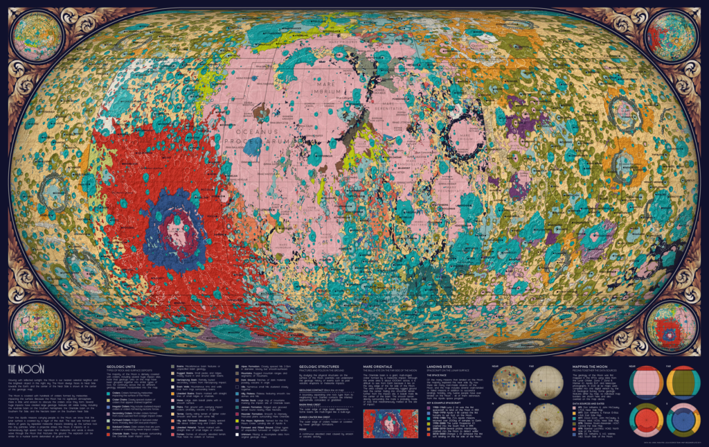
A notable example of data visualization on Tabletop Whale is the map of the solar system’s orbits. This map shows the orbits of over 18,000 asteroids using data from NASA. The visualization makes it easier to understand the distribution and movement of asteroids, something that would be difficult to grasp with textual data alone.
Data storytelling is another crucial aspect of Tabletop Whale. Each infographic and animation is accompanied by a detailed explanation that contextualizes the presented data. For example, in the project about medical ventilators, the animations are accompanied by descriptions explaining how ventilators work and why they are important. This helps the audience understand not just the data but also the story behind it.
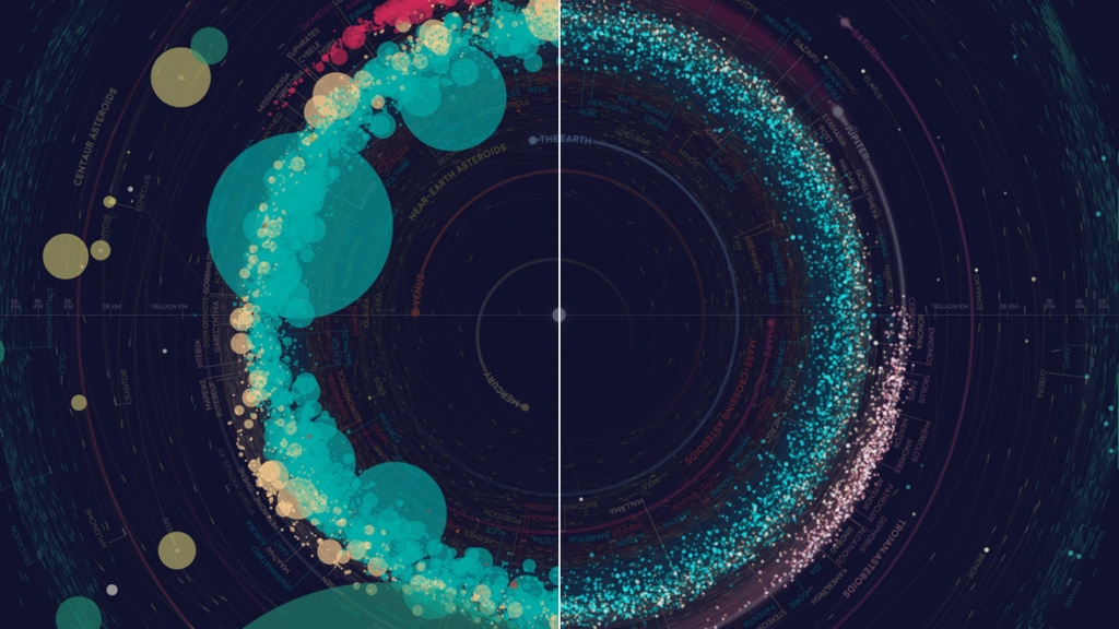
The combination of data visualization and data storytelling is especially effective in communicating complex scientific concepts. In the project about the geology of the Moon, Eleanor Lutz used data from six different datasets to create a cohesive geological map. The visualization helps highlight the different geological formations of the Moon, while the narrative explains the challenges and decisions made during the map creation process.
Accessibility is a priority on Tabletop Whale. The visualizations are designed to be understandable even for those without a scientific background. This is achieved through the use of vibrant colors, clear labels, and detailed explanations. The visual approach makes science more engaging and accessible to a broader audience.
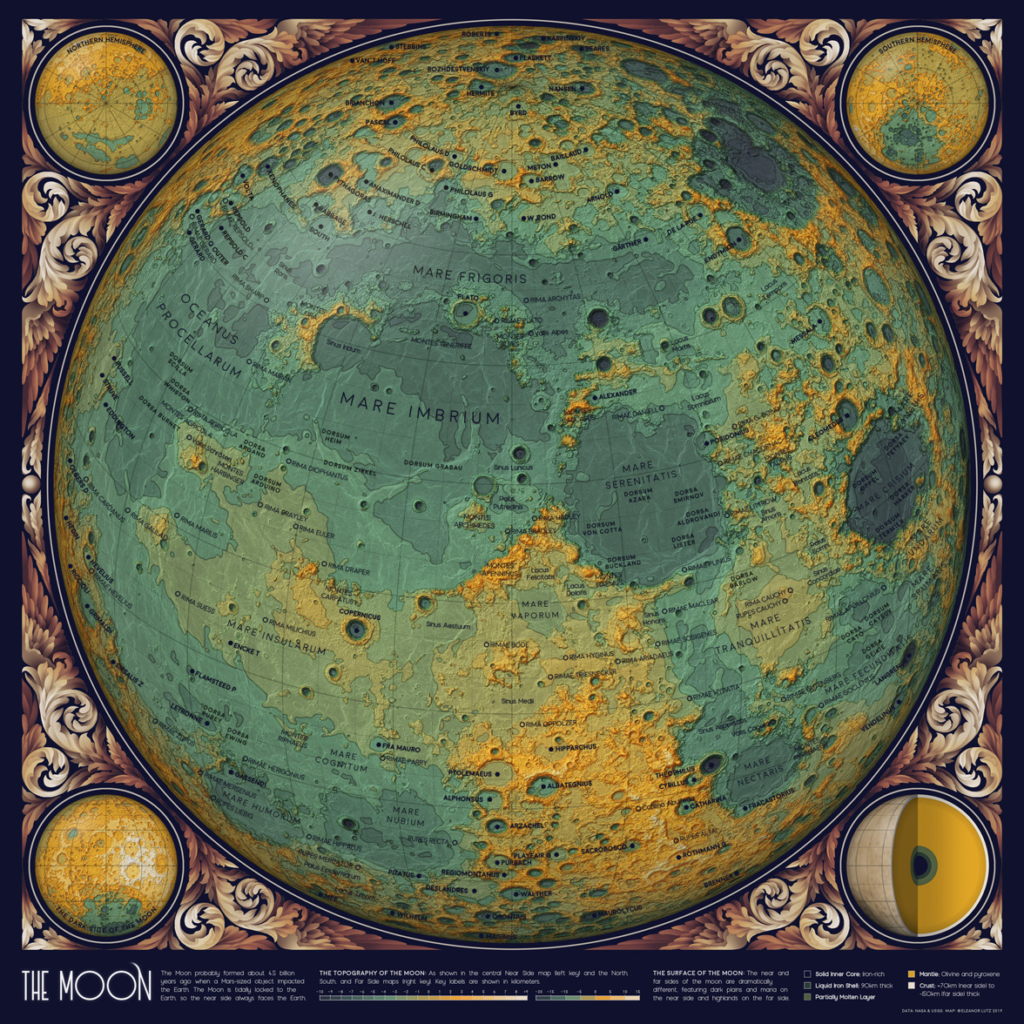
Data accuracy is fundamental to the credibility of the visualizations. In the project about asteroid orbits, for example, the data was carefully cleaned and verified to ensure accuracy. This is essential to avoid the spread of misinformation and to maintain public trust.
Innovation is a hallmark of Tabletop Whale. Eleanor Lutz frequently experiments with new visualization and storytelling techniques to improve scientific communication. For example, in the project about the geology of the Moon, she combined related geological terms into a single color to simplify the visualization. This innovative approach helps make complex data more comprehensible.
Collaboration is another important aspect of Tabletop Whale. In the project about medical ventilators, Eleanor Lutz collaborated with Dr. Sarah Low to create animations explaining how ventilators work. This collaboration between illustrators and scientific experts ensures that the visualizations are accurate and informative.
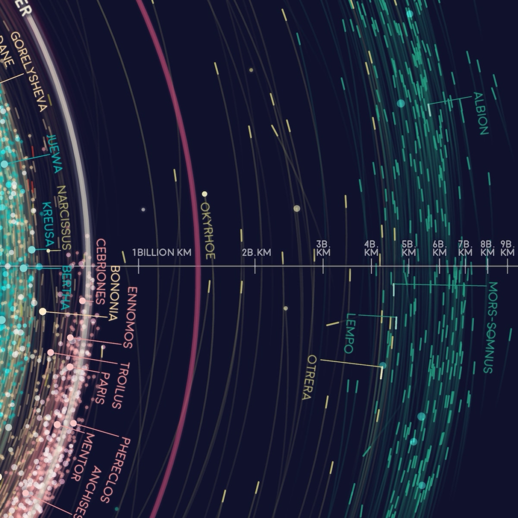
Visual storytelling is a powerful tool for engaging the audience. The visualizations on Tabletop Whale are not only informative but also visually appealing. This helps capture the audience’s attention and maintain interest in science. The combination of accurate data and engaging storytelling makes science more accessible and interesting.
Education is a central goal of Tabletop Whale. The visualizations are designed to be used as educational tools in classrooms and other learning environments. This helps promote scientific literacy and inspire the next generation of scientists and engineers.
Sustainability is a recurring theme on Tabletop Whale. Many of the projects highlight the importance of conservation and environmental sustainability. For example, the visualizations about ocean biology help raise awareness about the importance of preserving marine ecosystems.
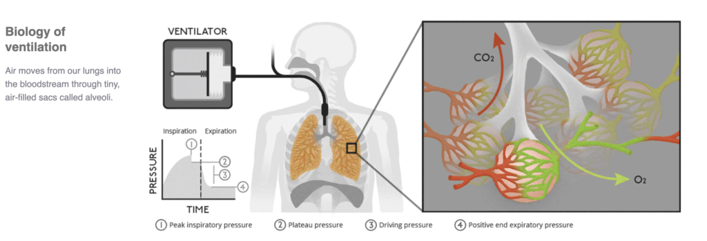
Data storytelling is also used to highlight important social issues. In the project about medical ventilators, the narrative emphasizes the importance of ventilators during the COVID-19 pandemic and the efforts to address ventilator shortages. This helps contextualize the data and highlight its relevance to current issues.
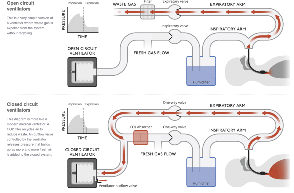
Creativity is a distinctive feature of Tabletop Whale. Eleanor Lutz uses a combination of illustration, animation, and data visualization to create unique and engaging projects. This creative approach helps make science more accessible and interesting to a broader audience.
Transparency is fundamental to the credibility of the visualizations. Eleanor Lutz often shares the source code and data used in her projects, allowing others to verify and replicate her visualizations. This promotes transparency and trust in science.
In conclusion, Tabletop Whale demonstrates the power of data visualization and data storytelling in scientific communication. By combining accurate data with engaging narratives, the site makes science more accessible and interesting to the general public. Eleanor Lutz’s innovative and collaborative approach serves as a model for effective scientific communication.

About the Author:
Eleanor Lutz is the creator of Tabletop Whale, a scientific illustration blog. She is an information designer specializing in data and science communication. Currently, Eleanor works as a Graphics Editor at the New York Times. She has a background in studying mosquito neuroscience and enjoys teaching coding and engaging with students. Eleanor’s work is characterized by its creativity, accuracy, and accessibility, making complex scientific concepts understandable and engaging for a wide audience.
#datavizmagic #tools #datastorytelling #datavisualization #tabletopwhale

Mapping the depths: How the world ocean atlas powers data.
The World Ocean Atlas (WOA), developed by NOAA’s National Centers for Environmental Information (NCEI), is one of the most comprehensive and authoritative collections of oceanographic data in the world. It provides global datasets of temperature, salinity, oxygen, nutrients, and other oceanographic variables, all derived from the World Ocean Database. These datasets are essential for scientists, educators, and policymakers who rely on accurate ocean data to understand and communicate the state of the oceans.
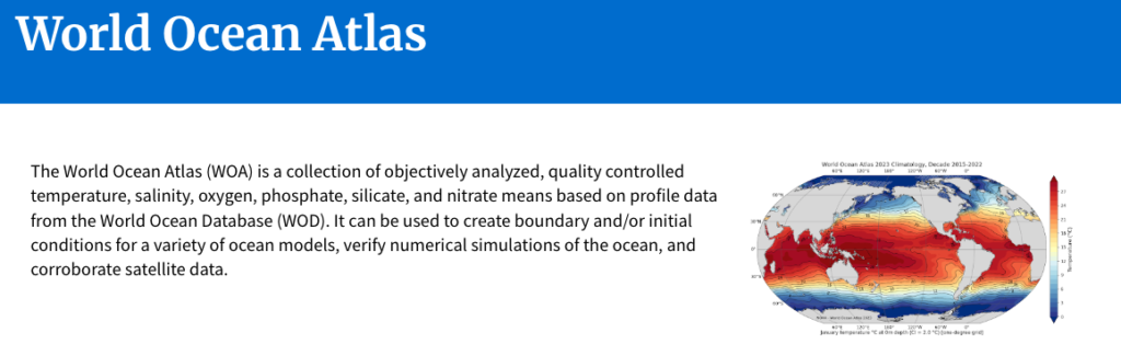
At its core, the WOA is a data product, but its true power lies in how it enables data visualization and data storytelling. By transforming raw oceanographic measurements into gridded, quality-controlled datasets, the WOA allows users to create maps, charts, and models that reveal patterns and trends across space and time. These visualizations are critical for interpreting the health of marine ecosystems and the impacts of climate change.
The WOA is updated regularly, with the most recent version being the World Ocean Atlas 2023. This release includes data from 1955 to 2022, offering a long-term view of ocean conditions. The datasets are available in multiple formats, including NetCDF, CSV, and ArcGIS-compatible files, making them accessible to a wide range of users from oceanographers to data journalists.
One of the most powerful applications of the WOA is in climate modeling. Scientists use WOA data to set boundary and initial conditions for ocean circulation models, which are essential for predicting climate patterns like El Niño and La Niña. These models rely on accurate visualizations of temperature and salinity gradients to simulate ocean currents and heat transport.
Beyond modeling, the WOA supports data storytelling by providing the foundational data needed to communicate complex oceanographic phenomena. For example, a journalist writing about ocean deoxygenation can use oxygen datasets to create compelling maps that show where and how oxygen levels are declining over time. These visuals help audiences grasp the scale and urgency of the issue.
The WOA also plays a key role in educational storytelling. Teachers and students can use the data to explore questions like “How has ocean temperature changed over the past 50 years?” or “Where are nutrient concentrations highest in the Pacific Ocean?” By visualizing these datasets, learners can engage with real-world data and develop critical thinking skills.
A unique feature of the WOA is its depth-resolved data. The datasets include measurements at 102 standard depth levels, from the surface to the deep ocean. This vertical resolution allows for detailed storytelling about ocean stratification, thermoclines, and nutrient cycling, phenomena that are invisible at the surface but crucial to marine life.
The WOA’s long time series also enables temporal storytelling. By comparing data across decades, users can visualize how ocean conditions have evolved in response to natural variability and human-induced climate change. These time-based narratives are essential for understanding trends and making informed decisions.
To support visualization, the WOA provides pre-made figures and maps on its website. These include global climatologies of temperature, salinity, and nutrients, which can be used directly or serve as templates for custom visualizations. These resources lower the barrier for non-specialists to engage with ocean data.
This is also a model of data transparency and reproducibility. Each dataset is accompanied by detailed metadata, documentation, and citations, allowing users to trace the origin and processing of the data. This transparency is vital for building trust in visualizations and ensuring that stories based on WOA data are credible.
In the realm of policy and advocacy, WOA data has been used to support international reports such as the IPCC assessments. Visualizations derived from datasets help policymakers understand the state of the oceans and the need for action on issues like ocean acidification and warming.
The WOA’s compatibility with GIS platforms enhances its storytelling potential. By integrating WOA data with spatial layers such as marine protected areas or shipping routes, users can create rich, multi-dimensional narratives that connect ocean conditions with human activities.
The accessibility of the WOA is another strength. The data is freely available to the public, and the NCEI provides user guides and technical support to help users navigate the datasets. This openness fosters a global community of practice around ocean data visualization and storytelling.
As ocean data becomes increasingly important in the face of climate change, the WOA stands out as a foundational resource. Its structured, high-quality datasets empower users to create visualizations that not only inform but also inspire action.
In conclusion, the World Ocean Atlas is more than a database. It is a storytelling engine. By enabling the transformation of complex ocean data into clear, compelling visual narratives, it helps scientists, educators, journalists, and advocates communicate the vital role of the ocean in our planet’s health.
#datavizmagic #datavizshow #datastorytelling #datavisualization #resources

Google Veo 3: The revolution of video generation through artificial intelligence.
At the end of May this year, Google, through its DeepMind division, officially launched Veo 3, the third generation of its artificial intelligence designed for video generation. This tool represents a significant leap in automated audiovisual content creation, allowing anyone to transform textual descriptions into videos with cinematic quality.
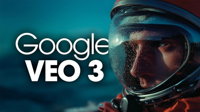
Veo 3 is the result of years of research into multimodal generative models, combining advances in natural language processing, computer vision, and video synthesis. It can interpret complex commands and generate videos lasting over a minute, in Full HD (1080p) resolution, with impressive fluidity and realism.
The development of Veo 3 involved integrating several of Google’s previous technologies, such as Imagen Video, Phenaki, and the Gemini language models. The DeepMind team worked to unify these approaches into a single robust system capable of understanding linguistic nuances and translating them into coherent visual scenes.

One of Veo 3’s major differentiators is its ability to maintain visual consistency across multiple scenes. This means that characters, settings, and objects retain their visual characteristics even when appearing at different moments in the video—something that was a challenge in previous versions.
The AI also understands technical terms from cinematic vocabulary. Commands like “one-shot sequence,” “timelapse,” “aerial shot,” or “noir style” are interpreted accurately, allowing users to have creative control over the style and narrative of the generated video.
The system was trained on a vast dataset of visual and audiovisual content, adhering to ethical and privacy guidelines. Google states that it used only licensed or public domain content and applied filters to prevent the generation of sensitive or misleading material.
Veo 3 also introduces AI-generated audio, including soundtracks, sound effects, and even dialogues with natural intonation. This is made possible through integration with voice and sound synthesis models like AudioLM, also developed by Google.
The tool is available through Google Flow, an experimental platform accessible via Google Labs. Users can create projects, input prompts, and generate videos directly in the interface, with editing options and fine adjustments via text commands.
To full use of the tool is tied to the Google Gemini Ultra plan, formerly known as Google One AI Premium.
The Google Flow interface allows users to save projects, share videos, and even collaborate in real time. This opens doors for educational, commercial, and artistic uses, democratizing access to high-quality audiovisual production.
Technically, Veo 3 uses an architecture based on multimodal transformers, with specialized modules for text, image, motion, and sound. These modules work in sync to generate cohesive and expressive videos.
The AI is also capable of performing intelligent edits. For example, a user can request “add a storm in the background” or “change the style to cyberpunk,” and the system adjusts the video automatically without needing to start over.
The impact of Veo 3 is already being felt in areas such as advertising, education, independent filmmaking, and social media. Small businesses and individual creators now have access to a tool that previously required entire teams and large budgets.
Google has also implemented safety and transparency mechanisms. Each video generated by Veo 3 includes metadata indicating its synthetic origin, helping to combat misinformation and misuse of the technology.
The arrival of Veo 3 in Brazil was marked by great interest, with servers temporarily overloaded in the first days of access. This demonstrates the public’s appetite for creative tools powered by AI.
The creative community has already begun exploring Veo 3’s potential in short films, music videos, trailers, and even educational videos. The ability to generate visual and audio content from written ideas is transforming the creative process.
Veo 3 also represents an advance in creative accessibility. People with technical or physical limitations can now express their visual ideas easily, simply by describing what they want to see.
In comparison, Veo 3 outperforms competitors like Runway, Pika Labs, and Sora (from OpenAI) in aspects such as visual fidelity, video duration, and sound integration, establishing Google as a leader in this segment.
The launch of Veo 3 marks a new chapter in the evolution of multimodal generative AIs. It shows how the combination of language, image, and sound can be orchestrated by algorithms to create complete audiovisual experiences.
Google Veo 3 is not just a video generation tool—it is a new paradigm in how we imagine, create, and share stories. It ushers in an era where human creativity is amplified by increasingly sophisticated artificial intelligences.
#datavizmagic #datavizshow #datastorytelling #datavisualization #resources
ItalianLP: Language as Living Technology.
In a world increasingly mediated by algorithms, language remains our most powerful and most complex tool. At the intersection of linguistics, computer science, and artificial intelligence, the ItalianLP lab stands out as a center of excellence dedicated to understanding, modeling, and transforming human language into computable knowledge.
Based at the Istituto di Linguistica Computazionale “Antonio Zampolli” (ILC-CNR), ItalianLP brings together researchers, linguists, and computer scientists with a shared goal: to develop natural language processing (NLP) technologies with a special focus on the Italian language. But its impact goes far beyond linguistic borders—it touches on fundamental questions about how we communicate, learn, and interact with machines.
The lab works on multiple fronts: from building probabilistic models for syntactic analysis to developing information extraction systems in specialized domains such as healthcare, education, and e-government. Its projects combine linguistic rigor with technological innovation, resulting in tools that not only process text but understand it in depth.
One of ItalianLP’s key strengths is its hybrid approach: blending traditional linguistic knowledge with the latest machine learning techniques. This fusion enables the creation of more accurate models, sensitive to the nuances of language and capable of handling real-world challenges such as ambiguity, irony, regional variation, and semantic change.
Among the lab’s many contributions are lexicons, annotated corpora, morphosyntactic analysis tools, and readability assessment systems. These resources are essential not only for researchers but also for developers, educators, and professionals working with large volumes of text.
The READ-IT project, for example, is one of the first advanced readability assessment tools for Italian. It combines traditional textual features with lexical and syntactic information, allowing users to evaluate the complexity of entire documents or individual sentences—an essential capability for education, accessibility, and institutional communication.

Another highlight is the lab’s involvement in the FAIR – Future Artificial Intelligence Research project, which aims to develop trustworthy, ethical, and human-centered AI. Within this initiative, ItalianLP leads efforts in automatic language generation and textual quality evaluation, with special attention to social and ethical aspects such as bias and clarity.
These efforts show that ItalianLP is not just interested in making machines understand language—but in ensuring that this understanding is fair, inclusive, and socially beneficial. In times of misinformation and information overload, this mission is more urgent than ever.
Language, after all, is not just a means of communication. It is a mirror of culture, a tool of power, and a field of symbolic struggle. By modeling language, we also model how we think, feel, and relate to one another. ItalianLP’s work, therefore, is also a form of digital citizenship.
Beyond research, the lab is committed to training new talent, offering courses, workshops, and collaboration opportunities with universities and industry. This educational dimension is essential to prepare a new generation of professionals capable of addressing the ethical, technical, and social challenges of linguistic AI.
The ItalianLP website functions as a true knowledge hub. There, users can access linguistic resources, APIs, interactive demos, and scientific publications all with a commitment to open, accessible, and applicable science.
In a global landscape dominated by English-language models, ItalianLP also plays a strategic role: ensuring that Italian—and by extension, other underrepresented languages—has a voice in the digital revolution. This means creating models trained on local data, sensitive to the cultural and linguistic specificities of Italy.
This commitment to linguistic diversity is essential for building truly inclusive AI. Because, ultimately, there is no such thing as a neutral language—and an AI that ignores this reality risks reproducing inequalities and silencing voices.
ItalianLP reminds us that language is alive, mutable, and deeply human. And that, in translating it into the world of machines, we must not lose sight of its richness, beauty, and complexity. Technology can be a powerful ally—but only if guided by ethical principles and a deep respect for language as an expression of life.
#datavizmagic #datavizshow #datastorytelling #datavisualization #resources
Humanizing Data Strategy: Leading Data with the Head and the Heart.
In today’s data-driven world, Tiankai Feng’s book, “Humanizing Data Strategy: Leading Data with the Head and the Heart,” offers a refreshing perspective on data management. Feng introduces the Five Cs Framework, which focuses on Competence, Collaboration, Communication, Creativity, and Conscience. This framework emphasizes the importance of aligning data skills with business needs, fostering a learning […]

Storytelling with Data: A Data Visualization Guide.
In today’s data-driven world, the ability to communicate effectively with data is a crucial skill. Cole Nussbaumer Knaflic’s book, “Storytelling with Data: A Data Visualization Guide for Business Professionals,” provides a comprehensive framework for transforming raw data into compelling stories. The first step in this process is understanding the context. By knowing your audience and […]
AI Literacy Fundamentals: Helping You Join the AI Conversation.
Understanding AI Literacy Artificial Intelligence (AI) is rapidly transforming various aspects of our lives, from how we work to how we interact with technology. However, understanding AI can be daunting for many. “AI Literacy Fundamentals: Helping You Join the AI Conversation” by Ben Jones serves as an essential primer for anyone looking to grasp the […]

Data Storytelling: Agile Planning for Insight-Driven Communication.
Unlocking the Power of Data Storytelling In today’s data-driven world, the ability to communicate insights effectively is crucial. Stefano Carnevalli’s book, “Data Storytelling: Agile Planning for Insight-Driven Communication,” offers a comprehensive guide to mastering this skill. The book introduces the Data Storytelling Canvas, a tool that helps professionals organize their data presentations systematically. By using […]
The Strategic Data Playbook.
The Strategic Data Playbook: A Six-Step Data Strategy Framework to Turn Your Company into a Data-Driven Powerhouse by Wissen Lau is a comprehensive guide designed to help organizations harness the power of data to drive innovation, insights, and success. The book emphasizes the importance of a clear data strategy and provides actionable frameworks to transform […]
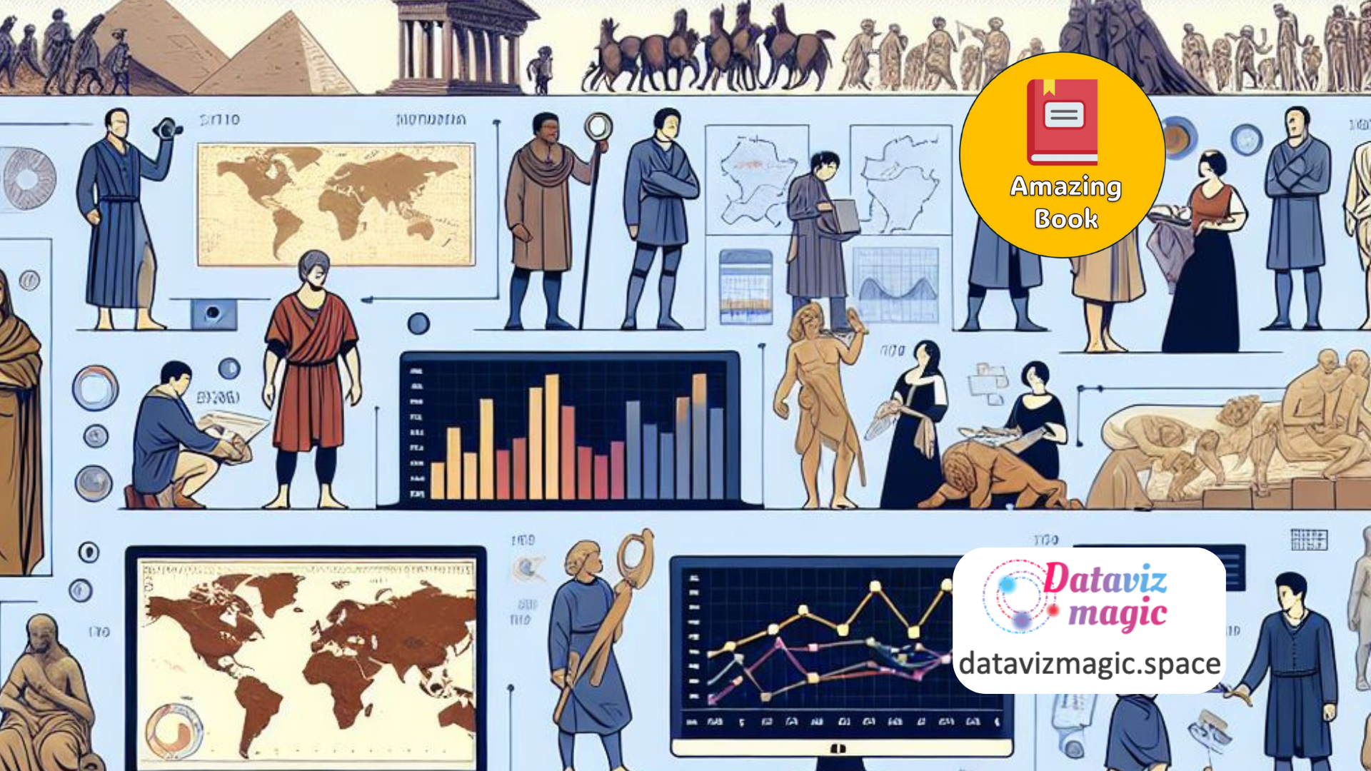
A History of Data Visualization and Graphic Communication.
A History of Data Visualization and Graphic Communication by Michael Friendly and Howard Wainer is a comprehensive exploration of the evolution of data visualization and its impact on how we understand and solve problems. The book delves into the origins, rise, and significance of graphic communication, highlighting its indispensable role in our daily lives. The […]
Good Charts: Smarter Data Visualization.
Good Charts: The HBR Guide to Making Smarter, More Persuasive Data Visualizations by Scott Berinato is a comprehensive guide aimed at helping individuals and organizations create effective and impactful data visualizations. The book emphasizes the importance of good charts in communicating ideas and influencing decision-making processes. The book begins by exploring the fundamental principles of […]

Data Story: Explain Data and Inspire Action Through Story.
Data Story: Explain Data and Inspire Action Through Story by Nancy Duarte is a compelling guide that teaches readers how to transform data into persuasive narratives. The book emphasizes the importance of storytelling in data communication, providing practical techniques to make data more engaging and actionable. The book begins by highlighting the power of stories […]
Fundamentals of Data Visualization.
Fundamentals of Data Visualization” by Claus O. Wilke is a comprehensive guide designed to help data scientists and analysts create informative and compelling visualizations. The book emphasizes the importance of accurately representing data while making it visually appealing and easy to understand. Wilke begins by discussing the principles of good data visualization, stressing the need […]
The Art of Insight: How Great Visualization Designers Think.
“The Art of Insight: How Great Visualization Designers Think” by Alberto Cairo is an insightful exploration into the minds of some of the world’s leading data visualization designers. The book is structured around interviews with these experts, providing a deep dive into their thought processes, design philosophies, and the unique challenges they face in their […]
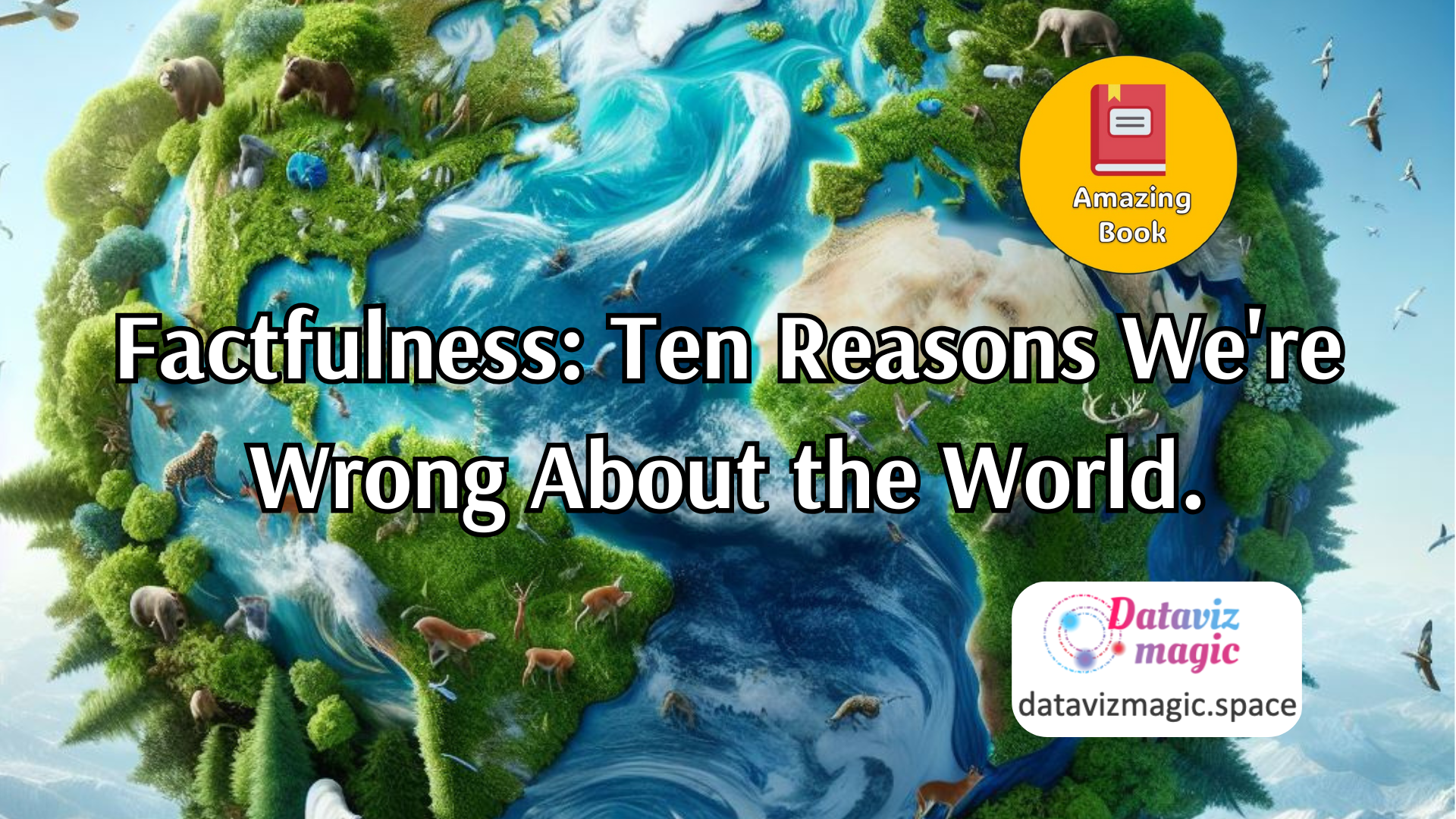
Factfulness: Ten Reasons We’re Wrong About the World.
“Factfulness: Ten Reasons We’re Wrong About the World – and Why Things Are Better Than You Think” by Hans Rosling, along with his son Ola Rosling and daughter-in-law Anna Rosling Rönnlund, is a transformative book that challenges common misconceptions about the state of the world. The authors argue that despite widespread pessimism, global trends in […]

Become a Great Data Storyteller.
Become a Great Data Storyteller: Learn How You Can Drive Change with Data by Angelica Lo Duca is a transformative guide that emphasizes the power of storytelling in data visualization. The book challenges conventional approaches by focusing on creating compelling data narratives that can significantly impact decision-making and drive organizational change. Lo Duca begins by […]

Data Visualization: A Handbook for Data Driven Design.
Data Visualisation: A Handbook for Data Driven Design, written by Andy Kirk, is an essential work for students, academics, and professionals who want to master the art of creating effective data visualizations. This book, now in its second edition, offers a comprehensive and practical approach to transforming data into impactful and useful communication tools. The […]

Effective Data Storytelling: How to Drive Change with Data, Narrative and Visuals.
Effective Data Storytelling: How to Drive Change with Data, Narrative and Visuals, written by Brent Dykes, is a comprehensive guide that teaches readers how to effectively communicate insights through data storytelling. This book emphasizes the importance of combining data, narrative, and visuals to create compelling stories that can influence decisions and drive change. The book […]

The Data Visualization Sketchbook.
The Data Visualization Sketchbook, authored by Stephanie D.H. Evergreen, is a practical guide designed to help individuals improve their data visualization skills through sketching. This book is a valuable resource for anyone looking to enhance their ability to communicate data effectively, whether they are beginners or experienced professionals. The book begins by emphasizing the importance […]

Unmasking AI: My Mission to Protect What Is Human in a World of Machines.
Unmasking AI: My Mission to Protect What Is Human in a World of Machines, written by Dr. Joy Buolamwini, is a compelling exploration of the ethical challenges posed by artificial intelligence and the urgent need to address them. This book delves into the intersection of technology, ethics, and social justice, offering a powerful narrative on […]
Fresh Perspectives: Meaning, Space, Data, and Truth.
Seeing with Fresh Eyes: Meaning, Space, Data, Truth, by Edward R. Tufte, is a visually stunning and intellectually provocative work that invites readers to rethink how they observe, interpret, and communicate information. In this book, Tufte continues his mission to elevate the standards of visual communication, exploring how design can reveal, or distort, the meaning […]

Data Detective: Ten Easy Rules to Make Sense of Statistics.
The Data Detective: Ten Easy Rules to Make Sense of Statistics, by Tim Harford, is a practical and engaging guide that helps readers navigate the often confusing world of statistics. Rather than focusing solely on mathematical formulas or technical jargon, Harford emphasizes the importance of mindset, curiosity, and critical thinking when interpreting data. The book […]
ColorWise: Data Guide to the Intentional Use of Color.
ColorWise: A Data Storyteller’s Guide to the Intentional Use of Color, by Kate Strachnyi, is a practical and insightful guide for anyone who works with data visualizations and wants to use color more effectively. The book addresses one of the most overlooked yet powerful tools in data storytelling — color — and shows how it […]
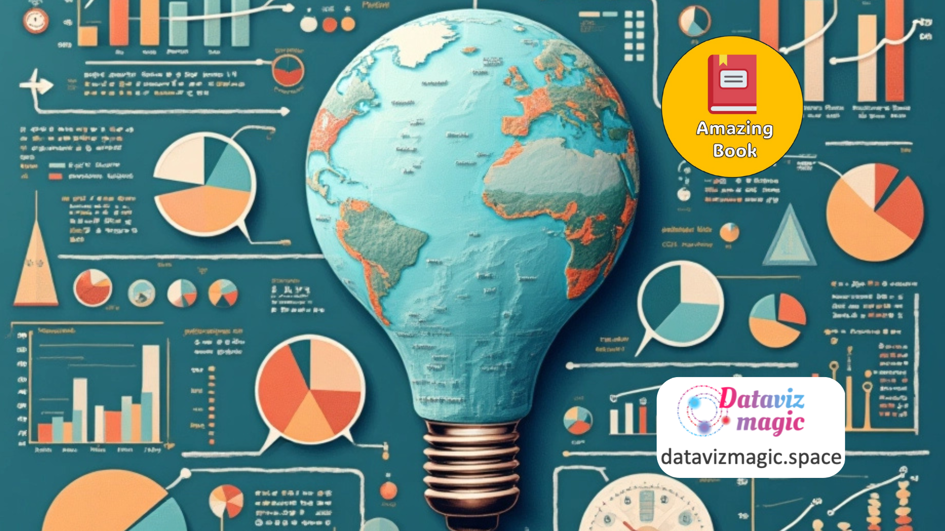
The Art of Thinking in Graphs.
The Art of Thinking in Graphs: Illustrating the Principles That Shape Our Productivity, Decision-Making, and the Way We Think by Dolev Erez is an innovative work that proposes a new way of understanding the world through graphs. The book presents key principles that influence our productivity, decision-making, and thought patterns, all illustrated with clear and […]
Visualizing AI: A Practical Guide.
In Visualizing AI, Gabe Araujo offers a timely and practical guide for anyone seeking to communicate artificial intelligence concepts through data visualization. As AI becomes increasingly embedded in our daily lives, the need to explain its inner workings to both technical and non-technical audiences has never been more urgent. This book addresses that challenge by […]
Envisioning Information.
Envisioning Information by Edward R. Tufte is a landmark work in the field of data visualization and information design. In this visually rich and intellectually rigorous book, Tufte explores how to effectively communicate complex, multidimensional data through clear and elegant visual representations. The book focuses on the challenge of representing real-world experiences and abstract concepts […]
Infographics Designers Sketchbooks.
Infographics Designers’ Sketchbooks by Steven Heller and Rick Landers is a visually rich and insightful exploration into the creative processes behind some of the world’s most compelling infographic designs. This book offers a rare behind-the-scenes look into the sketchbooks, drafts, and conceptual thinking of leading infographic designers, making it a unique resource for anyone interested […]
History of Information Graphics.
The book History of Information Graphics, edited by Sandra Rendgen, is a monumental exploration of how humans have used visual tools to understand and communicate complex information. Spanning centuries of innovation, this richly illustrated volume traces the development of information graphics from medieval manuscripts to modern data visualizations. With over 400 examples, it offers a […]